
Image: Countycartpurple1024

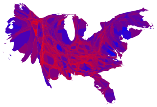
Description: This map adjusts the size of the a county based on its population size. Counties with larger populations are bigger and counties with smaller populations are smaller in proportion to their size. Color is used to indicate the percentage of the vote Obama and Romney got. Blue would be 100% vote for Obama. Red would be 100% vote for Romney. Purple shaded counties had their votes evenly split. As this map makes clear, large portions of the country are quite evenly divided, appearing in various shades of purple, although a number of strongly Democratic (blue) areas are visible too, mostly in the larger cities. There are also some strongly Republican areas, but most of them have relatively small populations and hence appear quite small on this map.
Title: Countycartpurple1024
Credit: http://www-personal.umich.edu/~mejn/election/2012/countycartpurple1024.png
Author: Mark E. J. Newman, mejn@umich.edu
Usage Terms: Creative Commons Attribution 3.0
License: CC BY 3.0
License Link: http://creativecommons.org/licenses/by/3.0
Attribution Required?: Yes
Image usage
The following page links to this image:
