
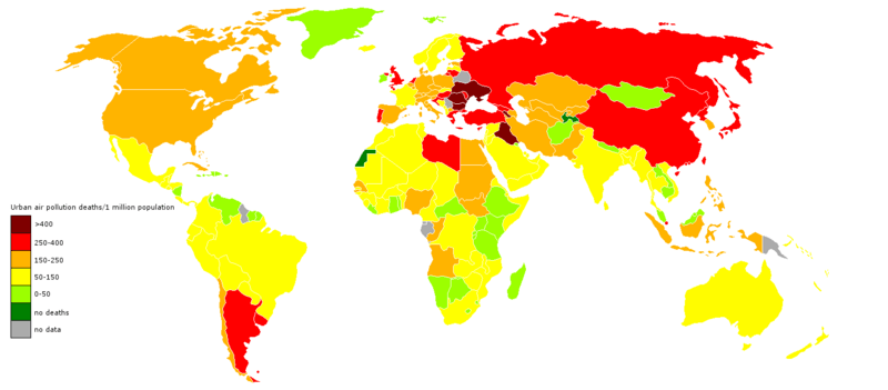
Image: Deaths from air pollution

Description: Map showing the number of deaths from air pollution per country. Map was based on a map of the WHO, see http://www.who.int/heli/risks/urban/en/webuapmap.2.jpg and http://www.who.int/heli/risks/urban/urbanenv/en/ This map is accurate for 2004. It should be noted though that it differed greatly from an earlier map made under the same project (see http://www.who.int/entity/heli/risks/urban/en/webuapmap.jpg and http://www.who.int/heli/risks/urban/en/ ). As such, questions arise regarding the accuracy even of this map. This, especially since this old and even the current map also differ greatly from the ESA map at http://en.wikipedia.org/wiki/File:Global_air_pollution_map.png and the map at http://www.environment.no/Topics/Air-pollution/Local-air-pollution/
Title: Deaths from air pollution
Credit: Own work
Author: KVDP
Usage Terms: Creative Commons Attribution-Share Alike 3.0
License: CC BY-SA 3.0
License Link: http://creativecommons.org/licenses/by-sa/3.0
Attribution Required?: Yes
Image usage
There are no pages that link to this image.
