
Image: Regular and bold
Size of this preview: 800 × 520 pixels. Other resolutions: 320 × 208 pixels | 6,605 × 4,293 pixels.
Original image (6,605 × 4,293 pixels, file size: 800 KB, MIME type: image/png)
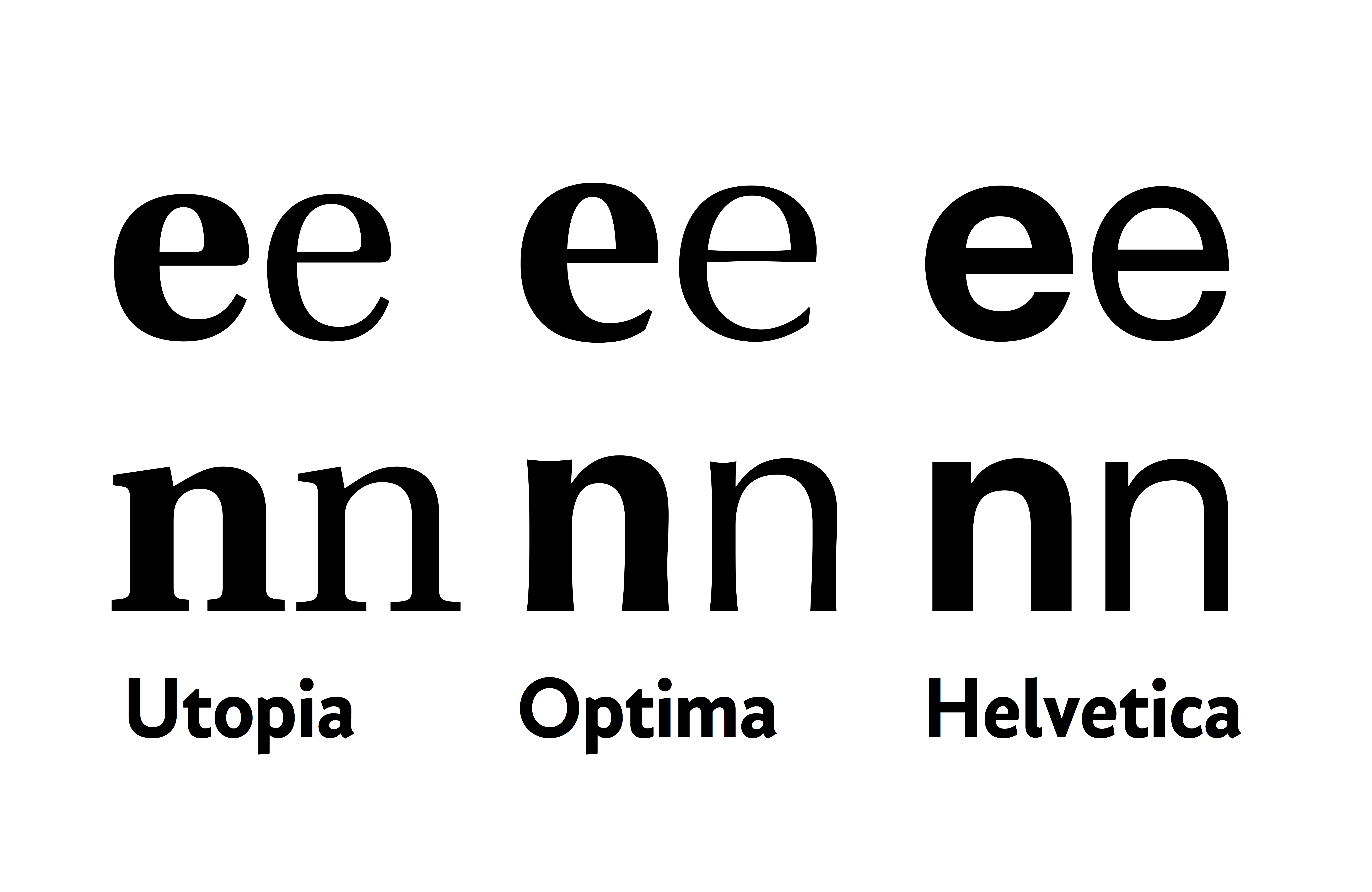
Description: A diagram of how bold fonts are designed. Normally, it is by increasing the contrast, making the thick strokes much bolder while the narrow strokes and joins such as on an 'n' only get slightly bolder. Helvetica's 'e' has a monoline construction, so on it all strokes get bolder.
Title: Regular and bold
Credit: Own work
Author: Blythwood
Usage Terms: Creative Commons Attribution-Share Alike 4.0
License: CC BY-SA 4.0
License Link: http://creativecommons.org/licenses/by-sa/4.0
Attribution Required?: Yes
Image usage
The following page links to this image:

All content from Kiddle encyclopedia articles (including the article images and facts) can be freely used under Attribution-ShareAlike license, unless stated otherwise.