
Image: 2017- Donald Trump veracity - composite graph

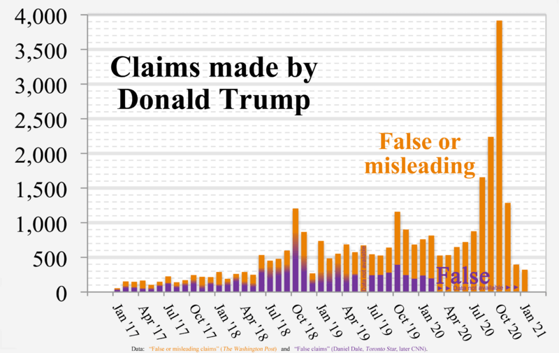
Description: Chart of Donald Trump's “False or misleading claims” (The Washington Post) and “False claims” by Daniel Dale (Toronto Star, later CNN) Graph with background orange bars, "False or misleading claims", is from monthly data in the The Washington Post fact checker, and is directly represented. Graph with foreground violet bars, "False claims", is in time segments: 1. Jan 2017–May 2019: from fact checker Daniel Dale's weekly chart published in Toronto Star. Color gradients (violet changing to orange) show the full range of possible "False Statements" resulting when the Toronto Star's weekly data was converted to monthly data. See Technical details below. 2. June 2019: No data available since Daniel Dale was between jobs. 3. July 2019— : from fact checker Daniel Dale's daily chart published on CNN. I grouped the days' values by month—of course requiring no calculation, error bars, or color gradients. Full sourcing is presented in the file description page of related image File:2017- Donald Trump - graph - false or misleading claims.png (shown below), which shows the same data, but in two separate graphs. Technical details: Orange values and violet values aren't "stacked" one atop the other. The violet bars are superimposed in front of the orange bars to save space. Beginning with Version 5 (2020-02-26), Toronto Star weekly data for weeks that are split across two months is represented using COLOR GRADIENTS (gradually changing color) in the middle portion of each column of the chart through May 2019. In Version 5, the bottom of the gradient area of the column assumes NO data from such "split" week(s) belongs to that month, and the top of the gradient area assumes ALL data from such "split" week(s) belongs to that month. This new approach graphically shows the full range of possible False Statements for such months, eliminates "error bar" estimation, and avoids algebraic calculations needed to determine the center point for error bars. In Versions 1 through 4: "Interpolation" example (used in Versions 1 through 4 for converting the Toronto Star's weekly figures into monthly figures) In a representative example, the February 2, 2018 week in the Toronto Star indicated 36 false statements. That 7-day week includes 5 days in January and 2 days in February. Thus, that week's contribution to January is simply 36*(5/7)=25.7, and its contribution to February is 36*(2/7)=10.3. Of course, weeks entirely within a single month contribute 100% to that month.
Title: 2017- Donald Trump veracity - composite graph
Credit: Own work
Author: RCraig09
Usage Terms: Creative Commons Attribution-Share Alike 4.0
License: CC BY-SA 4.0
License Link: https://creativecommons.org/licenses/by-sa/4.0
Attribution Required?: Yes
Image usage
The following page links to this image:
