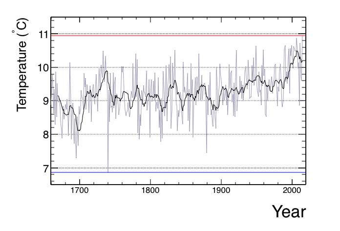
Image: CET 1659 - 2014 using Hadley Centre Data
Description: This graph shows the calander year mean Central England Temprature (CET) from 1659 - 2014 in grey. The Blue line is the minimum CET in this period and the red line shows the maximum. The black line is a rolling average of the previous 10 years.
Title: CET 1659 - 2014 using Hadley Centre Data
Credit: Data from their website http://www.metoffice.gov.uk/hadobs/hadcet/data/download.html. I then made the graph using ROOT (https://root.cern.ch)
Author: David Auty using (Met Office Hadley Centre data)
Permission: Evidence: The license statement can be found online at: http://www.metoffice.gov.uk/about-us/legal/tandc#Use-of-Crown-Copyright
Usage Terms: Creative Commons Attribution-Share Alike 3.0
License: CC BY-SA 3.0
License Link: https://creativecommons.org/licenses/by-sa/3.0
Attribution Required?: Yes
Image usage
The following page links to this image:


