
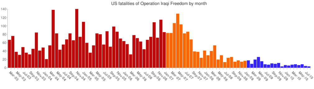
Image: OIF fatalities by month
Size of this preview: 800 × 228 pixels. Other resolutions: 320 × 91 pixels | 1,011 × 288 pixels.
Original image (1,011 × 288 pixels, file size: 9 KB, MIME type: image/png)
Description: A bar graph showing the complete US fatalities from Operation Iraqi Freedom by month, from beginning to end. Based on this Google Chart API graph, with further editing in Photoshop. The red months are pre-troop surge, the orange months are post-troop surge, and the blue months are under Obama. Although overall month-on-month figures have decreased, the total level of coalition forces has also reduced.
Title: OIF fatalities by month
Credit: Graph entirely my own work, statistics provided by iCasualties.
Author: Smurfy
Usage Terms: Public domain
License: Public domain
Attribution Required?: No
Image usage
The following page links to this image:

All content from Kiddle encyclopedia articles (including the article images and facts) can be freely used under Attribution-ShareAlike license, unless stated otherwise.