
Image: Optical Size Demonstration
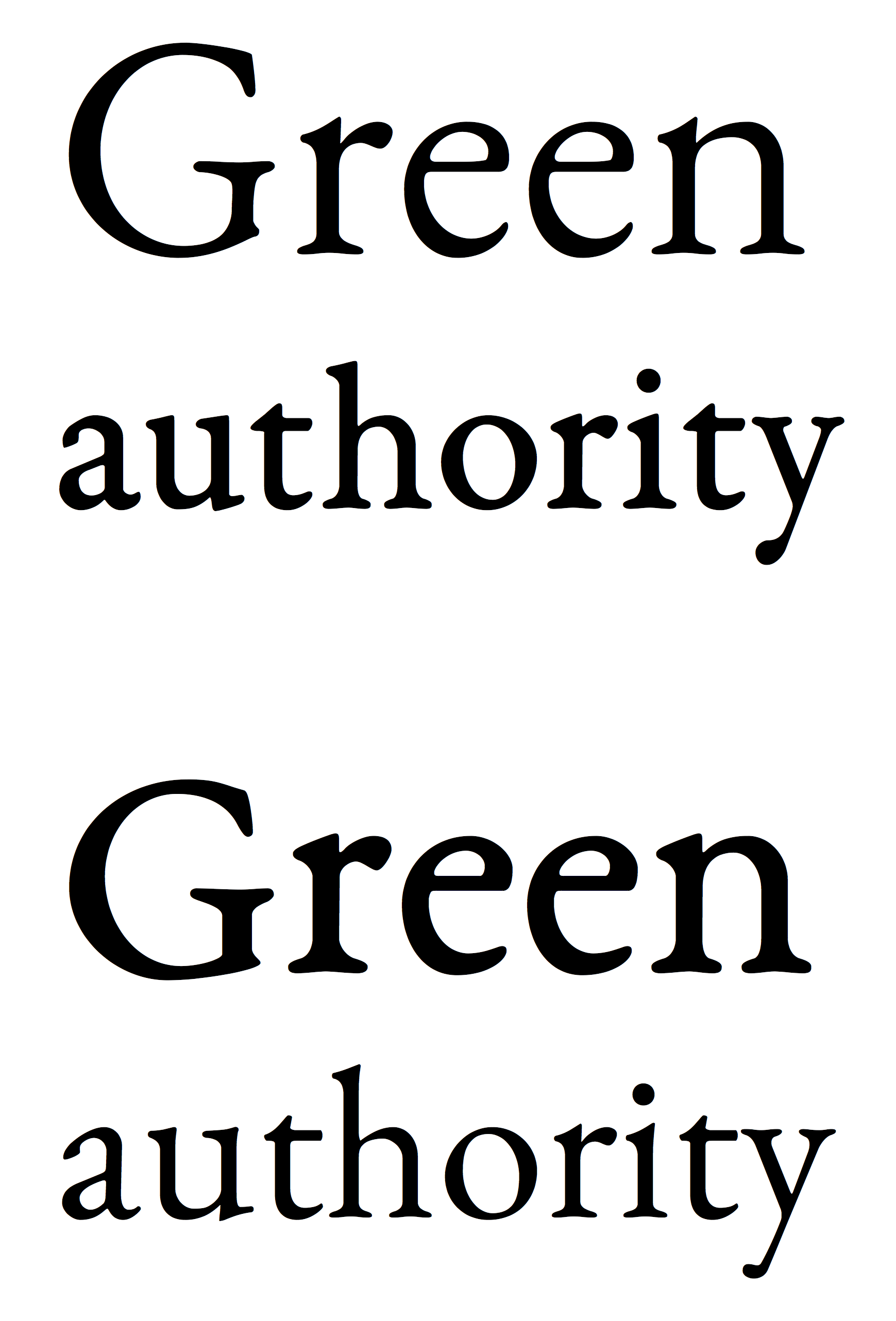
Description: Advanced fonts are issued in optical sizes: different designs for different text sizes. During the metal-type era each size of letters had to be custom-cut by hand, and would be given a different style that looked right at its size. Simpler modern computer fonts, and in particular almost all free and open-source ones, do not offer this, instead using one design for all text sizes. At top is how this is meant to look, using the open-source font EB Garamond: the larger text is in a slimmer size 12 weight, while the smaller text is in a size 08 weight that is bulkier so it looks clear when printed small. At bottom is the wrong way round: size 08 blown up looks heavy and size 12 printed small looks anaemic. It is worth noting that this is quite a subtle example and other fonts have much bigger changes across optical sizes. For example, the caption style of PT Serif massively increases the x-height (the height of small lower-case letters). This image was suggested by an illustration in the article "How To Choose The Right Face For A Beautiful Body" by Dan Reynolds.
Title: Optical Size Demonstration
Credit: Own work
Author: Blythwood
Usage Terms: Creative Commons Attribution-Share Alike 4.0
License: CC BY-SA 4.0
License Link: http://creativecommons.org/licenses/by-sa/4.0
Attribution Required?: Yes
Image usage
There are no pages that link to this image.
