Canadian currency tactile feature facts for kids
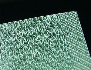
The Canadian currency tactile feature is a special design on Canadian banknotes. It helps people who can't see well to know the value of the money. This feature uses raised dots in the top left corner of the bill. It was first suggested by Bruno Thériault from the Canadian National Institute for the Blind. A professor named Susan Lederman from Queen's University helped design it.
Contents
How the Tactile Feature Works
The raised dots on Canadian banknotes are a bit like braille, but they are not exactly the same. Regular braille was thought to be too hard to feel quickly on money. So, the banknotes use full braille blocks, which have six dots each.
- The $5 bill has one block of dots.
- The $10 bill has two blocks of dots.
- The $20 bill has three blocks of dots.
- The $50 bill has four blocks of dots.
- The $100 bill has two blocks of dots with a space of two empty blocks in between them.
This system makes it easier for people to quickly tell the difference between the different money values.
Tactile Features Around the World
Canada was one of the first countries to add these special features to its money. Other countries have started to use similar systems too.
Costa Rica's Money
A very similar system of raised dots is now being used on new banknotes in Costa Rica. This helps visually impaired people there identify their money as well.
United States Money
The United States Treasury has also announced that new $10 bills will have a tactile feature. This shows that more countries are making their money easier for everyone to use.


