
Flag of Seattle facts for kids
 |
|
| Proportion | 11:15 |
|---|---|
| Adopted | July 16, 1990 |
| Designed by | Paul Kraabel |
The flag of Seattle is the official symbol of the city of Seattle. It helps people recognize Seattle and represents its spirit. This flag is mostly teal and white. It features the city's special logo, which shows a picture of Chief Seattle. Around his portrait are two lines, and the words "City of Goodwill" are above, with "Seattle" below.
Contents
What Does the Seattle Flag Look Like?
The flag has a simple yet meaningful design. Its main colors are a bright teal and clean white. These colors help the flag stand out.
Symbols on the Flag
At the center of the flag is the official logo for the city of Seattle. This logo includes a portrait of Chief Seattle, a famous leader of the Suquamish and Duwamish tribes. He is a very important historical figure for the city.
Around Chief Seattle's picture, you can see two curved lines. These lines help frame the portrait. Above the logo, the words "City of Goodwill" are written. This phrase highlights Seattle's role as a friendly and welcoming place. Below the logo, the word "Seattle" clearly identifies the city.
How the Seattle Flag Was Adopted
The Seattle flag was created by an architect named David Wright. A member of the Seattle City Council, Paul Kraabel, also supported its design.
When Was the Flag Chosen?
The city officially adopted this flag on July 16, 1990. It was chosen especially for an important event happening in Seattle that year.
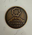
The Goodwill Games Connection
The flag was adopted to be used during the Goodwill Games. These games were a big international sports event. They brought athletes from many countries together in a spirit of friendship. The flag helped welcome everyone to Seattle during this special time.
Why Some People Want a New Seattle Flag
Even though the flag is official, some people think it could be better. Flag design has certain rules to make flags easy to recognize and remember.
Common Criticisms of the Flag
Many flag experts believe the Seattle flag breaks some of these rules. One main criticism is that the design is too complex. It has too many details, like the portrait and words, which can make it hard to see from far away.
Another point of criticism is that the flag uses the city's official seal. Experts often say that flags should not use complicated seals. Simple designs are usually better for flags.
Ideas for a New Design
Because of these criticisms, there have been ideas to redesign the flag. In 2019, local newspapers like The Seattle Times and The Stranger asked people for new flag ideas. The Stranger even held a public vote to see which new designs people liked best.
Images for kids
-

Contemporary Seattle City Flag
-
Volunteer medal for the Seattle Goodwill Games


