Gini coefficient facts for kids
In economics, the Gini coefficient ( JEE-nee), also known as the Gini index, is a special number that helps us understand how evenly (or unevenly) things like income, wealth, or even how much people spend are shared within a country or a social group. It was created by an Italian expert named Corrado Gini.
The Gini coefficient measures how much inequality there is in how money or wealth is spread out. A Gini coefficient of 0 means perfect equality, where everyone has the exact same amount. On the other hand, a Gini coefficient of 1 (or 100%) means extreme inequality, where one person has everything, and everyone else has nothing.
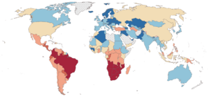
Corrado Gini first suggested this coefficient to measure how unequal income or wealth was. For many developed countries in the late 20th century, after considering taxes and special payments, the income Gini coefficient was usually between 0.24 and 0.49. Slovakia had one of the lowest, meaning more equality, while Mexico had one of the highest. Some African countries, like South Africa, had very high Gini coefficients before taxes, but these numbers dropped after social help and taxes were included.
It's important to know that the same Gini coefficient value can come from different ways that income or wealth is spread out. So, we need to consider other things, like how old the population is. For example, countries with more older people or more babies might see their Gini coefficient increase, even if the income for working adults stays the same.
Contents
- History of the Gini Coefficient
- What the Gini Coefficient Means
- How to Calculate Gini (Simple Example)
- Gini Coefficients for Income Distribution
- Gini for Social Development
- Key Features of the Gini Coefficient
- Limitations of the Gini Coefficient
- Other Ways to Measure Inequality
- Gini Coefficients for Ancient Societies
- Other Uses of the Gini Coefficient
- See also
History of the Gini Coefficient
The Gini coefficient was created by the Italian statistician Corrado Gini. He first wrote about it in 1912 in a paper called Variabilità e mutabilità, which means "variability and changeability." Gini built on ideas from another economist, Max Lorenz. He suggested comparing a line of perfect equality (where everyone has the same income) with the actual line showing how people's incomes are really distributed. This comparison helps measure how unequal things are.
Later, in 1914, Gini applied his ideas to income and wealth inequality. He introduced a "concentration ratio" which eventually became the Gini coefficient we use today.
In 1915, another expert, Gaetano Pietra, helped explain the Gini coefficient using geometry. This made it easier to understand and use.
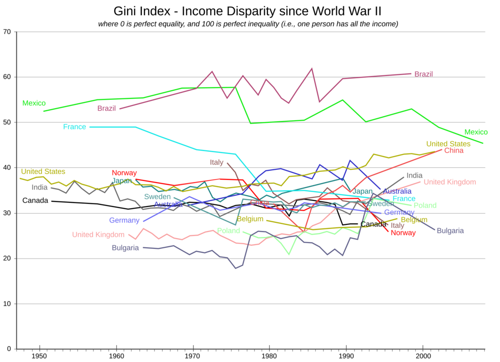
According to the OECD, Canada was one of the first countries to officially use the Gini coefficient in the 1970s. Since the 2000s, countries like Slovenia, Czechia, and Slovakia have consistently shown the lowest inequality. Scandinavian countries also often appear at the top of the equality list.
What the Gini Coefficient Means
The Gini coefficient is a way to measure how much a country's wealth or income distribution is different from a perfectly equal distribution.
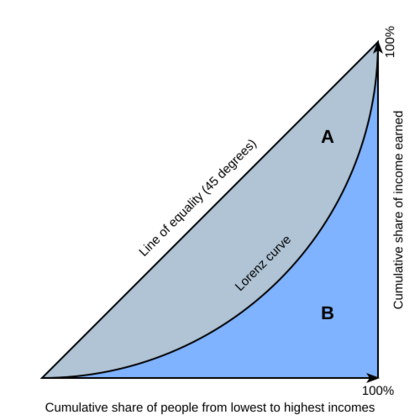
It's usually explained using something called the Lorenz curve. Imagine a graph:
- The bottom line (x-axis) shows the percentage of the population, from the poorest to the richest.
- The side line (y-axis) shows the percentage of the total income they earn.
If everyone had the same income, the line would be perfectly straight, going up at a 45-degree angle. This is the "line of equality." The Lorenz curve shows the real situation. It usually sags below the line of equality because the poorest people earn a smaller share of the total income.
The Gini coefficient is the ratio of the area between the line of equality and the Lorenz curve (marked A in the diagram) to the total area under the line of equality (marked A and B in the diagram). So, Gini = Area A / (Area A + Area B).
- If the Gini coefficient is 0, it means perfect equality (Area A would be zero).
- If the Gini coefficient is 1, it means perfect inequality (Area B would be zero, and Area A would be the entire triangle).
Usually, the Gini coefficient is a number between 0 and 1. Sometimes it's shown as a percentage, from 0% to 100%.
How to Calculate Gini (Simple Example)
While real-world income distributions are complex, we can use simple examples to understand the Gini coefficient.
Imagine a society with two income levels: low and high.
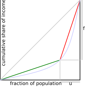
- If a small group of people (let's say 20% of the population) earns a very large share of all the income (like 80%), then the Gini coefficient would be at least 60% (0.6). This shows a lot of inequality.
- If 1% of the world's population owns 50% of all wealth, the wealth Gini coefficient is at least 49%.
These examples show that the Gini coefficient helps us quickly see how concentrated income or wealth is.
Gini Coefficients for Income Distribution
The Gini coefficient for income can be looked at in two ways:
- Market income Gini: This is calculated before taxes are taken out and before any government help (like unemployment benefits) is given. It shows the inequality in income just from jobs and investments.
- Disposable income Gini: This is calculated after taxes and government help. It shows the inequality after a country's policies have tried to make things more equal.
For developed countries between 2008 and 2009, the market income Gini coefficient ranged from 0.34 to 0.53. After taxes and government help, the disposable income Gini coefficient was lower, ranging from 0.25 to 0.48. This shows that taxes and social programs often help reduce income inequality. Countries in Europe, especially those with strong social support systems, tend to have lower income inequality.
The Gini coefficient for the entire world's income has been estimated to be between 0.61 and 0.68. This means there's a lot of income inequality globally.
Regional Income Gini Indices
According to UNICEF, the Latin America and Caribbean region had the highest average net income Gini index in the world in 2008, at 48.3. Other regions had lower averages: sub-Saharan Africa (44.2), Asia (40.4), Middle East and North Africa (39.2), Eastern Europe and Central Asia (35.4), and High-income Countries (30.9).
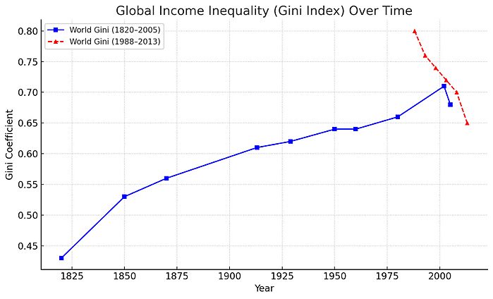
World Income Gini Index Over Time
Looking at the income distribution for all people worldwide, global income inequality generally increased from the early 19th century until the early 2000s. There was a big jump between 1980 and 2002. However, this trend seems to have changed, and global inequality has started to decrease. This is partly because of fast economic growth in developing countries, especially in places like China and India.
Here are some estimated world income Gini coefficients over time:
| Year | World Gini coefficients |
|---|---|
| 1820 | 0.43 |
| 1850 | 0.53 |
| 1870 | 0.56 |
| 1913 | 0.61 |
| 1929 | 0.62 |
| 1950 | 0.64 |
| 1960 | 0.64 |
| 1980 | 0.66 |
| 2002 | 0.71 |
| 2005 | 0.68 |
More recent data shows a continuous decline in global income inequality since 1988. This is often linked to globalization, which has helped billions of poor people, especially in countries like China and India, earn more. Many developing countries have also improved basic services and adopted fairer tax policies.
| Year | World Gini coefficients |
|---|---|
| 1988 | 0.80 |
| 1993 | 0.76 |
| 1998 | 0.74 |
| 2003 | 0.72 |
| 2008 | 0.70 |
| 2013 | 0.65 |
Gini for Social Development
The Gini coefficient isn't just for money! It's used in many areas, like understanding social development.
Education Inequality
The Education Gini index measures how unequal education is within a population. It helps us see how much access people have to schooling over time. For example, a study of 85 countries found that Mali had a very high education Gini index of 0.92 in 1990, meaning education was very unevenly distributed. The United States had a much lower index of 0.14, showing more equal access to education. Between 1960 and 1990, countries like China, India, and South Korea saw the biggest drops in education inequality.
Opportunity Inequality
Similar to income Gini, the Gini opportunity coefficient measures how equally opportunities are shared. This idea comes from Amartya Sen, who suggested that social development should be about giving people more choices and abilities. The Gini opportunity coefficient tries to estimate how well a society helps its citizens succeed based on their choices and talents, rather than on things they can't control, like their gender, race, or where they were born.
In 2003, research showed that Italy and Spain had some of the highest opportunity inequality among advanced economies.
Income Mobility
The Shorrocks index uses Gini coefficients to measure income mobility. This helps us understand if income inequality is permanent or if people can move up (or down) the income ladder over time. For example, it compares how unequal short-term earnings (like a year's salary) are to long-term earnings (like total income over 5 or 10 years). If people can easily move between income groups, it suggests more mobility.
A study looking at the United States since 1937 found that income mobility has changed a lot, partly because more women joined the workforce. When men and women are considered together, long-term income inequality has actually decreased in recent decades in the US.
Key Features of the Gini Coefficient
The Gini coefficient is a useful tool because:
- It gives a clear number between 0 (perfect equality) and 1 (perfect inequality).
- It compares how much of the population has how much of the income or wealth.
- It helps us understand how spread out resources are in a group.
Limitations of the Gini Coefficient
While helpful, the Gini coefficient has some limitations:
Relative, Not Absolute
The Gini coefficient measures relative inequality, not absolute wealth. A developing country might have a rising Gini (meaning more inequality) even if the number of people living in extreme poverty is going down. This is because the Gini doesn't tell you how much money people have in total, only how it's shared. For example, two countries could have the same Gini coefficient, but one might be very rich and the other very poor.
Mathematical Limitations
The Gini coefficient can sometimes be misleading.
- It's not additive: You can't just average the Gini coefficients of different groups to get the Gini for the whole population.
- Different distributions can have the same Gini: Two countries can have the same Gini coefficient even if their income is distributed in very different ways. This means the Gini alone doesn't tell the whole story.
| Household group | Country A annual income ($) | Country B annual income ($) |
|---|---|---|
| 1 | 20,000 | 9,000 |
| 2 | 30,000 | 40,000 |
| 3 | 40,000 | 48,000 |
| 4 | 50,000 | 48,000 |
| 5 | 60,000 | 55,000 |
| Total income | $200,000 | $200,000 |
| Country's Gini | 0.2 | 0.2 |
Table A shows an example where two countries have the same total income and the same Gini coefficient (0.2), but the way income is spread among households is different.
Income Gini Can Hide Wealth Inequality
The Gini coefficient for income doesn't tell us about wealth inequality. Wealth includes things like savings, property, and investments, which are different from yearly income. A country might have low income inequality but very high wealth inequality. For example, Sweden has a low income Gini (0.31) but a very high wealth Gini (0.79 to 0.86), meaning wealth is much more unevenly distributed than income.
Country Size and Measurement Bias
The Gini index can be affected by the size of the population being measured. Smaller countries or regions might appear to have lower Gini coefficients. Also, how detailed the measurements are can change the result. If you group people into large income brackets, the Gini might look lower than if you use many small, detailed brackets.
Changes in Population
Changes in a society's population, like more births, an aging population, or people moving in and out of the country, can affect the Gini coefficient. For example, if many low-income immigrants move to a country, its Gini coefficient might rise, even if the original residents' income distribution hasn't changed.
Household vs. Individual Income
The Gini coefficient can give different results depending on whether it measures income for individual people or for entire households. How a "household" is defined can also change the outcome. For example, if more people live alone, the total income might be split among more households, which could make the Gini coefficient appear higher.
| Income bracket (in 2010 adjusted dollars) | % of Population 1979 | % of Population 2010 |
|---|---|---|
| Under $15,000 | 14.6% | 13.7% |
| $15,000 – $24,999 | 11.9% | 12.0% |
| $25,000 – $34,999 | 12.1% | 10.9% |
| $35,000 – $49,999 | 15.4% | 13.9% |
| $50,000 – $74,999 | 22.1% | 17.7% |
| $75,000 – $99,999 | 12.4% | 11.4% |
| $100,000 – $149,999 | 8.3% | 12.1% |
| $150,000 – $199,999 | 2.0% | 4.5% |
| $200,000 and over | 1.2% | 3.9% |
| Total Households | 80,776,000 | 118,682,000 |
| United States' Gini on pre-tax basis | 0.404 | 0.469 |
Table C shows that in the US, the number of households increased between 1979 and 2010. Even though incomes generally rose, the Gini coefficient also increased, partly due to these structural changes in how households are formed.
Instantaneous vs. Lifetime Inequality
The Gini coefficient usually gives a snapshot of inequality at one point in time. It doesn't always show how income changes over a person's entire life. For example, young people often earn less than middle-aged adults, and older people might earn less again. So, a country might look more unequal at any given moment, but if people can move up the income ladder throughout their lives, the lifetime inequality might be lower.
Benefits and Informal Income
It's hard to measure the value of non-money benefits, like subsidized housing or free healthcare. These are often not included in Gini calculations, which can make the picture of inequality less accurate. Also, in many parts of the world, people earn money in the "informal economy" (jobs not officially recorded or taxed). This income is hard to track, making it difficult to get a true Gini coefficient.
Other Ways to Measure Inequality
Because of the Gini coefficient's limitations, other methods are sometimes used alongside it or instead of it. These include measures like the Atkinson index or the Theil Index, which also try to understand how resources are distributed.
Gini Coefficients for Ancient Societies
In recent years, researchers have tried to estimate Gini coefficients for societies from long ago, even before the 20th century. Since there were no income surveys back then, they use clues like:
- Records of wealth taxes in old European cities.
- Patterns of land ownership in Roman Egypt.
- Differences in the size of houses in ancient Greece or Aztec Mexico.
- Information about inheritances and dowries in Babylonian society.
These clues help historians understand how unequal wealth might have been in the past.
Other Uses of the Gini Coefficient
The Gini coefficient is used in many different fields:
- Ecology: It can measure biodiversity, showing how evenly different species are distributed in an area.
- Health: It can measure inequality in health-related quality of life within a population.
- Education: It can measure how unequal universities are in terms of resources or opportunities.
- Engineering: It helps evaluate how fairly internet routers share network traffic among different users.
- Machine Learning: It's used to evaluate how similar different data points are, which helps train computer models.
- Credit Risk: It helps banks see how well their systems can tell the difference between people who will pay back loans and those who might not.
- Dating Apps: It has even been used to analyze inequality in how people are matched on dating apps!
- Reliability Theory: It can help assess how much systems (like machines) are aging or improving over time.
See also
 In Spanish: Coeficiente de Gini para niños
- Diversity index
- Economic inequality
- Great Gatsby curve
- Herfindahl–Hirschman Index
- Hoover index (a.k.a. Robin Hood index)
- Human Poverty Index
- Income inequality metrics
- Kuznets curve
- List of countries by income inequality
- List of countries by inequality-adjusted Human Development Index
- List of countries by wealth inequality
- List of U.S. states by Gini coefficient
- Lorenz curve
- Matthew effect
- Pareto distribution
- ROC analysis
- Suits index
- The Elephant Curve
- Utopia
- Welfare
- Welfare economics


