
Image: Diagram of different habitable zone regions by Chester Harman

Size of this preview: 800 × 468 pixels. Other resolutions: 320 × 187 pixels | 3,302 × 1,931 pixels.
Original image (3,302 × 1,931 pixels, file size: 1.63 MB, MIME type: image/jpeg)
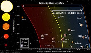
Description: This is the most widely used diagram for explaining the Habitable Zone. Shown is temperature vs starlight received. Important exoplanets are placed on the diagram, plus Earth, Venus, and Mars.
Title: Diagram of different habitable zone regions by Chester Harman
Credit: Send to me personally upon request
Author: Chester Harman
Permission: Evidence: The license statement can be found online at: http://sites.psu.edu/ceh5286/images/
Usage Terms: Creative Commons Attribution-Share Alike 4.0
License: CC BY-SA 4.0
License Link: https://creativecommons.org/licenses/by-sa/4.0
Attribution Required?: Yes
Image usage
The following 2 pages link to this image:

All content from Kiddle encyclopedia articles (including the article images and facts) can be freely used under Attribution-ShareAlike license, unless stated otherwise.