
Image: S&P 500 Chart 2025

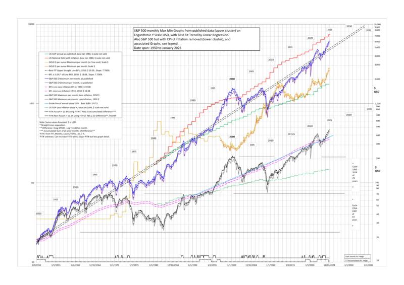
Description: S&P 500 Max Min Chart to Jan 2025 with Trend and other plots. REFERENCES: S&P 500 Data from Finance Yahoo history: https://finance.yahoo.com/quote/%5EGSPC/history. CPI Inflation data from: https://inflationdata.com/Inflation/Inflation_Rate/CurrentInflation.asp?reloaded=true. National Debt Data from: https://fiscaldata.treasury.gov/datasets/historical-debt-outstanding/historical-debt-outstanding. GDP data from: https://www.bea.gov/data/gdp/gross-domestic-product#gdp. Gold Data from: https://www.usagold.com/daily-gold-price-history/ Gold is included as an interesting aside, USD scale valid. DESCRIPTION: The S&P 500 chart with Y axis Logarithmic $ values was generated using MS Excel and has 75 years of monthly data. There is an upper cluster of lines in USD $ as published (with Inflation) and a lower cluster of lines with CPI Inflation Subtracted. The upper cluster has two roughly parallel curvy plots with S&P 500 monthly $ MAXIMUM values used for the upper line and $ MINIMUM values for the lower line, January 1950 to latest on chart. A Straight Line on a Log chart represents a fixed annual percentage rate compounded and made a Best Fit to the S&P 500 curvy Line is thus a Trend Line. The chart upper cluster has 2 Straight Lines processed to be a Best Fit. There is one Fitting and the 2 lines have a Separation with the Upper BFU used with the Maximums and Lower BFL with Minimums. Separation value is arbitrary and has little effect and also Difference distribution is not Normal. FIT METHOD: ‘Difference’ used in Fitting is (upper Log S&P 500 minus upper Log Straight Line), plus (lower Log S&P 500 minus lower Log Straight Line). Also used is ‘Accumulated Difference’ where the ‘Difference’ each month is added up with time increasing. A FIT is where the Fit calculated Absolute monthly value is less than an arbitrary variable Fit threshold chosen to give sensitivity to Best Fit line Start and Slope value changes. The two Straight Lines keep same separation and move together in Fitting. Two FIT data types are used each with a Fit threshold and the results are plotted. FIT 1 uses a simple Absolute ‘Difference’ per month independently (non-accumulating). FIT 2 uses Absolute ‘Accumulated Difference’ for fitting or matching Area over many months. The Best FIT is found by retrying slightly different values of Percentage slope with different USD Starting points to achieve a maximum or peak Count below chosen Fit threshold and observing the graph. If a discrepancy the Accumulating type peak is chosen being more sensitive. OTHER: The lower cluster of lines is S&P 500 data Inflation Subtracted starting 1950 so look different and have less overall slope. It includes two parallel lines derived from the upper straight lines BFU and BFL data but now curvy. The lower cluster also includes a informational % per annum straight line see chart. US GDP graphs With and Without inflation and US National Debt graph are valid only for percentage SLOPE to compare to the S&P 500, both base 1/1980. Their chosen USD base is for clarity and not on the S&P 500 value so that the graph isn’t overlapping others. It is interesting to note that the GDP graph % slope greatly underperforms the S&P 500 % slope and the Debt graph % slope somewhat matches the S&P 500 slope.
END
Usage Terms: Public domain
Image usage
The following page links to this image:
