Legibility facts for kids
Legibility is all about how easy it is to read something. When you look at words on a page or screen, your brain quickly recognizes each letter and symbol. The clearer these letters are, the easier it is for you to understand what you're reading.
Think of it like this: if you're trying to read a message written in a messy, scribbled handwriting, it's hard work, right? But if it's written neatly and clearly, you can read it much faster and understand it without effort. That's what legibility is about – making text easy on your eyes and brain.
Contents
What is Legibility?
Legibility is the quality of text that makes it easy to recognize and read. It's about how clearly you can see and understand each individual letter, number, or symbol. Every letter, like an 'a' or a 'b', has a specific shape. These individual shapes are called glyphs. When you put many glyphs together to form words and sentences, their clarity helps you read smoothly.
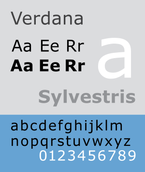
The complete set of letters, numbers, and symbols in a specific design is called a font. For example, Arial, Times New Roman, and Verdana are all different fonts. The font chosen for any text is one of the biggest things that affects how easy it is to read.
Why is Legibility Important?
Good legibility is super important because it helps you read faster and understand information better. Imagine trying to read a textbook or an important message if the words were blurry or hard to tell apart. It would take a long time, and you might even misunderstand things.
When text is legible, your eyes don't have to work as hard. This means you can read for longer periods without getting tired. It's especially important for things like road signs, instructions, or anything where quick and clear understanding is key.
How Font Choice Affects Reading
The style of the letters themselves plays a huge role in legibility. Some fonts are designed to be very clear and simple, while others might be more decorative or fancy.
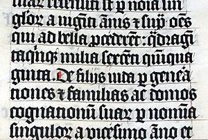
For example, fonts like Arial or Verdana (which you often see on computers) are usually very legible. Their letters are distinct and easy to tell apart. On the other hand, some older fonts, like the Blackletter style used in ancient manuscripts (see the image of the old Bible), can be very beautiful but are much harder for modern readers to understand because of their complex shapes and how close the letters are.
When choosing a font, designers think about:
- Clarity of letters: Are 'i' and 'l' easy to tell apart? What about 'o' and '0' (zero)?
- Openness: Are the spaces inside letters (like the loop in 'e' or 'o') clear and open, or do they look squished?
- Consistency: Do all the letters in the font look like they belong together?
How Text Layout Helps You Read
Besides the font itself, how the text is arranged on the page or screen also affects how easy it is to read. This arrangement is often called the "setting" or "layout."
Line Length and Spacing
- Line length: This is how wide each line of text is. If lines are too long, your eyes can get lost trying to find the start of the next line. If they are too short, your eyes have to jump to the next line too often, which can be tiring. There's a sweet spot for comfortable reading.
- Line spacing (or "leading"): This is the amount of space between lines of text. If lines are too close together, they can feel cramped and hard to follow. If they are too far apart, the text might look disconnected. Just the right amount of space helps your eyes flow smoothly from one line to the next.
Text Size and Style
- Point size: This is simply the size of the text. Text that is too small is obviously hard to read, especially for people with vision problems. Text that is too large can also be uncomfortable because you can't see many words at once.
- Typestyle: This refers to variations like bold text or italic text. These styles are used to highlight important words or phrases, making them stand out. However, using too much bold or italic text can make a whole paragraph harder to read.
Spacing Between Letters
- Kerning and Tracking: These terms refer to the spacing between individual letters and words.
* Kerning adjusts the space between specific pairs of letters (like 'VA' or 'To') to make them look more balanced. * Tracking adjusts the overall spacing between all letters in a word or a block of text. If letters are too close together, they can blur into each other. If they are too far apart, words can look disconnected. Good spacing makes words look natural and easy to recognize.


