
Dot distribution map facts for kids

A dot distribution map, also known as a dot density map, is a special kind of thematic map that uses dots to show where things are located. Imagine you wanted to show where every single pizza place in a city is. You could put one dot on the map for each restaurant. This helps you see which neighborhoods have a lot of pizza places and which have very few.
These maps use a scatter of dots to show patterns and how crowded or spread out something is in an area. The dots can show the exact location of one thing, or each dot can stand for a group of things, like 100 people.
Contents
Where Did Dot Maps Come From?
The idea of using dots on a map to show information became popular in the 1800s. This was a time when people in Europe were collecting more and more data about the world around them. They realized that maps could be powerful tools for understanding this data.
Early Ideas
.jpg)
One of the very first dot maps was made in 1797 by a doctor named Valentine Seaman. He was studying an outbreak of yellow fever in New York City. He put a dot on a map for each person who was sick. This helped him see where the illness was concentrated. It was one of the first times a map was used to study health patterns.
The First Dot Density Map

The first map that used dots to represent groups of people was created in 1830 in France. A teacher named Armand Joseph Frère de Montizon made a map of France's population. On his map, one dot stood for 10,000 people.
He calculated how many dots each region (called a département) should get based on its population. Then, he spread the dots evenly inside that region. This created a picture of where France's population was most dense.
A Famous Case: The London Cholera Map

One of the most famous dot maps in history was created by Dr. John Snow in 1854. There was a serious cholera outbreak in the Soho neighborhood of London. At the time, no one was sure how the disease spread.
Dr. Snow had a theory that it was spreading through contaminated water. To test his idea, he made a map of the neighborhood. He went door-to-door and marked the location of every single cholera case with a dot.
When he looked at the finished map, he saw a clear pattern. The dots were clustered tightly around one specific water pump on Broad Street. He also noticed there were very few cases in areas where people got their water from a different source. His map provided strong evidence that the Broad Street pump was the source of the outbreak. He convinced local officials to remove the handle from the pump, and the outbreak soon ended. Snow's map is a classic example of how maps can be used to solve real-world problems.
Two Main Kinds of Dot Maps
Dot maps are used to show how things are spread out, but they do it in two different ways.
One-to-One Maps: Every Dot Is One Thing
In a one-to-one dot map, each dot represents the exact location of a single item or event. Think of it as a "pin map." If you were mapping all the schools in your state, you would place one dot on the map for each school.
These maps are great for seeing the precise distribution of things. Dr. John Snow's cholera map is a perfect example of a one-to-one map because each dot represented one sick person at their home address. Today, scientists might use these maps to track the locations of specific animals in a wildlife preserve or to see where lightning strikes most often during a storm.
One-to-Many Maps: Every Dot Is a Group
In a one-to-many dot map, each dot stands for a certain number of things. This is why it's often called a dot density map. Instead of showing exact locations, it gives you an idea of how dense or crowded something is in an area.
For example, a map showing the population of the United States might have one dot for every 20,000 people. A map showing farming might have one dot for every 500 acres of corn.
To make these maps, cartographers (map makers) use data that has been collected for a whole area, like a county or a state. They figure out how many dots the county gets and then place them randomly inside the county's borders. Areas with more dots look darker and more crowded, showing a higher density.
How Are Dot Maps Designed?
Making a good dot map is like a balancing act. Cartographers have to make two important choices that work together: the size of the dots and the value of each dot (how many things each dot represents).
- Dot Size: If the dots are too big, they will quickly overlap and turn into a big blob in crowded areas, making it impossible to see the pattern. If they are too small, they might be hard to see at all.
- Dot Value: This is only for one-to-many maps. If the dot value is too small (for example, 1 dot = 10 people), you might need millions of dots for a country, which would just look like a solid color. If the dot value is too large (1 dot = 1,000,000 people), areas with smaller populations might not get any dots at all, making them look empty when they aren't.
The goal is to choose a size and value so that the dots are easy to see, show detail even in less crowded areas, and only start to merge together in the most crowded places. Modern computer programs, like Geographic information systems (GIS), help mapmakers make these choices much more easily.
Challenges with Dot Maps
While dot maps are very useful, they can sometimes be tricky to read or can even be misleading if you're not careful.
One problem is that people often underestimate how many dots are in a dense area. A cluster of dots might represent a much larger number than it appears to.
Another challenge is with one-to-many maps. Because the dots are placed randomly inside a region (like a county), they don't show the actual locations of things. For example, on a population map of a county that is mostly farmland with one big city, the dots might be spread all over the county. This could make it look like people are living evenly across the farmland, when in reality most of them live in the city.
To fix this, mapmakers can use a clever method called the dasymetric technique. They use other information to place the dots more accurately. For instance, they can tell the computer not to place "people" dots in areas where no one lives, like lakes, large parks, or industrial zones. This forces the dots into the areas where people actually live, creating a much more realistic picture of population density.
Images for kids
-
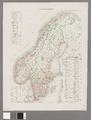
An 1859 dot density map showing the population of Sweden and Norway.
-
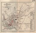
This 1849 map shows a cholera outbreak in Exeter, England. Different symbols were used for cases in different years.
-
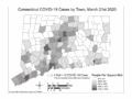
An animated dot map showing the spread of COVID-19 cases in Connecticut during two months in 2020.
-
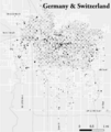
This map from 1900 shows where immigrants from Germany and Switzerland lived in Salt Lake City, Utah.


