Thematic map facts for kids
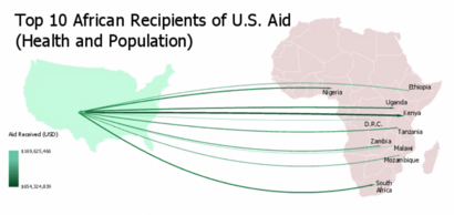
A thematic map is a special kind of map that focuses on showing a particular topic or "theme" across a geographic area. Think of it like a map that tells a story about one specific thing. Instead of just showing roads and rivers, it uses map symbols to display information you can't usually see, like how hot a place is, what languages people speak, or how many people live there.
These maps are different from general reference maps. Reference maps show many physical features like mountains and cities. Thematic maps, however, zoom in on one subject. They help us understand patterns and distributions of things in the world.
People started creating many types of thematic maps in the 1700s and 1800s. This was when countries began collecting lots of information, like through national censuses. Maps like choropleth maps, isarithmic maps, and chorochromatic maps were invented. Each type uses different ways to show information. They can visualize many things, from natural topics like climate and soils to human topics like demographics (population data) and public health.
Contents
- The Story of Thematic Maps
- Why We Use Thematic Maps
- How Thematic Maps Are Made
- Choropleth Maps: Coloring Regions
- Proportional Symbol Maps: Sizing Up Data
- Cartograms: Stretching and Shrinking the World
- Isarithmic Maps: Lines of Equal Value
- Chorochromatic Maps: Showing Different Types
- Dot Maps: Pinpointing Information
- Flow Maps: Tracing Movement
- Dasymetric Maps: Getting More Detailed
- See also
The Story of Thematic Maps
The idea of thematic maps really took off during the Industrial Age, from the 1700s to the mid-1800s. Before this, mapmakers focused on making basic maps accurate. Once they had good base maps, they could start adding special information.
One of the very first thematic maps was made in 1607 by Jodocus Hondius. It showed where different religions were found around the world using special symbols.
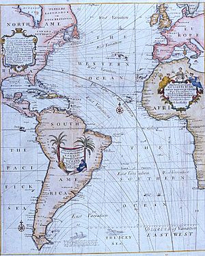
An important figure in early thematic mapping was the English astronomer Edmond Halley (1656–1742). He saw maps as a way to explore scientific ideas. In 1701, he created a famous map showing lines of equal magnetic variation. This was one of the first maps to use isarithmic lines, which are lines connecting points of the same value.
The 1800s were a "golden age" for thematic mapping. Many of the map types we use today were invented or improved then. For example, the first choropleth map was made in 1826 by Charles Dupin.
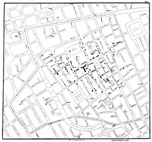
A great example of how thematic maps help solve problems comes from Dr. John Snow. In 1854, he mapped cholera deaths in a London neighborhood. He placed a dot for each death on a map that also showed streets and water pumps. He noticed that many deaths were clustered around one specific water pump. When the pump handle was removed, the outbreak quickly stopped. This showed how maps could help find the cause of a problem.
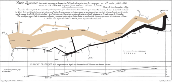
Charles Joseph Minard was another master of thematic mapping. In the 1850s and 1860s, he created amazing maps that combined different types of information. His 1869 map of Napoleon's 1812 invasion of Europe is very famous. It shows the army's path, how many soldiers were left, and the freezing temperatures they faced.
The popularity of thematic maps grew a lot in the second half of the 20th century. This was thanks to new technology like personal computers, geographic information systems (GIS), and the Internet. Also, more and more data became available, especially from digital censuses in the 1990s. These tools made it much easier to create and share thematic maps.
Why We Use Thematic Maps
The main reason we use thematic maps is to show how one or more things are spread out across an area. Sometimes, the mapmaker already knows the pattern and wants to share it. Other times, they create the map to find new patterns they didn't know about before. Maps help our brains see these patterns easily.
A thematic map usually focuses on showing one main topic. Sometimes, it might show two or more related topics to see how they connect. Because they focus on one subject, thematic maps are great for specific tasks. Here are three main uses:
- To give exact information about certain places. For example, "What percentage of people in Chicago are of Hispanic background?"
- To give general information about patterns in an area. For example, "Where is corn mostly grown?"
- To compare patterns on different maps. For example, "How did voting patterns change between the 2008 and 2012 U.S. presidential elections?"
How Thematic Maps Are Made
Mapmakers use many different ways to create thematic maps. These are often called different "types" of thematic maps. But you can also think of them as different "layers" or "techniques" that can be combined. For example, you could use a cartogram to change the size of countries based on population. Then, you could fill those countries with colors to show another variable, like income, using a choropleth technique.
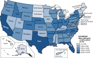
Choropleth Maps: Coloring Regions
A choropleth map shows statistical data for predefined areas, like countries or states. It does this by coloring or shading these regions. For example, countries with higher rates of infant mortality might appear darker. These maps are very popular because they are easy to understand. They often use lighter or darker colors to show differences in numbers, or different colors to show different types of things. It's important to use data that is a rate (like people per square mile) to avoid making the map misleading.
Proportional Symbol Maps: Sizing Up Data
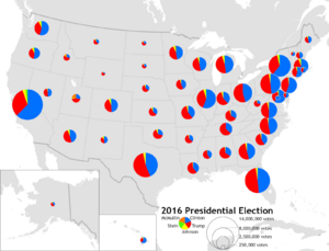
Proportional symbol maps use symbols of different sizes to show numbers related to specific places. For instance, a map might show circles at each city's location. The size of the circle would be proportional to the city's population. Circles are common, but squares or bars can also be used. These maps are great for showing total counts or amounts.
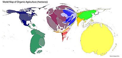
Cartograms: Stretching and Shrinking the World
A cartogram is a map that purposely changes the size of geographic areas based on a specific variable. For example, countries might be made larger or smaller depending on their population. This distortion helps us see the importance of the variable. The changed shapes can then be used with other mapping techniques, like coloring them based on another variable.
Isarithmic Maps: Lines of Equal Value
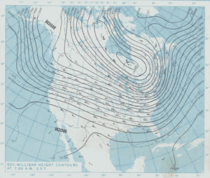
Isarithmic maps, also known as contour maps or isoline maps, show continuous data like rainfall or elevation. They do this by drawing lines that connect all points with the same value. For example, on a topographic map, each contour line shows an area that is at the same height above sea level.
Chorochromatic Maps: Showing Different Types
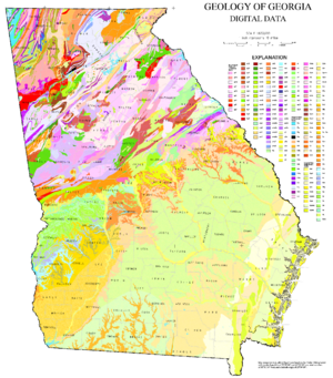
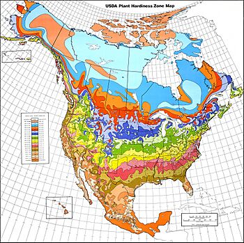
A chorochromatic map shows different categories or types of things spread across an area. It uses different colors or patterns to represent regions that are all the same type. Common examples include maps of geology (rock types), soil types, vegetation, land use, and climate zones.
Dot Maps: Pinpointing Information
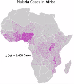
A dot distribution map places small dots on a map to show where something is located. Each dot might represent a single item, like a person or a tree. Or, if you have total numbers for an area, dots can be placed randomly within that area to show how dense something is. Dr. John Snow's cholera map is a famous example where each dot showed one death.
Flow Maps: Tracing Movement
Flow maps use lines to show movement or connections between places. This could be anything from air travel routes to how money or goods move between countries. The lines can be simple or follow actual paths. Some flow maps just show if a connection exists, while others use line width or color to show how much is moving.
Dasymetric Maps: Getting More Detailed
A dasymetric map is a more detailed version of a choropleth map. While a choropleth map assumes data is spread evenly across a region, a dasymetric map uses extra information to show a more accurate distribution. For example, it might use land cover data (like forests or cities) to show population density more precisely within a county.
See also
 In Spanish: Mapa temático para niños
- André-Michel Guerry
- Nautical chart
- Topographic map


