Helvetica facts for kids
Helvetica (also called Neue Haas Grotesk) is a very popular sans serif font family. A font family is a group of fonts that are designed to look similar. Helvetica was created in 1957 by a designer named Max Miedinger, with help from Eduard Hoffmann.
Helvetica is known as a "neo-grotesque" or "realist" design. This means it's a simple, clear style of font. It was inspired by older fonts from the 1800s, like Akzidenz-Grotesk, and other designs from Germany and Switzerland. Helvetica quickly became one of the most famous fonts of the 20th century.
When it was first made, it was called Neue Haas Grotesk. Later, a company called Linotype got the rights to it and changed its name to Helvetica in 1960. The name "Helvetica" comes from "Helvetia," which is the Latin name for Switzerland, where the font was created.
Contents
What is Helvetica?
Helvetica is a sans serif font. This means it doesn't have the small lines or "feet" (called serifs) at the ends of its letters. Think of fonts like Times New Roman, which have serifs. Helvetica's letters are clean and straight. This makes it look modern and easy to read, especially on signs and screens.
Why is Helvetica so popular?
Helvetica is used everywhere! You might see it on company logos, street signs, advertisements, and even on your computer or phone. It became popular because it's very clear and simple. It works well for many different uses. Its clean design makes it look professional and modern.
One reason for its success is its neutral look. It doesn't have a strong personality, so it can be used for many different messages without distracting from the words themselves. It's also very readable, even when the text is small or far away.
Where can you see Helvetica?
You can find Helvetica in many places around the world.
- Company Logos: Many famous companies use Helvetica or fonts very similar to it for their logos. This includes companies like 3M, American Airlines, and Panasonic.
- Public Signs: It's often used on road signs, subway maps, and airport signs because it's so easy to read quickly. For example, the New York City subway system uses a font very much like Helvetica.
- Government Use: Some governments use Helvetica for official documents and publications. This helps make sure information is clear and consistent.
- Advertisements: Because it's so versatile, advertisers love to use Helvetica to get their message across clearly.
The History of Helvetica
Helvetica was created in a time when designers wanted fonts that were simple and functional. This was part of a design movement called the "Swiss Style" or "International Typographic Style." This style focused on clarity, order, and using grids to organize information.
From Neue Haas Grotesk to Helvetica
The font was first designed for a Swiss company called Haas Type Foundry. They wanted a new, modern font that could compete with popular German fonts of the time. Max Miedinger and Eduard Hoffmann worked together to create it.
When Linotype, a larger company, decided to license the font, they renamed it Helvetica. This helped it become known around the world. Linotype made it available for many different printing machines, which helped spread its use even further.
Helvetica in the Digital Age
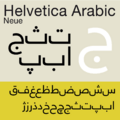
When computers became common, Helvetica was adapted for digital use. This meant it could be used easily on screens and for digital printing. Many versions of Helvetica have been made over the years, including "Neue Helvetica" (New Helvetica), which was designed to work even better in the digital world.
Even today, Helvetica remains a very important and widely used font. Its simple, clear design continues to be a favorite for designers and businesses everywhere.
Images for kids
-
Signs for the Chicago 'L' train system.
-
A publication from the UK government.
See also
 In Spanish: Helvética para niños


