
Font facts for kids
A font is a specific style of letters and numbers used in writing. Think of it as a special set of characters that all look the same. For example, if you see text written in "Times New Roman" at a size of 12 points, that specific combination is a font. If you change the size to 14 points, it's technically a different font, even though it's still Times New Roman.
In the past, when people used metal blocks for printing, a font was a physical collection of all the letters and symbols of one size and style. But today, with personal computers, the word "font" is often used to mean the same thing as a typeface. A typeface is the overall design of the letters, like "Arial" or "Calibri." So, when you pick a font on your computer, you're usually choosing a typeface.
Contents
Understanding Typefaces and Fonts
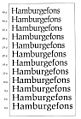
A typeface is the main design of a set of characters. Imagine it as the family name, like "Helvetica" or "Garamond." Within that family, you have different styles, like bold, italic, or light. Each of these specific styles, at a particular size, used to be called a font.
How Fonts Were Made
Long ago, before computers, printers used small metal pieces for each letter. These pieces were called "sorts." To print a book, they would arrange these sorts by hand. Each size and style of a typeface needed its own set of metal sorts. So, a 10-point Times New Roman bold was one font, and a 12-point Times New Roman bold was another. This was a lot of work!
Fonts in the Digital Age
Today, fonts are digital files on computers. These files contain all the information needed to draw the letters on your screen or print them. Because computers can easily change the size of a typeface, the old definition of "font" (as a specific size of a typeface) isn't as important. Now, when you choose a "font" in a word processor, you're usually picking a typeface and then you can easily change its size and style.
Common Font Styles
Most typefaces come with different styles to help text stand out.
- Regular: This is the normal version of the typeface.
- Bold: This style makes the letters thicker and darker. It's great for headings or important words.
- Italic: This style makes the letters slanted. It's often used for emphasis or for titles of books and movies.
- Light: Some typefaces have a lighter version, where the lines are thinner than the regular style.
- Condensed: These fonts have letters that are narrower, allowing more text to fit in a small space.
Why Different Fonts Matter
Choosing the right font is important for many reasons.
- Readability: Some fonts are easier to read than others, especially for long texts.
- Mood: Fonts can create a certain feeling. A fancy, script font might feel elegant, while a strong, blocky font might feel powerful.
- Purpose: Different fonts are best for different uses. A newspaper might use a classic, easy-to-read font, while a movie poster might use a bold, exciting one.
Images for kids
-
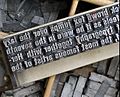
Metal type sorts arranged on a composing stick
-
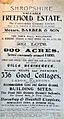
A 1910 letterpress poster, advertising an auction, using a variety of fonts
-
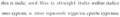
'Upright italic' within normal italics
-
The typeface Avenir Next in condensed and regular widths.
-
A set of optical sizes developed at URW of the typeface Leipziger Antiqua. The fonts become thicker and more widely spaced as the point size for which they are designed decreases.
-
EB Garamond's regular and schoolbook versions of a and g. Single-storey characters are more commonly found as default in geometric sans-serif fonts such as Century Gothic, shown at bottom.


See also
 In Spanish: Tipo de letra para niños
