
Optima facts for kids

Optima is a special kind of typeface (or font) that doesn't have the small "feet" or hooks you sometimes see on letters. These "feet" are called serifs. Because Optima doesn't have them, it's known as a sans serif font. It was created by a famous designer named Hermann Zapf. What makes Optima unique is that some of its lines get a little wider at the ends. This makes it look a bit like a serif font, but it's still considered sans serif.
Contents
The Story Behind Optima
How Optima Was Inspired
Hermann Zapf found the idea for Optima during a trip to Florence, Italy, in 1950. He was on holiday and saw old tombstones from the Renaissance period. These tombstones had beautiful capital letters carved into them. Zapf was really inspired by the look of these classical Roman letters.
Zapf's Goal for Optima
Zapf wanted Optima to be a very useful font. He designed it so it could be used for many different things. It was meant to work well for both long paragraphs of text (called "body text") and for big, eye-catching titles. Zapf even used only Optima in his own book, About Alphabets, to show how versatile it was.
Versions of Optima
Original Optima Design
The first version of Optima is the one you'll see most often. Like many sans serif fonts, it has a slanted style called oblique. This is different from a true italic style, which is designed to look more like handwriting.
Optima Nova Update
Later, a newer version of the font was released, called Optima nova. In this updated version, the oblique style was replaced with a true italic. This gave designers more options for how they could use the font.
Images for kids
-
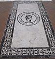
Zapf cited this gravestone as inspiring Optima. Portions of the text are copied onto one of his 1950 sketches.

See also
 In Spanish: Optima para niños
