Hermann Zapf facts for kids
Quick facts for kids
Hermann Zapf
|
|
|---|---|

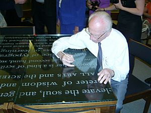
Zapf signing in May 2007
|
|
| Born | 8 November 1918 Nuremberg, Kingdom of Bavaria, German Empire
|
| Died | 4 June 2015 (aged 96) |
| Occupation | Type designer |
|
Notable work
|
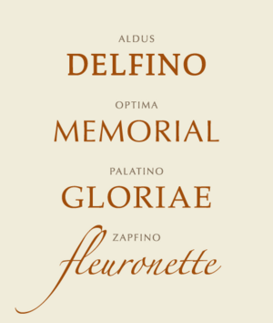
Aldus, Palatino, Optima, Zapfino |
| Spouse(s) | |
| Children | 1 |
| Signature | |
Hermann Zapf (born November 8, 1918 – died June 4, 2015) was a famous German type designer and calligrapher. He lived in Darmstadt, Germany. Hermann Zapf was married to Gudrun Zapf-von Hesse, who was also a talented calligrapher and typeface designer.
He created many well-known typefaces, which are like different styles of letters and numbers used in printing. Some of his most famous designs include Palatino, Optima, and Zapfino. Many people consider him one of the greatest type designers ever.
Contents
Early Life and Challenges
Hermann Zapf was born in Nuremberg during a very difficult time in Germany. This was when World War I was ending, and there were big changes happening in the country. A serious flu outbreak also spread across Europe in 1918 and 1919. Sadly, two of Zapf's brothers and sisters died from this illness.
Later, Germany faced food shortages. Zapf's mother was very thankful when he started school in 1925. There, he received daily meals through a program organized by Herbert Hoover. In school, Zapf loved technical subjects. He and his older brother even built a crystal radio and an alarm system for their house. Young Zapf also enjoyed inventing secret alphabets to send messages to his brother.
Facing Political Difficulties
In 1933, Zapf finished school. He hoped to become an electrical engineer. However, his father had lost his job and was in trouble with the new government at the time. Because of this, Zapf could not attend the technical institute he wanted to. He needed to find an apprenticeship instead.
Discovering Typography
Zapf's teachers noticed he was very good at drawing. They suggested he become a lithographer, which is someone who creates images for printing. But when he applied for apprenticeships, companies asked him political questions. Even though they liked his drawings, they kept rejecting him.
Finally, in 1934, he found a company that didn't ask political questions. They didn't need a lithographer, but they offered him a job as a retoucher. This is how Zapf began his four-year apprenticeship.
Learning Calligraphy
In 1935, Zapf visited an exhibition honoring a typographer named Rudolf Koch. This event sparked his interest in lettering. He bought two books and taught himself calligraphy, which is the art of beautiful handwriting. He also studied old calligraphy examples at the Nuremberg city library.
Soon, his boss noticed his amazing calligraphy skills. Zapf's work then changed to retouching letters and helping his co-workers improve their lettering.
Moving to Frankfurt
After his apprenticeship, Zapf moved to Frankfurt. He didn't have a special certificate, so he couldn't get a job in Nuremberg. In Frankfurt, he worked at a place run by Paul Koch, Rudolf Koch's son. Here, Zapf spent most of his time working with typography and creating songbooks.
Through a print historian, Zapf connected with important companies like D. Stempel, AG and Linotype GmbH. In 1938, he designed his first printed typeface for them, called Gilgengart.
Serving in the War
On April 1, 1939, Zapf was called to join the army. He was sent to help build defenses near the French border. The hard work caused him heart problems, so he was given a desk job. He wrote camp records and sports certificates using his beautiful Fraktur handwriting.
When World War II started in September, Zapf's unit was to join the main army. But because of his heart condition, he was sent home instead. However, on April 1, 1942, he was called back to serve. He was first sent to the artillery, but he struggled with the training. His officers quickly ended his artillery career.
Zapf was then sent to train as a cartographer, someone who draws maps. He joined the First Army's map unit in Bordeaux. He drew maps of Spain, especially its railway system. Zapf was happy in this unit. His eyesight was so good that he could write tiny letters without a magnifying glass. This skill likely kept him from being sent back to combat.
After the war, Zapf was held as a prisoner of war by the French. Because of his artwork, he was treated with respect. Due to his poor health, he was sent home only four weeks after the war ended. He returned to Nuremberg, which had been heavily damaged by air raids.
Post-War Career and Teaching
In 1946, Zapf taught calligraphy in Nuremberg. He went back to Frankfurt in 1947. There, the Stempel type foundry offered him a job as the artistic head of their print shop. They didn't ask for his qualifications. They only wanted to see his wartime sketchbooks and a calligraphic piece he made in 1944.
One of Zapf's projects was a book called Feder und Stichel (Pen and Graver). It was printed in 1949 using metal plates that Zapf designed during the war.
From 1948 to 1950, Zapf taught calligraphy at the Arts and Crafts School in Offenbach. He gave lettering lessons to graphic design students. On August 1, 1951, he married Gudrun Zapf-von Hesse, who also taught at a school in Frankfurt.
Most of Zapf's work as a graphic artist involved designing books. He worked for many different publishing companies.
Designing Typefaces
Hermann Zapf's career in type design covered three major periods of printing technology. These were hot metal composition (old printing presses), phototypesetting (using light), and digital typesetting (using computers).
His two most famous typefaces are Palatino and Optima. He designed Palatino in 1948 and Optima in 1952.
Palatino and Optima
Palatino was designed with great care. It was named after a 16th-century Italian writing master. Palatino became very popular after 1984. It was included as one of the main fonts in PostScript, which is a language used by printers. This meant Palatino was available on almost all laser printers and other printing devices.
Optima is a sans-serif typeface, meaning it doesn't have the small lines (serifs) at the ends of letters. Zapf wanted Optima to be a bridge between serif and sans-serif fonts. He designed it to look good for both headings and long paragraphs of text.
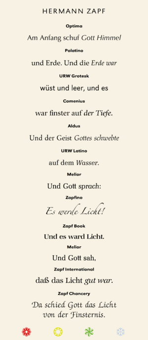
Zapf's work covered many different styles. Palatino has a warm, natural look, inspired by old Italian handwriting. Melior, another of his designs, was inspired by German printers from the 1800s and uses a unique mathematical shape called a "superellipse." His sans-serif series URW Grotesk was made for newspapers.
Copies and New Versions
Zapf's typefaces have been copied a lot, sometimes without his permission. A well-known example is Monotype's Book Antiqua, which came with Microsoft Office. Many people thought it was a copy of Palatino.
In 1993, Zapf even left an international typography association because he felt they weren't doing enough about unauthorized copying. However, in 1999, Microsoft worked with Zapf and Linotype to create a new, official version of Palatino for Microsoft, called Palatino Linotype.
Sometimes, Zapf worked with font makers to create new versions of his existing typefaces. For example, in the 1980s, he worked with Bitstream to make versions of Palatino, Optima, and Melior, adding "Zapf" to their new names.
Calligraphy Work
Zapf is considered one of the greatest calligraphers. However, he didn't do a lot of commercial lettering. His biggest calligraphy project was the "Preamble to the United Nations Charter" in four languages. The Pierpont Morgan Library in New York asked him to do this in 1960.
His ideas about calligraphy also influenced how cards looked in the mid-20th century. He advised Hallmark Cards in the 1960s and 70s, helping them create a style guide for their artists. Most of his calligraphy was for his own studies and art. He also taught calligraphy during summer workshops at the Rochester Institute of Technology in the 1980s.
Computer Typography
Zapf started working on typography for computer programs in the 1960s. His ideas were very new and not taken seriously in Germany at first. He lectured at the Technische Universität Darmstadt from 1972 to 1981, but his ideas were rejected there.
Because he didn't have success in Germany, Zapf went to the United States. He gave talks about computerized typesetting and was invited to speak at Harvard University in 1964. The University of Texas at Austin also wanted him to be a professor, but he didn't take the job.
In 1976, Rochester Institute of Technology (RIT) offered Zapf a professorship in computer typography. This was the first job of its kind in the world. He taught there from 1977 to 1987, traveling between Darmstadt and Rochester. At RIT, he developed his ideas further, working with companies like IBM and Xerox. Many of his students from RIT became important type designers, including Kris Holmes and Charles Bigelow.
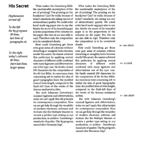
In 1977, Zapf and his friends founded a company in New York to develop computer software for typography. Later, Zapf used his experience to start developing his own typesetting program, called the "Hz-program." This program improved on an existing system for breaking words and aligning text.
Later, Adobe Systems bought the patent for Zapf's Hz-program. They used some of his ideas in their InDesign software, which is used for creating layouts for books and magazines.
Creating Zapfino
In 1983, Zapf finished a typeface called AMS Euler with Donald Knuth and students at Stanford University. This font was for mathematical texts. After one of the students, David Siegel, finished his studies, he wanted to create a typeface with many different letter variations. He suggested starting with an example of Zapf's calligraphy.
Zapf remembered a page of calligraphy from his 1944 sketchbook. He had tried to make a calligraphic typeface before, but old printing methods limited how free the letters could be. He realized that modern digital technology could finally make such a beautiful font possible. So, Zapf and Siegel began working on the complex software needed for this project.
However, before the project was finished, Siegel decided to leave it. The development of Zapfino was delayed until Zapf presented the project to Linotype. The company agreed to finish it. Zapf worked with Linotype to create four different alphabets and many decorative elements. Zapfino was finally released in 1998.
Later versions of Zapfino used new computer technologies. These allowed the font to automatically connect letters and change their shapes. This made Zapfino look even more like Hermann Zapf's original, flowing handwriting.
Death
Hermann Zapf passed away on June 4, 2015, in Darmstadt, Germany. He was 96 years old.
List of Typefaces
Here are some of the typefaces Hermann Zapf designed:
|
|
Awards and Recognition
Hermann Zapf received several important awards for his work:
- 1969 Frederic W. Goudy Award
- 1974 Gutenberg Prize of the International Gutenberg Society and the City of Mainz
- 2010 Bundesverdienstkreuz 1. Klasse (Order of Merit of the Federal Republic of Germany)
Film Appearances
Zapf appeared in a film about his art called The Art of Hermann Zapf, made in 1967. He was also featured in the 2007 documentary Helvetica. A documentary called "Alphabet Magic" about Hermann Zapf and Gudrun Zapf-von Hesse was shown in 2019.
See also
 In Spanish: Hermann Zapf para niños
- Edward Johnston
- Rudolf Koch
Images for kids


