
Cartography facts for kids

Cartography is the art and science of making maps. It's a big part of geography, which is the study of the Earth's surface.
How people make maps is always changing. Long ago, maps were drawn by hand. Today, most maps are made using computers. A person who makes maps is called a cartographer.
Making a map can be simple, like drawing directions on a napkin. Or it can be very complex, like showing information about a whole country. Anyone can make a map, but some people spend their lives learning to make detailed maps.
Maps come in two main types:
- General maps: These show many different features.
- Thematic maps: These focus on a specific topic for certain people.
General maps are often made in a series, like maps of a whole country. Governments create them in different sizes, from very detailed to broader views.
Thematic maps are very common now. They help show information about places, cultures, and societies.
Contents
History of Maps


The very first map is hard to pinpoint. Some old wall paintings, like one from Çatalhöyük (around 7000 BCE), might be maps. Ancient rock carvings in Italy (around 4000 BCE) show patterns that look like farm fields.
Other old maps include a Minoan wall painting (around 1600 BCE) showing a town by the sea. There's also an engraved map of the city of Nippur from ancient Babylonia (around 14th–12th centuries BCE). The oldest world maps we still have are from Babylonia, made in the 9th century BCE. One shows Babylon surrounded by land and a "bitter river" (ocean).
The ancient Greeks and Romans also made maps. Anaximander made maps in the 6th century BC. Later, in the 2nd century AD, Ptolemy wrote a book called Geographia. It included Ptolemy's world map, showing the world known to Western society at that time. Arab scholars later translated these Greek works.
In ancient China, people wrote about geography from the 5th century BC. The oldest Chinese maps we have are from the 4th century BC. A Chinese scientist named Su Song published a star map in 1092. This was one of the oldest printed star maps.
Early maps in cartography of India showed the Pole star and other stars. These maps might have been used for navigation around the beginning of the Common Era.
Mappa mundi were medieval European world maps. About 1,100 of these maps still exist from the Middle Ages.

The Arab geographer Muhammad al-Idrisi created his famous atlas, Tabula Rogeriana, in 1154. He combined knowledge from Arab traders and explorers with old Greek information. This made his map the most accurate world map for the next 300 years.

During the Age of Discovery (15th to 17th centuries), European mapmakers copied old maps and drew new ones. They used information from explorers and new surveying tools. Inventions like the magnetic compass, telescope, and sextant made maps much more accurate. In 1492, Martin Behaim made the oldest Earth globe that still exists.
In 1507, Martin Waldseemüller created a world map that was the first to use the name "America." Diego Ribero made the first map with a measured Equator in 1527.
Mapmakers often copied from earlier works without giving credit. For example, the "Beaver Map" of North America (1715) by Herman Moll was a copy of an earlier map. By the 18th century, mapmakers started to give credit to the original creators.
How Technology Changed Maps


Technology has always changed how maps are made. The first maps were drawn by hand, so they varied in quality. The invention of the compass helped create much more accurate maps.
New machines like the printing press allowed maps to be made in large numbers. Tools like the quadrant and vernier helped make maps more precise. Optical tools like the telescope and sextant allowed surveyors to measure land accurately. Navigators could find their location by looking at the North Star or the sun.
Later, photography and lithography made maps with fine details that didn't get damaged easily. This also made map production faster.
In the 20th century, Aerial photography, satellite imagery, and remote sensing offered fast and exact ways to map features like coastlines, roads, and mountains. Computers brought another big change. With computers, printers, and special programs, making maps became easier and more common. Maps could now show many layers of information.
Today, most professional maps are made using special software. This includes CAD and GIS programs. Information can be stored in a database, making maps dynamic and interactive.
With tough computers, GPS devices, and laser rangefinders, people can now make maps directly in the field.
Types of Maps
General vs. Thematic Maps


Maps can be split into two main types: general cartography and thematic cartography.
- General maps are made for everyone and show many different features. They often come in a series, like the detailed maps made by the United States Geological Survey (USGS) or the "Ordnance Survey" maps of the UK.
- Thematic maps focus on specific topics for certain groups of people. For example, a map showing corn production in a state, or a map showing population density by county. As we have more and more geographic information, thematic maps are very helpful for understanding data about places, cultures, and societies.
An orienteering map combines both general and thematic ideas. It's made for a specific group of users (people doing orienteering). It shows how hard it is to travel through different types of plants.
Topographic vs. Topological Maps
A topographic map mainly shows the shape of the land. It uses contour lines to show elevation (how high the land is). It can also show mountains and valleys in different ways.
A topological map is a very general type of map. It's like a quick sketch you might draw. It often ignores exact scale and detail to make it clear how things are connected or how to get somewhere. The London Underground map by Harry Beck is a great example. It doesn't show the real distances or curves of the tracks. It only shows the order of stations and how train lines connect. This is all a typical passenger needs to know, so the map works perfectly.
Map Design

Purpose of a Map
Arthur H. Robinson, a famous American mapmaker, said that a map not designed well "will be a cartographic failure." He believed that map design is very complex. A map must always be designed with its audience and their needs in mind.
From the very beginning, maps "have been made for some particular purpose." The map's goal should be clear to the person looking at it. If the user can't quickly understand what the map is trying to show, the map might not be useful.
The main goal is to make a map that means something. A well-designed map "implies authenticity," meaning it looks trustworthy. An interesting map will keep a reader's attention. Maps that show many different pieces of information allow for comparisons. This makes the map more meaningful and can lead to new ideas or research. The map's title can help explain its message, but the overall design helps the reader understand it.
Today, you can find maps of almost anything, from the human body to virtual worlds. There are many different styles of maps. For example, maps for public transport (like subway maps) often use 45-degree angles, a style made popular by Harry Beck.
Map Symbols
Map symbols are like a special language. They put information on the map in a way that's easy for the reader to understand. They also consider the limited space on a map and what the reader already knows. Symbols can be universal, or specific to that map.
A map can have many kinds of symbols:
- A legend, or key explains what the map's symbols mean.
- A title tells you what area the map shows and its main topic.
- A neatline is a border around the map image.
- A compass rose or north arrow shows direction.
- An overview map gives a bigger picture of where the main map is located.
- A bar scale helps you measure real distances on the map.
- A map projection is how the curved Earth is shown on a flat map.
The map might also say where its information came from, how accurate it is, when it was made, and who made it. The map image itself shows the area.
Map coloring is another type of symbol. Colors can be very important, especially on complex maps. The way colors are used can greatly affect how well a reader understands the map's information. Modern screens and printers can show many colors, allowing mapmakers to use color to show detailed information.
Quantitative symbols show how much of something there is.
- Proportional symbols change size based on the amount of something, like showing population with bigger circles for more people.
- Choropleth maps use different shades or intensities of color to show data in areas, like counties. Darker colors might mean a higher concentration of something.
Map Key or Legend

The map key, also called the legend, tells you how to understand the map's symbols. It might also give details about when and who published the map.
Images for kids
-
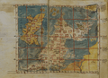
A 14th-century map of the British Isles from a book by Ptolemy.

See also
 In Spanish: Cartografía para niños
