Choropleth map facts for kids
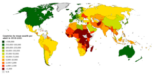
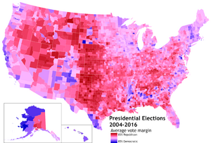
A choropleth map is a special type of map that uses colors to show how a certain feature or statistic changes across different areas. Imagine you want to see where more people live, or where a certain type of plant grows. A choropleth map uses different shades or colors to represent these numbers in specific regions, like countries, states, or counties.
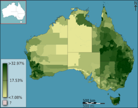
These maps make it easy to see patterns and differences in data across a geographic area. For example, you can quickly spot regions with high population density or areas with lower income. They are very common because a lot of information, like census data, is already collected for specific geographic units. This makes them relatively simple to create using computer tools.
Contents
How Choropleth Maps Started
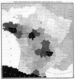
The very first choropleth map was made in 1826 by a French geographer named Charles Dupin. His map showed how many people could read in different parts of France. These early "tinted maps" quickly became popular. People used them to visualize other important information, like education levels or living conditions.
As more countries started collecting detailed information about their populations through censuses, choropleth maps became even more useful. After 1850, when color printing became easier, maps started to use many more colors.
The name "choropleth map" was first used in 1938 by another geographer, John Kirtland Wright. By the 1940s, cartographers (mapmakers) commonly used this term.
Building a Choropleth Map
A choropleth map combines two main things: the shapes of geographic areas (like states or cities) and statistical data (numbers) related to those areas. Think of it as coloring in a puzzle map, where each puzzle piece gets a color based on a number linked to that piece.
What Areas Do Maps Use?
On a choropleth map, the areas are usually already defined. These could be countries, states, provinces, or even smaller areas like census districts. These boundaries are fixed and don't change based on the data you're mapping.
Using these pre-defined areas has some good points:
- It's easier to gather and map data because information is often collected for these specific units.
- People usually recognize these areas, which makes the map easier to understand.
However, there can be some challenges:
- A single color for an entire area makes it look uniform, even if there's a lot of variation inside. For example, a city might have rich and poor neighborhoods, but the map shows it all as one "average" color.
- This can sometimes lead to misunderstandings about the real patterns of the data.
To make maps more accurate, using smaller areas can help. Smaller districts show more detail and reduce the chance of people making wrong assumptions about what's inside a large, uniformly colored area.
What Kind of Data Works Best?
Choropleth maps are best for showing data that describes a "rate" or "average" for an area. These are called intensive variables.
Examples of data that work well:
- Densities: Like population density (how many people live per square kilometer).
- Percentages: Such as the percentage of people who speak a certain language in a county.
- Averages: For instance, the average income per person in a state.
- Rates of change: Like the annual population growth rate.
It's generally not a good idea to use choropleth maps for showing total counts, like the total number of people in a country. This is because larger areas might appear more important just because they are bigger, even if their actual "rate" is lower. For total counts, other map types, like proportional symbol maps (where symbol size changes with the number), are usually better.
Making Data Fair: Normalization
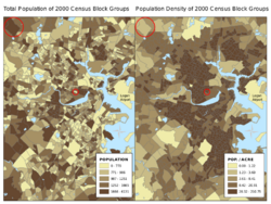
Normalization is a very important step. It means changing raw numbers into percentages, densities, or averages so that you can compare areas fairly, regardless of their size.
For example, if you map the total number of people in each state, a large state like Texas will likely have a darker color than a small state like Rhode Island, even if Rhode Island is much more crowded. By normalizing the data to population density (people per square kilometer), you get a much clearer and fairer picture of where people are actually concentrated.
Not normalizing data is a common mistake that can make a map misleading. It's like comparing the total amount of candy two friends have without knowing the size of their bags – one might have a huge bag with a little candy, and the other a small bag packed full!
Grouping Data into Classes
When you create a choropleth map, you need a plan for how to turn the data values into colors.
- Classified maps are the most common. They group data values into a few categories, and each category gets a specific color. For example, incomes might be grouped into "low," "medium," and "high," each with a different shade. This makes the map easier to read because there are fewer colors to remember.
- Unclassed maps use a smooth range of colors, where each value gets a slightly different shade. This shows more subtle changes in the data but can be harder to match exact values to the legend.
Mapmakers use different rules to create these classes:
- Equal intervals: This rule divides the entire range of data values into equally sized groups. For example, if incomes range from $20,000 to $100,000, and you want four classes, each class would cover a $20,000 range.
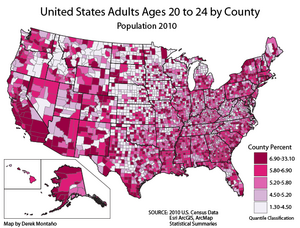
- Quantiles: This rule puts an equal number of geographic areas into each class. So, if you have 100 counties and want four classes, each class would contain 25 counties.
- Natural breaks (Jenks): This rule looks for natural gaps or clusters in the data. It tries to group similar values together, making the map often look more meaningful. This is a popular choice in mapping software.
Choosing Colors for Your Map
The colors you choose for a choropleth map are very important. They should help people understand the data quickly.
- Sequential colors: These are used when data goes from low to high (like population density). The colors usually go from light to dark, or from a light shade of one color to a dark shade of the same color. This helps you see "more vs. less" at a glance.
- Grayscale: Uses only shades of gray, from light to dark.
- Single-hue: Uses different shades of one color, like light blue to dark blue.
- Partial-spectral: Uses a small range of colors, like yellow to green to blue, to add more contrast.
- Divergent colors: These are used when data has a middle point, and you want to show values above and below that point. For example, a map showing temperature might use dark blue for cold, white for average, and dark red for hot. This helps highlight extremes in both directions.
- Qualitative colors: These use different, distinct colors for categories that don't have a specific order, like different types of land use or the most common religion in an area.
It's also important to choose colors that are easy to tell apart, especially for people with color vision deficiencies. For example, using only red and green might be hard for some people to distinguish.
Showing Two Types of Data at Once
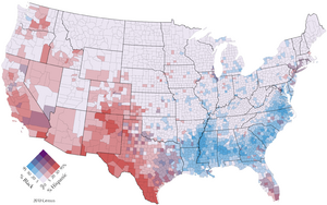
Sometimes, you can show two different types of data on one choropleth map. This is called a bivariate choropleth map. You do this by using two different color progressions and blending them. For example, if you use red for one type of data and blue for another, areas where both are high might appear purple.
These maps are great for seeing how two different things relate to each other in the same areas. However, they need a very clear legend to help people understand what all the blended colors mean.
Reading a Choropleth Map
A choropleth map uses special symbols (the colored areas) to show the data. To understand what each color means, you always need to look at the legend.
For a classified map, the legend will show a few colored boxes, each with a range of values next to it (e.g., "Light Green: 0-10%", "Dark Green: 11-20%"). For an unclassed map, the legend might show a smooth color bar with numbers at different points along it.
The legend is your key to unlocking the information on the map!
See also
- Cartograms, which are often colored like choropleths.
- Chorochromatic map
- Dasymetric map
- Dot distribution map
- Heat map
- Proportional symbol map


