
Cartogram facts for kids

A cartogram is a special kind of thematic map. Instead of showing the true geographic size of places like countries or states, it changes their size. The new size is based on a specific number, like how many people live there, how much money they make, or how long it takes to travel through.
Imagine a map where countries grow bigger if they have more people, or shrink if they have fewer. That's a cartogram! It makes the map look "warped" or stretched. This helps us easily see where a certain variable, like population, is highest or lowest. Cartograms are great for showing how important something is in different places. They are similar to proportional symbol maps, which use different sized symbols, but cartograms actually change the size of the places themselves.
Contents
What is a Cartogram?
A cartogram is a map that intentionally distorts the size of geographic areas. It makes these areas bigger or smaller to show a specific type of data. For example, a country might appear much larger on a cartogram if it has a huge population, even if its actual land area is small.
Why Do We Use Cartograms?
Cartograms help us understand data in a very visual way. Our brains naturally connect "bigger" with "more" and "smaller" with "less." By changing the size of places on a map, cartograms make it easy to spot patterns and compare different areas quickly. They are especially useful for showing things like:
- How many people live in different regions.
- The total wealth or economy of various countries.
- How election votes are distributed.
A Look Back: The History of Cartograms
Cartograms are a newer type of map compared to some others. They became popular as people found new ways to show information on maps.
Early Ideas and Maps
The very first known cartogram was made in 1876 by a French expert named Pierre Émile Levasseur. He created maps of Europe where countries were shown as squares. The size of each square depended on things like population or national budget. Levasseur wanted to help students understand how important different countries were in terms of trade and wealth. He noticed that children could easily see how a small country like England was very important for trade, while a large country like Russia was still developing in that area.
Later, in Germany, Hermann Haack and Hugo Weichel made maps for the 1898 election. These were some of the first "contiguous cartograms," meaning the distorted areas still touched each other. They showed how densely populated cities had different voting patterns than rural areas.
An American mapmaker, Erwin Raisz, also helped make cartograms more popular. He created "rectangular statistical cartograms" which used rectangles to represent areas.
Computers Make Cartograms Easier
Drawing cartograms by hand was very difficult and time-consuming. In 1963, a scientist named Waldo R. Tobler developed one of the first computer programs to create cartograms. This was a big step! Since then, many different computer programs and methods have been created to make cartograms more accurate and easier to produce.
How Cartograms Work: General Ideas

Making a cartogram is a bit like making a map projection. Both methods change how geographic space looks. The goal is to show one piece of information as accurately as possible, while trying not to distort other things too much.
Balancing Accuracy and Recognition
When a cartogram changes the size of places, it can sometimes make them look very different from their real shapes. This can make it hard to recognize them. Mapmakers try to find a balance:
- They want the size of each area to be correct according to the data.
- They also want the shapes to be recognizable, or at least for neighboring areas to still touch each other (this is called "topological relationship").
It's often impossible to keep both the original shape and the correct neighboring relationships perfectly. So, different cartogram methods try to achieve different balances.
Different Kinds of Cartograms
There are many ways to make a cartogram, and each method creates a map that looks a bit different.
Area Cartograms: Changing Sizes
Area cartograms are the most common type. They change the size of regions (like countries or states) so that their area is directly related to a chosen variable. This variable is usually a total count, like total population or total money earned. A map showing population size is sometimes called an isodemographic map.
Smoothly Warped Maps
Some cartograms use mathematical formulas to smoothly stretch or shrink the entire map. Imagine the map as a rubber sheet being pulled and pushed. This method distorts the space itself, rather than just individual shapes. The Gastner-Newman algorithm is a popular tool that uses this idea.
Stretching and Squishing Shapes

These cartograms change the shape of each region, but they make sure that regions that touch in real life still touch on the map. This means the shapes can look very stretched or squished, but their neighbors stay connected. Early examples from Haack and Weichel used this idea, and modern computer programs can do it very precisely.
Separate but Clear Shapes
In this simple method, each region is made bigger or smaller without changing its original shape at all. Then, the regions are moved around to reduce gaps or overlaps. The advantage is that you can still recognize the original shape of each place, but they might not touch each other anymore.
Simple Shapes: Circles and Squares
This type of cartogram replaces each region with a simple geometric shape, like a circle or a square. The size of the circle or square is proportional to the data. The original shape of the region is completely gone. These are often called Dorling cartograms if they use circles. They are good for showing overall patterns, especially when the original shapes might not be familiar to everyone. For example, a map of countries of the world using circles for population.

Building with Blocks: Mosaic Cartograms
Mosaic cartograms build each region from small, uniform blocks, usually squares or hexagons. Each block represents a fixed amount of the variable (e.g., 5,000 people). The number of blocks used for a region shows its value. These maps often try to keep some of the original shape, making them easier to recognize.
They are very popular for showing United States Electoral College results during presidential elections. News channels and websites often use them to visualize how votes are distributed across states.

Linear Cartograms: Changing Distances

While area cartograms change the size of places, linear cartograms change the distances between places. They are great for showing things like travel time or how connected different points are in a network. For example, on a subway map, all stations might look like they are the same distance apart, even if some are much closer in real life. This helps you focus on the connections and travel time, rather than the exact physical distance.
Adding More Information to Cartograms
Cartograms can be combined with other map techniques to show even more information. For area cartograms, it's common to fill each region with a color. This is called a choropleth map. For example, a cartogram showing population could then use different colors to show the average income in each region. This helps you see how many people live in an area and what their economic situation is like.
Another way is to put small charts, like pie charts, inside the shapes of a diagrammatic cartogram. This can show complex information, like the different age groups within a population.
Making Cartograms Today
Today, most cartograms are created using computer software. Early pioneers like Waldo Tobler from UC Santa Barbara helped develop the first computer methods in the 1960s.
Many software programs are available that can generate cartograms. These tools often work with GIS software (Geographic Information Systems) to process map data and create the distorted maps. Popular algorithms, like the Gastner-Newman algorithm, are used in these programs to make accurate and visually interesting cartograms.
Images for kids
-
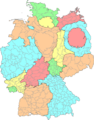
Cartogram of Germany, with states and districts resized according to population.
-
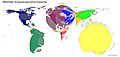
A contiguous cartogram of the world, where each country is resized based on the hectares of certified organic farming.
-
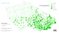
A non-contiguous cartogram of the Czech Republic. The size of each district shows the percentage of Catholics, and the color shows the proportion voting for a specific political party in 2010.
-
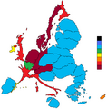
This cartogram shows an estimate of how much money each person in European Union countries contributed to or received from the EU budget between 2007 and 2013.


