Proportional symbol map facts for kids
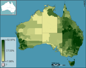
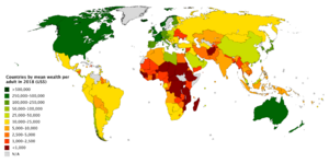
A choropleth map (from the Greek words khōros for "area" and plēthos for "multitude") is a special kind of map that uses colors and shades to show data about different places. These maps make it easy to see patterns across a geographic area, like where population is highest or which areas have higher incomes.
Choropleth maps are one of the most common types of thematic maps. This is because a lot of information, like from a government census, is already collected for specific areas like countries, states, or counties. This makes it easy to create these maps using computer software like GIS or even spreadsheets. They help us understand how a certain feature or variable changes from one region to another.
History of Choropleth Maps
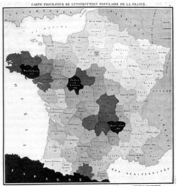
The very first choropleth map was made in 1826 by Baron Pierre Charles Dupin. His map used shades to show how many people could read and write in different parts of France. Soon after, more of these "tinted maps" were created to show other social patterns, like information about health and living conditions.
These maps became very popular as countries started collecting more data about their populations. For example, the 1841 Census of Ireland used several choropleth maps in its official reports. When color printing (Chromolithography) became common after 1850, mapmakers began adding bright colors to their maps, making them even easier to read.
The name "choropleth map" was first used in 1938 by a geographer named John Kirtland Wright. By the 1940s, mapmakers all over the world were using the term.
How Do Choropleth Maps Work?
A choropleth map combines two types of information:
- Geographic Areas: These are the shapes on the map, like countries, states, or counties.
- Statistical Data: This is the information that is collected for each area, like the number of people who live there.
The Areas on the Map
The areas on a choropleth map are usually well-known boundaries, like city limits, county lines, or country borders. These are often called "aggregation districts" because the data is aggregated, or gathered together, for that whole area.
Using these pre-defined areas is helpful because:
- The data is often already collected for these areas.
- People can easily recognize the shapes of countries or states.
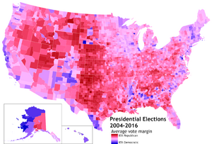
- The information can be used to make decisions for that area, like in an election.
However, this can also cause problems. When one color is used for a whole area, it makes it seem like the data is the same everywhere inside that area. For example, a county might be colored to show a "medium" income level, but it could have very wealthy neighborhoods and very poor neighborhoods inside it. The single color hides these details. Using smaller areas, like zip codes or census tracts, can help show more detail, but it can also make the map look too complicated.
The Data Behind the Colors
The information shown on a choropleth map can be about almost anything, from population and economics to farming and weather. However, it's very important to map the right kind of data. There are two main types of data:
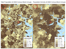
- Counts (Extensive Variables): This is data that shows a total number, like the total population of a state. It is usually a bad idea to map total counts on a choropleth map. This is because larger areas will naturally have larger counts, which can be misleading. A large state with a lot of people might get a dark color, making it look more important than a small, crowded city with the same number of people. Maps with proportional symbols are better for showing total counts.
- Rates or Densities (Intensive Variables): This is data that has been adjusted for the size of the area or the number of people. Examples include population density (people per square mile) or the percentage of people who own a home. This type of data is perfect for choropleth maps because it allows you to compare different areas fairly, no matter their size.
Making Data Fair: Normalization
To avoid making a misleading map, mapmakers use a process called normalization. This means turning a total count into a rate or density. It's the most important step in making a good choropleth map.
Common ways to normalize data include:
- Density: Dividing the total count by the area's size (e.g., Total Population / Square Miles = Population Density).
- Proportion: Dividing a smaller group by the total group (e.g., Number of Students / Total Population = Percentage of Population that are Students).
- Average: Dividing a total amount by the number of people (e.g., Total Income / Total Population = Income Per Person).
Using normalized data ensures that the patterns you see on the map are accurate and not just based on the size of the geographic areas.
How Are the Colors and Groups Chosen?
Every choropleth map needs a plan for turning data values into colors. There are two main ways to do this:
- A classed map sorts the data into a few groups, or classes. Every area in the same group gets the same color. This is the most common type of choropleth map.
- An unclassed map gives each area its own unique color based on its exact value. This creates a smooth gradient of color across the map.
Classed maps are often easier for people to read because there are fewer colors to worry about. Unclassed maps can show more subtle details in the data, but they can sometimes be harder to interpret.
How to Group the Data
When making a classed map, the mapmaker has to decide where to set the "breaks" between each class. There are many ways to do this, but here are a few common methods:
- Equal Intervals: The entire range of data (from the minimum to the maximum value) is split into groups of equal size. For example, if data ranges from 0 to 100 and you want 4 classes, the breaks would be at 25, 50, and 75. This method is easy to understand but can be misleading if the data isn't spread out evenly.
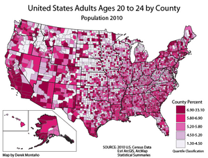
- Quantiles: This method puts an equal number of geographic areas into each class. For example, if you are mapping all 50 U.S. states and want 5 classes, you would put 10 states in each class. The 10 states with the lowest values go in the first group, the next 10 go in the second group, and so on. This method is good for showing rankings.
- Natural Breaks: This method uses a computer algorithm to look for natural gaps or clusters in the data. It tries to create groups where the values within each group are very similar, and the values between groups are very different. This is often the default method in mapping software.
Picking the Right Color Scheme
The colors on a map should make sense. If the data goes from low to high, the colors should look like they go from light to dark. This helps people understand the map without even looking at the legend.
Mapping Two Things at Once
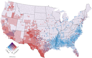
It is possible to show two different variables on one choropleth map. This is called a bivariate map. To make one, you create a color scheme for each variable (like blue for one and red for the other) and then blend the colors. For example, an area that is high in both variables might appear purple.
These maps can be very powerful for showing the relationship between two things, but they can also be confusing if they are not designed carefully. A clear legend is very important for a bivariate map.
How to Read the Map Legend
The legend is the key to understanding a choropleth map. It shows you what the colors and shades mean.
For a classed map, the legend will show a box of color for each class, along with the range of values that color represents (e.g., Red = 50-100 people per square mile). For an unclassed map, the legend usually shows a smooth gradient of color with labels for the minimum, maximum, and a few values in between.
See also
- Cartogram
- Chorochromatic map
- Dasymetric map
- Dot distribution map
- Heat map
- Proportional symbol map


