Dasymetric map facts for kids

A dasymetric map is a special type of thematic map that shows information, like how many people live in an area, more accurately than a standard map. The name comes from the Greek words dasýs (meaning "dense") and métro (meaning "measure").
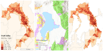
Imagine a map showing the population of your state. A simple map, called a choropleth map, might color the entire state one shade. But people don't live evenly spread out across the whole state—they don't live in lakes, on mountaintops, or in large forests. A dasymetric map is smarter because it uses extra information to remove these empty areas. This gives a much more realistic picture of where people actually live.
Dasymetric maps are a mix of two other map types: choropleth maps (which color in whole regions) and isarithmic maps (which use lines to show changes, like a weather map).
Contents
A Brief History of Dasymetric Maps
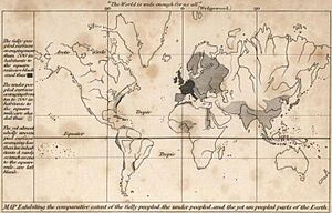
The idea for these smarter maps is older than you might think. One of the first was created in 1833 by George Julius Poulett Scrope to show world population density. Another early example was a map of Ireland made in 1838.
However, the term "dasymetric" wasn't used until 1911. A Russian geographer named Benjamin Semyonov-Tian-Shansky officially named and described the technique. He wanted to create maps that showed population "as it is distributed in reality," focusing on where people gathered and where areas were empty, instead of just following political borders.
Later, in the 1930s, an American geographer named John Kirtland Wright helped make the method more popular. With the invention of computers and Geographic Information System (GIS) software, making these detailed maps has become much easier.
How Dasymetric Maps Are Made
Creating a dasymetric map involves a few clever steps to make a basic map more accurate. It starts with a standard choropleth map and uses "helper data" to improve it.
The Binary Method
The most common and simple way to make a dasymetric map is called the binary method. "Binary" just means two options: people live here, or they don't.
Here’s how it works:
- Start with a basic map: Take a regular choropleth map, which shows data for a whole area, like a county.
- Add helper data: Use extra information to find areas that are known to be uninhabited. This could be a map of water bodies (lakes, rivers), national parks, or large industrial areas.
- Remove the empty areas: Crop out the uninhabited areas from the original county map.
- Recalculate the data: Adjust the data, like population density, for the new, smaller area where people actually live.
By removing the empty spaces, the map shows a higher, more realistic density in the populated parts of the county.
Applying the Method to Dot Maps
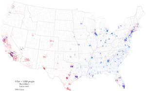
This technique also works great for dot density maps. On these maps, one dot represents a certain number of people (for example, 1 dot = 100 people).
Normally, the dots are placed randomly inside a county's borders. But with the dasymetric method, a "mask" is used to block dots from being placed in uninhabited areas like parks or lakes. This forces the dots to cluster in the parts of the county where people truly live, creating a much more accurate visual.
Dasymetric vs. Other Maps
Dasymetric maps combine the best features of other maps while trying to avoid their weaknesses.
- Compared to Choropleth Maps: A standard choropleth map is easy to make but can be misleading. It assumes everything is spread out evenly within a boundary. A dasymetric map is more work to create but gives a far more truthful representation of the data.
- Compared to Isarithmic Maps: An isarithmic map uses smooth, flowing lines (called isolines) to connect points of equal value. Think of a weather map showing lines for temperature. Dasymetric maps create sharp, defined zones that are believed to have a consistent density inside them.
In short, a dasymetric map is an estimate, but it's a very educated and often more accurate one than the original data presented on a simpler map.


