Chorochromatic map facts for kids
A Chorochromatic map (which comes from the Greek words chora meaning "region" and chroma meaning "color") is a special kind of thematic map. It uses different colors or patterns to show areas that belong to different groups or categories. Think of it like a mosaic map, where each piece of the mosaic represents a different type of area.
These maps are great for showing information that describes types of things, rather than numbers. For example, they can show different types of soil, different kinds of forests, or areas where certain languages are spoken. What makes them unique is that their boundaries are drawn based on where these different types of things actually change in the real world. This is different from choropleth maps, which often use existing borders like states or counties.
Contents
Exploring Chorochromatic Maps
Chorochromatic maps help us visualize discrete fields. This means that every spot on the map belongs to a specific category. For instance, a map showing different types of land cover would have each area labeled as "forest," "water," or "city." These maps are all about showing where different kinds of things are located across a space.
A Look Back: The History of These Maps
Chorochromatic maps are some of the oldest types of thematic maps. They first appeared in different fields of study a long time ago.
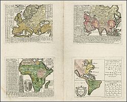
In 1741, a scholar named Gottfried Hensel published a book about world languages. It included maps that showed different language regions using boundaries and colors. These were some of the very first chorochromatic maps. Later, in the 19th century, more maps showing cultural regions started to appear.
The first known geological map that showed different types of rocks on the surface was made by Jean-Étienne Guettard and Philippe Buache in 1746. It used gray bands to show rock formations that crossed the English Channel. By the early 1800s, these kinds of maps became very popular, especially in the United Kingdom and France, often colored by hand.
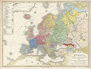
One of the most skilled mapmakers using this technique was Heinrich Berghaus. His 1837 book, Physikalischer Atlas, was likely the first atlas ever to focus on themes. It contained many colorful chorochromatic maps. These maps covered a wide range of topics, from physical geography (like river systems and geology) to human geography (like farming areas and different ethnic groups). Much of his information came from the famous explorer Alexander von Humboldt.
As new printing methods like chromolithography (which allowed for colorful printing) became more common in the late 1800s, chorochromatic maps became very widespread. The term chorochromatic itself was used later by Erwin Raisz in his 1938 textbook, General Cartography.
Today, with modern computer tools like geographic information systems (GIS), we can create these maps even more easily. Researchers continue to study how best to show different categories and their boundaries on maps.
How Chorochromatic Maps Show Information
A chorochromatic map shows areas that are different from each other in a descriptive way, not by numbers. These areas can be distinct, like national or state parks.
Often, these maps show what we call thematic regions. This means an area where a certain type of thing is found. For example, a map might show where a specific type of plant grows most often, or where most people speak a certain language. Because things that are close together in geography tend to be similar, you often see large areas that are mostly the same category.
These maps often represent a categorical coverage or discrete field. Imagine a property that changes across space, and every point has a value. For a discrete field, that value is a category, like "forest" or "desert," instead of a number.
Sometimes, these categories are organized in a hierarchy, meaning some are more related than others. For example, different types of rocks might be grouped by their age. When this happens, choosing similar colors (like different shades of red) can help show these relationships clearly on the map.
The way regions look on a chorochromatic map can depend a lot on the map's scale (how zoomed in or out it is). A map of a whole country might not show a small pond, but a map of a local park would. Mapmakers decide what details are important enough to show at a particular scale. This process is called Cartographic generalization, and it's important to do it carefully so the map is clear and accurate.
In a Geographic information system, these types of areas can be stored as either vector (like shapes and lines) or raster (like a grid of pixels) data. Software like ArcMap, ArcGIS Pro, and QGIS have tools to color these areas based on their categories, making them easy to visualize as chorochromatic maps.
Where We Use Chorochromatic Maps
Chorochromatic maps are used for many different topics in both physical (like natural features) and human geography (like human activities). Here are some examples:
- Biomes (major life zones like rainforests or deserts)
- Climate types (like tropical or polar)
- Land cover (what covers the land, such as forests, water, or cities)
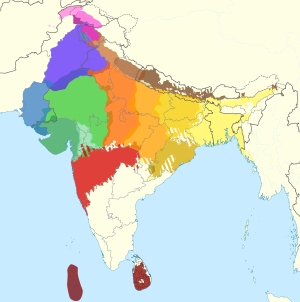
- The main language, religion, or other cultural features in an area
- Soil types
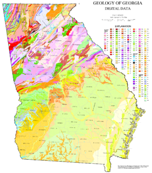
- Surface geologic strata (different layers of rock on the Earth's surface)
- Land use (how land is used, like for farming, housing, or industry)
- City zoning (rules about what kinds of buildings can be built in different parts of a city)
Types of Chorochromatic Maps
Chorochromatic maps can be divided into two main types: simple and compound.
Simple Chorochromatic Maps
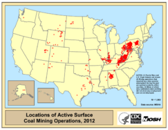
Simple chorochromatic maps show a single type of area that isn't found everywhere. There are gaps between these areas. For example, a map showing only the locations of forests or mineral deposits would be a simple chorochromatic map. The map uses one color or pattern to represent that specific feature.
Compound Chorochromatic Maps
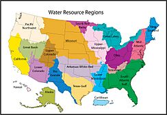
Compound chorochromatic maps show a complete set of different categories for an entire area. For instance, a full vegetation map would show all the different kinds of plants in a region, using different colors or patterns for each type. Every part of the map is covered by one category or another.
Chorochromatic vs. Choropleth Maps
Choropleth map It's easy to confuse chorochromatic maps with choropleth maps, but they have a key difference. Both can show categories, but they use different kinds of boundaries.
- Chorochromatic maps draw their boundaries based on where the actual feature changes in the real world. For example, a chorochromatic map of languages would show irregular borders where one language area naturally ends and another begins.
- Choropleth maps use boundaries that already exist, like states, counties, or census districts. They summarize information (like the most common language) within those fixed areas.
So, while a choropleth map might show the main language in each county, a chorochromatic map would show the actual areas where different languages are primarily spoken, regardless of county lines.
Things to Watch Out For
Like all maps, chorochromatic maps can sometimes be misunderstood.
For example, someone looking at the map might think that a larger colored area means there are more people or more of a certain characteristic in that area. However, a large desert region on a map doesn't mean more people live there; it just means the desert covers a big area. To prevent confusion, mapmakers might add diagrams or notes to explain the actual numbers or details.
Another challenge is that these maps can make boundaries look very sharp and clear, even when they might be fuzzy or gradual in real life. For instance, the border between two language areas might be a gradual blend rather than a sudden line. When there's uncertainty about boundaries, mapmakers can use special techniques to show that the borders might not be as rigid as they appear.


