|
Sans-serif font |
|
Serif font |
|
Serif font
(serifs in red) |
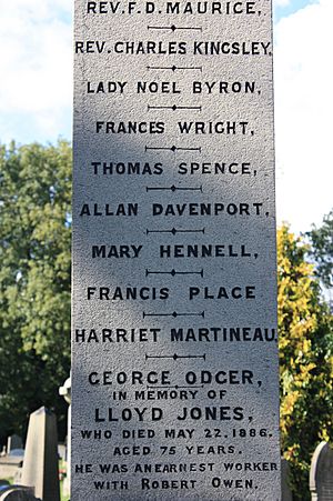
Simple sans-serif capitals on a late nineteenth-century
memorial, London
In typography, a sans serif typeface is one that does not have the tiny feet called "serifs" at the end of strokes. The term comes from the French word sans, meaning "without" and "serif" from the Dutch word schreef meaning "line".
Sans serif typefaces have been used since the 18th century, but became most used in the twentieth century as the modern art movement developed. Most designers of typefaces were artists. Some were outstanding in other artistic fields, and were part of the wider artistic culture of their times.
The apostle of sans serif was Jan Tschichold (2 April 1902 Leipzig, Germany – 11 August 1974 Locarno, Switzerland), a German-Swiss graphic designer. Tschichold not only designed typefaces, he showed how they could be used in the design of book printing. He was a chief designer for Penguin Books after the Second World War.
Sans serif faces are most used for display signs, advertising and for headings in books. Although they seem to work well for the text in books, they are much less used for that purpose.
Other names for sans serif
- Egyptian
- Antique
- Grotesque
- Doric
- Gothic (not to be confused with blackletter)
- Lineale, or linear
- Simplices
- Swiss
Images for kids
-
Syntax, originally released by D. Stempel AG in 1969. A humanist sans-serif.
-
Rothbury, an early modulated sans-serif typeface from 1915. The strokes vary in width considerably.
-
An inscription at the neoclassical grotto at Stourhead in the west of England dated to around 1748 (replica shown), one of the first to use sans-serif letterforms since the classical period
-
An early 1810 "neoclassical" use of sans-serif capitals to represent antiquity, by William Gell
-
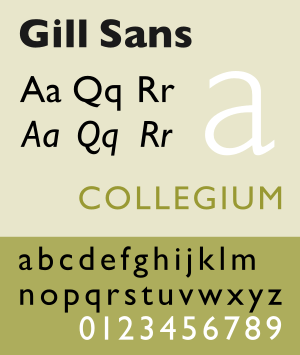
Gill Sans on the nameplate of a 4468 Mallard locomotive (built in 1938). It was marketed as a sophisticated refinement of earlier sans-serifs, taking inspiration from Roman capitals and designer Eric Gill's experience carving monuments and memorials.
-
A 1969 poster exemplifying the trend of the 1950s and 1960s: solid red colour, simplified images and the use of a grotesque face. This design, by Robert Geisser, appears to use Helvetica.
-
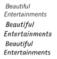
Three sans-serif "italics". News Gothic has an oblique. Gothic Italic no. 124, an 1890s grotesque, has a true italic resembling Didone serifs of the period. Seravek, a modern humanist typeface, has a more organic italic which is less folded-up.
-
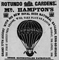
Dublin 1848, caps-only heading with crossed V-form 'W'
-
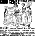
Corset advertisement using multiple grotesque typefaces, United States, 1886
-
Light sans-serif being used for text, Germany, 1914
-
German propaganda poster, 1914
-
Small art-nouveau flourishes on 'v' and 'e'. Ljubljana, 1916.
-
-
Nearly monoline and stroke-modulated sans; Austrian war bond poster, 1916
-
Broad block capitals. Hungarian film poster, 1918.
-
Monoline sans-serif with art-nouveau influenced tilted 'e' and 'a'. Embedded umlaut at top left for tighter linespacing.
-
Art Deco thick block inline sans-serif capitals, inner details kept very thin. France, 1920s.
-
Berthold Block, a thick German sans-serif with shortened descenders, allowing tight linespacing. Switzerland, 1928.
-
Artistic sans-serif keeping curves to a minimum (the line 'O Governo do Estado'), Brazil, 1930
-
Lightly modulated sans-serif lettering on a 1930s poster, pointed stroke endings suggesting a brush
-
Geometric sans-serif capitals, with sharp points on 'A' and 'N'. Australia, 1934.
-
Dwiggins' Metrolite and Metroblack typefaces, geometric types of the style popular in the 1930s
-
Stencilled lettering apparently based on Futura Black, 1937
-
A 1940s American poster. The curve of the 'r' is a common feature in grotesque typefaces, but the 'single-storey' 'a' is a classic feature of geometric typefaces from the 1920s onwards.
-
1952 Jersey holiday events brochure, using the popular Gill Sans-led British style of the period
-
Swiss-style poster using Helvetica, 1964. Tight spacing characteristic of the period.
-
Ultra-condensed industrial sans-serif in the style of the 1960s; Berlin, 1966
-
Neo-grotesque type, Switzerland, 1972: Helvetica or a close copy. Irregular baseline may be due to using transfers.
-
Tightly-spaced ITC Avant Garde; 1976
-
Governmental poster using Univers, 1980
-
Anti-nuclear poster, 1982
-
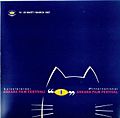
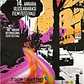
1997 film festival poster, Ankara
-
-
Letterpress poster by Alan Kitching, 2015
-
-
Sample image of condensed sans-serifs from the Figgins foundry of London in an 1845 specimen-book. Much less influenced by classical models than the earliest sans-serif lettering, these faces became extremely popular for commercial use.
-
Sans-serif type in both upper- and lower-case on a 1914 poster
See also
In Spanish: Palo seco para niños