
Gill Sans facts for kids

Gill Sans is a well-known sans-serif typeface (a type of font) that was created by a British artist named Eric Gill. It was first made available by the British company Monotype starting in 1928.
Gill Sans is based on an older font called the "Underground Alphabet." This font was designed by Edward Johnston in 1916 for the London Underground (the subway system in London). Eric Gill actually helped Johnston with some of the early work on that font when he was a young artist.
How Gill Sans Was Created
In the 1920s, Eric Gill became famous as a stonemason, an artist, and someone who designed letters. He started working on his own typeface designs. A friend of his, Stanley Morison, who worked at Monotype, asked Gill to turn his alphabet ideas into a full set of metal type. Morison hoped this new font could compete with popular German sans-serif fonts like Futura.
Monotype released Gill Sans in 1928. Eric Gill wanted to mix ideas from Johnston's font, classic fonts with little "feet" (called serifs), and old Roman writings like those found on Trajan's Column. His goal was to create a font that looked both modern and classic at the same time.
Where You Might See Gill Sans
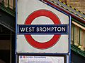
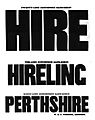
Gill Sans became very popular and was used for many different things. For example, it was used by the LNER for their train signs and even on the famous locomotive Mallard. The BBC also used a logo based on Gill Sans for many years. You might also see it on old Penguin Books paperbacks.
Images for kids
-
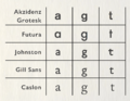
Gill Sans compared to other sans-serif fonts from its time. It looks different from some other sans-serifs because of how its letters like "a" and "g" are shaped.
-
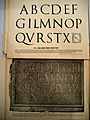
A drawing by Eric Gill of the letters from the Column of Trajan. These ancient Roman letters helped inspire Gill Sans.
-
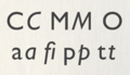
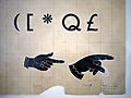
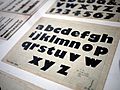
Some unique letters and symbols of Gill Sans.
-
An early version of the Johnston font on a London Underground sign. This font was a big influence on Gill Sans.
-
Some very bold sans-serif fonts from an older company called Figgins. Gill and Johnston wanted to make fonts that were modern but not as heavy as these.
-
Some of Eric Gill's original drawings for Gill Sans, showing the letter "Q" and other symbols.
-
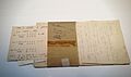
Notes from Monotype in the 1940s, discussing different drawings for certain letters.
-
A collection of some Gill Sans fonts designed for headlines and larger text.
-
Eric Gill's drawings for a very bold version of the font called Gill Kayo.
-
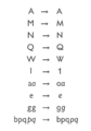
Different versions of characters available in Gill Sans Nova, similar to options from the old metal type days.
-
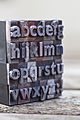
A metal piece of type for Gill Sans Bold, shown mirrored as it would be for printing.
-

A Penguin Books paperback from 1949 next to a modern digital Gill Sans font, showing small differences.
-

Gill Sans on the nameplate of the famous LNER train, Mallard.
-
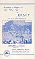
A brochure from 1952, showing the design style of that time, often using fonts like Gill Sans.
-
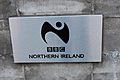
The BBC logo at BBC Broadcasting House in Belfast. The BBC used a logo based on Gill Sans for many years.
-
Lettering on a British Railways sign. It looks like Gill Sans, but some letters are slightly different.
-
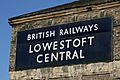
An old enamel sign at Lowestoft Central station using a standard British Railways font.
-
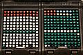
A keyboard from a Monotype typesetting machine from 1935, using a slightly changed Gill Sans font.
-
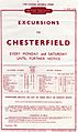
A railway timetable from 1950 that uses Gill Sans.
-
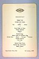
Gill Sans used on a menu from an LNER hotel in York in 1940.
-
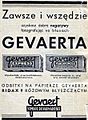
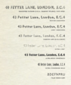
Parts of this old Polish advertisement use Gill Sans, including some of its "continental" letter options.

.jpg)


.jpg)

.jpg)


.JPG)


See also
 In Spanish: Gill Sans para niños
