Stanley Morison facts for kids
Quick facts for kids
Stanley Morison
|
|
|---|---|

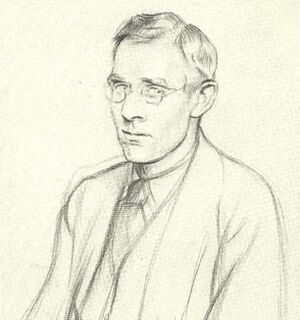
Morison drawn by Sir William Rothenstein in 1923.
|
|
| Born | 6 May 1889 Wanstead, Essex, England
|
| Died | 11 October 1967 (aged 78) London, England
|
| Occupation | Typographer, printer, historian |
|
Notable work
|
Times New Roman |
Stanley Arthur Morison (born May 6, 1889 – died October 11, 1967) was a British expert in printing. He was a typographer, which means he designed and arranged typefaces (the styles of letters). He also worked as a printing executive and studied the history of printing. Even though he taught himself most of what he knew, he helped make printing better and brought back some of the best old typefaces.
From the 1920s, Morison became a very important advisor to the British Monotype Corporation. This company made machines and typefaces for printing. He helped them choose and create new type designs. Thanks to his good taste, Monotype became known for bringing back classic typefaces from history. They also created new ones that became very popular. Some famous typefaces he helped create or bring back include Times New Roman, Gill Sans, Perpetua, Bembo, Ehrhardt, and Bell. Times New Roman, which Morison helped design, is now one of the most used typefaces ever. He also worked closely with The Times newspaper and later joined the team behind Encyclopædia Britannica.
Contents
Early Life and Learning About Printing
Stanley Morison was born on May 6, 1889, in Wanstead, Essex, England. He spent most of his childhood in London. Stanley taught himself about printing and design because he left school early.
In 1913, Morison started working as an editor for The Imprint magazine. This was a magazine about printing.
During the First World War, in 1916, he refused to join the army because of his beliefs. People who do this are called conscientious objectors. Because of his choice, he was put in prison. Morison later became a Catholic. He married Mabel Williamson in 1916.
In 1918, he became a design supervisor at Pelican Press. This company printed materials that were against the war. He then moved to a similar job at the Cloister Press. In 1922, he helped start the Fleuron Society. This group focused on everything about typography. He was the editor of the society's magazine, The Fleuron, from 1925 to 1930. This magazine was known for its amazing artwork and printing quality.
Working with Monotype Corporation
From 1923 to 1967, Stanley Morison was a special consultant for the Monotype Corporation. He helped them with type design. In the 1920s and 1930s, he researched old typefaces and helped Monotype bring them back. Two examples are the Bembo and Bell typefaces. He greatly expanded the number of typefaces Monotype offered. This had a huge impact on how typefaces are designed even today.
Morison helped Monotype get the rights to use typefaces designed by famous artists like Bruce Rogers and Jan van Krimpen. He didn't like the fancy, old-fashioned printing styles from the Victorian era. Instead, he preferred a simpler, cleaner look for printed materials.
In 1927, Monotype hired Beatrice Warde as their Publicity Manager. She helped spread Morison's ideas about typography through her own writing. Morison and Warde also helped edit the Monotype Recorder. This newsletter promoted Monotype's machines and gave tips to users. It also showed examples of great printing and included articles about printing history.
Morison learned about an old typeface called Bell from the 1700s. He arranged for Monotype to get the rights to it and recreate it. Not all of his projects at Monotype were successful. But his work on Gill Sans and especially Times New Roman made a lot of money for the company. Both of these typefaces are still among the most used today.
Morison became friends with Brooke Crutchley, who was the printer for the University of Cambridge. Morison's old papers and works went to Cambridge after he passed away. Later in his life, he wrote a book for Crutchley called A Tally of Types. This book looked at the typefaces Monotype created that were used at Cambridge. Even though it was a small book, it is seen as a very important book about printing in the 1900s.
As a writer for The Fleuron, Morison once suggested that italics in books were distracting and should be used less. While some designers agreed at first, Morison later realized this idea wasn't the best. He even joked that the italics in Times New Roman were more about design than his old rule.
Morison wrote many books about the history of printing. However, some people noted that while his ideas were interesting, his historical facts were sometimes not perfectly accurate.
Creating Times New Roman
Morison also worked as a typography consultant for The Times newspaper from 1929 to 1960. In 1931, he told the newspaper that their printing quality was not good enough. Because of this, the newspaper asked him to create a new typeface that was easy to read.
The typeface, called Times New Roman, was developed by Morison with a graphic artist named Victor Lardent. Times New Roman was first used by The Times newspaper in 1932. Monotype then made it available for everyone to buy in 1933. Morison also helped edit the History of the Times from 1935 to 1952. He was also the editor of The Times Literary Supplement between 1945 and 1948.
Later Career and Achievements
In 1956-1957, Morison gave special lectures at the University of Oxford about the history of writing.
In 1960, Morison was named a Royal Designer for Industry. This is a special honor for designers in the UK. He was also part of the team that edited Encyclopædia Britannica from 1961 until he died in 1967. He was offered a knighthood in 1953 and another honor, the CBE, in 1962. But he chose to turn down both.
He played a key role in creating a big exhibition called "Printing and the Mind of Man." This exhibition showed how printing has helped people learn and share knowledge. It happened at the same time as a large printing trade show in 1963.
Stanley Morison passed away in London on October 11, 1967.
Selected Books by Stanley Morison
- On Type Faces (1923)
- Four Centuries of Fine Printing (1924)
- Type Designs of the Past and Present (1926)
- English Newspaper (1932)
- First Principles of Typography (1936)
- A Tally of Types (1953)
- Calligraphy 1535–1885 (1962)
- On Type Designs Past and Present (1962)
- The Typographic Book, 1450–1935 (1963)
Images for kids


