
Times New Roman facts for kids
Times New Roman is a special kind of serif typeface, which is like a style of letters. It was designed to be very easy to read, especially for long pieces of writing like in books or newspapers.
This famous font was created in 1931 for a British newspaper called The Times. A man named Stanley Morison, who was an artistic advisor for the newspaper, helped create it. Another person, Victor Lardent, who was a lettering artist, also helped with the design.
Even though it was made for The Times newspaper, they don't use it anymore. But Times New Roman is still super popular! You'll find it used a lot in books and for general printing. It has also become a standard font on most computers, so you probably see it all the time.

Because it was made for newspapers, Times New Roman was designed to fit a lot of words into a small space. This means the lines of text are close together, and the letters look a bit smaller. It first appeared in The Times newspaper on October 3, 1932.
How Times New Roman Looks
Times New Roman has a unique look that helps make it easy to read. The letters are packed together quite closely. Also, the lowercase letters (like 'a', 'b', 'c') are quite tall. These features help your eyes move smoothly across the page, making reading simpler and faster.
Images for kids
-
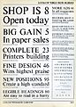
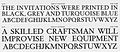
Twenty-two lines in Times New Roman compared to its predecessor "modern" serif font. Times appears larger on the page, with tighter linespacing and more solid in appearance.
-
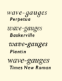
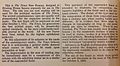
Times compared with its influences in italic. The italic was made simpler than Plantin's, losing flourishes on the 'w' and 'v', but less radically than that of Perpetua.
-
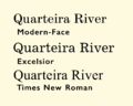
Times compared to a modern-face and the wide, monoline Excelsior, part of Linotype's Legibility Group.
-
A Ludlow Typograph specimen of Times New Roman Type Specimen from the metal type period. The design was altered in smaller sizes to increase readability, particularly obvious in the widened spacing of the six and eight-point samples at centre right of the diagram. The hollows at the top of upstrokes are also not seen in the standard digitisations.
-
Times Hever Titling from a Monotype specimen.
-
A 1943 brochure used by Crowell-Collier, one of the first major American users of Times New Roman, to promote the changeover.
-
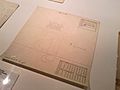
Working drawings for a Linotype release of "Times Roman". Various accents are drawn together on the same sheet.
-
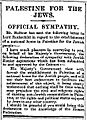
The Times' previous typeface from an article describing the Balfour Declaration in 1917
-
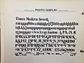
Times Modern Swash, an exaggerated and unauthorised display adaptation of Times from the phototypesetting period
-
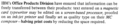
Press Roman, a version of Times New Roman typed on a premium IBM typewriter
-
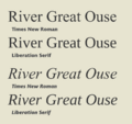
Comparison between Times New Roman and Liberation Serif, showing its much squarer design
-
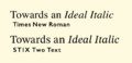
A standard Times New Roman digitisation compared to the STIX Two project, an open-source typeface for mathematics based on Times's smaller metal point sizes. STIX Two has a higher x-height and a reduction in fine detail.


.jpg)


.jpg)

.jpg)


See also
 In Spanish: Times New Roman para niños
