Bembo facts for kids
 |
|
| Category | Serif |
|---|---|
| Classification | Old-style |
| Designer(s) |
|
| Foundry | Monotype |
| Variations |
|
| Shown here | ET Bembo |
Bembo is a classic serif typeface that was created by the British company Monotype Corporation in 1928–1929. It's mostly used for the main text in books and other publications. Bembo is known as an "old-style" serif font.
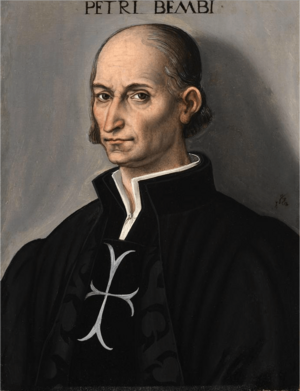
Its regular style, called roman, is based on a design made around 1495. This original design was created by Francesco Griffo for a printer in Venice named Aldus Manutius. The font is named after a book Manutius published in 1496 for the poet Pietro Bembo.
The italic style of Bembo is different. It's based on the work of Giovanni Antonio Tagliente, a calligrapher and printer from the 1520s.
Monotype developed Bembo because there was a new interest in the printing styles of the Italian Renaissance. This was largely due to Stanley Morison, a Monotype executive and printing historian. Since it was created, Bembo has been a very popular and easy-to-read font for books. Many famous publishers like Penguin Books and Oxford University Press have used it.
Contents
The Story Behind Bembo
The regular, upright style of Bembo is based on a typeface designed by Francesco Griffo. Griffo was an engraver who made designs by cutting metal punches. These punches were used to create molds for casting metal type.
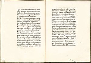
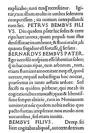
In 1496, Aldus Manutius printed a book called De Aetna. This short book was about a trip to Mount Etna, written by a young poet named Pietro Bembo. Griffo's typeface was used for this book.
Griffo's work was special because it captured the look of handwriting that people liked for classical texts. One key feature of his design was the flat cross-stroke on the letter "e". This made the "e" look more modern. Many people, including modern font designers, see Griffo's work as a big step forward in creating beautiful and useful typefaces. This style is sometimes called the "Aldine roman" after Manutius.
Griffo's typeface became very popular in France. Printers like Claude Garamond were inspired by it. Even though the exact typeface from De Aetna was only used in a few books, its high quality made a big impact.
Over time, these "old-style" fonts became less common. This was because new, more geometric fonts appeared in the 1700s and 1800s. But later, with the Arts and Crafts movement, old-style fonts became popular again.
In 1500, Manutius also released the first books printed using italic type. This was also designed by Griffo. At first, italic type was meant to be a separate, more informal style, not a companion to the regular font like it is today.
The Italic Style
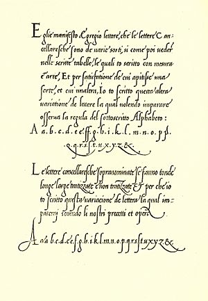
Bembo's italic style isn't directly based on Griffo's work. Instead, it comes from the work of Giovanni Antonio Tagliente. He was a calligrapher and handwriting teacher. In 1524, he published a writing manual in Venice called The True Art of Excellent Writing. This book included engravings and text set in an italic typeface that looked like his handwriting.
Tagliente's italic style was also copied in France. Another important italic font from this time was by Ludovico Vicentino degli Arrighi. His almost upright italic design also influenced later font designs in the 1900s.
How Monotype Created Bembo
Monotype Bembo is one of the most famous modern versions of the Aldine typeface from 1495. It was created by the Monotype design team in Salfords, England. This project was guided by Stanley Morison, who loved Aldus Manutius's typeface. He admired its balanced letters, like the even "e" and how the capital letters were slightly shorter than the tall lowercase letters. Morison felt the Aldine roman looked "sculpted," not written.
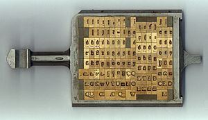
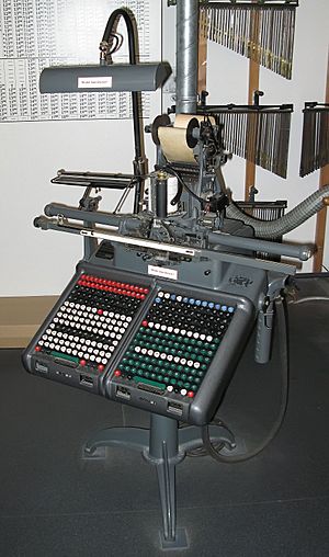
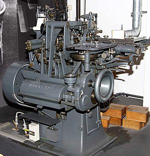
Bembo was developed during a time of big changes in printing. New machines could create metal type very precisely. This made it easier to create many different font sizes. Also, hot metal typesetting systems like Monotype's allowed printers to quickly cast metal type using a keyboard. This meant printers could use a wider variety of fonts.
At the same time, people started preferring "true old style" serif fonts again, moving away from the more mechanical fonts of the 1800s. Monotype's system had some rules about letter widths, so the designers had to make sure the letters still looked good together.
Morison was very interested in the history of 15th-century Italian printing. He even bought a copy of De Aetna to use as a model for Bembo.
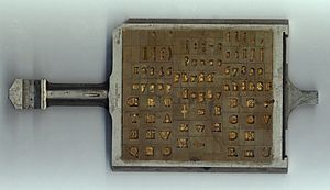
The Monotype team drew the characters on large paper diagrams. Then, special machines were used to cut the metal punches that made the molds for the type. It was common to make a few characters first, print them, and check how they looked before finishing the whole font.
Monotype wanted Bembo's italic to look "fine, tranquil." They didn't want it to be too unusual. They did consider a very upright italic design by calligrapher Alfred Fairbank, but decided it was too unique for Bembo's main italic. Monotype ended up creating a more traditional italic based on Tagliente's work. Fairbank's design was later released as "Bembo Condensed Italic."
Like other metal type fonts of that time, Bembo was designed differently for different sizes. Smaller sizes had looser spacing and taller lowercase letters to make them easier to read. Larger sizes were more delicate and graceful.
What Makes Bembo Special?
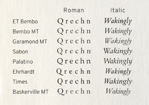
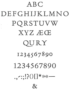
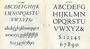
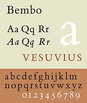
Bembo has some unique features. The tail of the capital "Q" starts from the middle of the letter. The capital "J" has a small hook. The sides of the "M" spread out a bit. The capital "A" has a flat top. Many lowercase letters have subtle, smooth curves. For example, the end of the "r" and "e" strokes curve slightly upwards. The lowercase "c" and "e" lean slightly forward. The "h," "m," and "n" are not perfectly straight on their right side, with a slight curve.
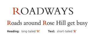
In the original metal type, Bembo had two capital "R"s. One had a long, extended leg like Griffo's original design. The other had a shorter leg, which printers could use for body text if they preferred.
Bembo doesn't exactly copy every detail from Renaissance printing. Instead, it combines those old styles with a modern feel. For example, Griffo's original De Aetna had an unusual "M" without a top-right serif. Monotype didn't include this in the main Bembo release, though it could be specially ordered.
For the italic style, the tall ascenders (the parts of letters that go above the main height) from Tagliente's type were made shorter. Also, Monotype created italic capital letters that sloped, matching the lowercase letters. In the Renaissance, italic fonts were usually used with upright capital letters. Monotype also added a bold version, which Griffo and his contemporaries didn't have. This bold style is very strong and easy to see.
Other Fonts Like Bembo
Poliphilus and Blado
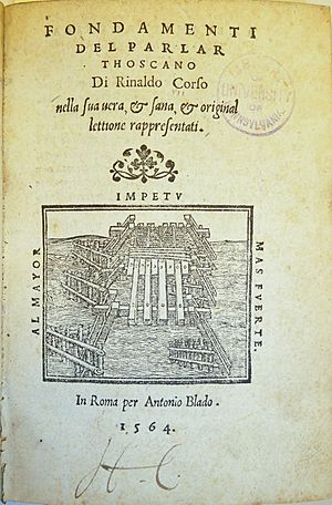
Before Bembo, Monotype had already made two other fonts inspired by the same Italian printing period: Poliphilus and Blado (both from 1923). These were more unusual than Bembo, designed to feel like old printing. They are still available but not as well known as Bembo. Bembo was made to be more popular and updated for modern printing.
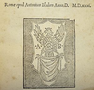
Poliphilus is named after the book Hypnerotomachia Poliphili, one of Manutius's most famous books. Blado is named after the printer Antonio Blado.
Centaur
Monotype also released the font Centaur around the same time as Bembo. Its regular style is based on the work of Nicolas Jenson from Venice around 1470, which is a bit older than Bembo's inspiration. Centaur's italic style is based on Arrighi's work from the 1520s. Centaur looks a bit lighter than Bembo. Penguin Books often used Centaur for headings in their classic editions.
Dante
Even though Bembo became very popular, Stanley Morison wasn't completely happy with how Griffo's original roman style was recreated. His friend, printer Giovanni Mardersteig, tried to design an alternative called Dante. This font was also taken up by Monotype, but it wasn't as popular as Bembo.
Titling Fonts
Monotype also created special titling fonts that went well with Bembo. These include Bembo Titling, which is based on Bembo's capitals but is more delicate for larger sizes. There's also Felix Titling, inspired by ancient Roman capital letters.
Bembo Through Time
The Renaissance (1400s-1500s)
- 1496: Francesco Griffo creates his roman (upright) typeface.
- 1501: Griffo creates his italic typeface. Italic fonts continue to develop over the next 50 years.
- 1515: Aldus Manutius dies.
- 1518: Francesco Griffo dies.
- 1520s: Giovanni Antonio Tagliente and Ludovico Vicentino degli Arrighi publish writing manuals in Venice and Rome. They are former calligraphers who become involved in printing.
- 1528: Tagliente dies.
- 1530s–1550s: France becomes a major center for typefounding. French typefaces, influenced by Manutius, replace older Italian designs. It becomes common for italic capital letters to slope like the lowercase ones.
20th Century
- 1910s: The italic calligraphy style of the Italian Renaissance becomes popular again among calligraphers.
- 1923: Monotype releases Poliphilus, a roman font based on Griffo's work, and Blado, an italic font based on Arrighi's work.
- 1928–29: Monotype develops and releases Bembo. They decide to use an italic based on Tagliente's style.
- 1929: Monotype releases Centaur and its matching italic.
- 1960s: Monotype releases Bembo for phototypesetting, a new way of creating type.
Digital Versions of Bembo
Monotype's Digital Bembo
Monotype has released two main digital versions: Bembo and Bembo Book. They also have Bembo Titling (for large headlines) and Fairbank (an alternate italic). Bembo Book is often seen as better for body text because it's thicker and includes an alternate "R" for better spacing.
The very first digital version of Bembo wasn't perfect. It looked lighter than the original metal type. Also, it was based on the 9-point metal drawings, which meant its proportions looked a bit off compared to the sizes most used in books.
Bembo Book is considered a better digital version. The original digital Bembo, however, has extra weights (like semi-bold) and "infant styles" with simpler "a" and "g" letters, which are good for handwriting-like text.
Other Fonts Inspired by Griffo
Many other fonts have been inspired by Griffo's original designs.
- Agmena: A newer font from Linotype (2014) that supports many languages and has a more calligraphic italic.
- Iowan Old Style: Designed by John Downer, this font has taller lowercase letters and is good for reading at a distance or on screens. It's a default font in the Apple Books app.
- Minion: Created by Adobe, this font is very popular in modern fine printing.
Because typefaces don't have strong intellectual property protection, many unofficial versions of Bembo have been made. These are often sold under different names like "Bentley" or "Aldine 401." The name "Bembo" itself is a trademark of Monotype.
Free and Open-Source Fonts
There are also free versions of Bembo-inspired fonts:
- Cardo: Developed by David J. Perry, this font is for classical studies and includes Greek and Hebrew characters. It's free to use.
- ET Book: Statistician and designer Edward Tufte commissioned this font for his books. He later released it publicly as an open-source font in 2015.
Fonts Used by Companies

- BAA Bembo: Heathrow and other British airports used a very bold version of Bembo for their signs, called BAA Bembo.
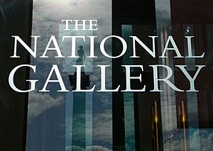
- National Gallery: The National Gallery in London used Bembo for its corporate font, even for the carving of its name on the building.
- Yale: Yale University uses a custom font called Yale, designed by Matthew Carter. It's also based on Griffo's work. Yale created this font because they weren't happy with the digital versions of Bembo. This font is only for Yale students and staff.
See also
 In Spanish: Bembo para niños


