Edward Tufte facts for kids
Quick facts for kids
Edward Tufte
|
|
|---|---|

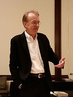
Tufte (age 73) during his one-day course in Dallas, May 21, 2015
|
|
| Born | March 14, 1942 Kansas City, Missouri |
| Occupation | Professor, statistician, writer, sculptor |
| Nationality | American |
| Education | Stanford University (BS, MS) Yale University (PhD) |
| Notable works |
|
| Scientific career | |
| Thesis | The Civil Rights Movement and Its Opposition (1968) |
| Doctoral advisor | Robert Dahl |
Edward Rolf Tufte (born March 14, 1942), also known as "ET," is an American statistician and a retired professor from Yale University. He taught subjects like political science, statistics, and computer science. Tufte is famous for his ideas on how to design information and is a leader in the field of data visualization. This means he helps people understand how to show information clearly using pictures and charts.
Contents
Edward Tufte's Early Life and School
Edward Rolf Tufte was born in 1942 in Kansas City, Missouri. His parents were Virginia and Edward E. Tufte. He grew up in Beverly Hills, California, where his father worked for the city for many years. Edward Tufte went to Beverly Hills High School.
He studied at Stanford University, where he earned degrees in statistics. Later, he went to Yale University and got his PhD in political science. His big research paper in 1968 was about "The Civil Rights Movement and Its Opposition."
Edward Tufte's Career Journey
In 1967, Tufte started teaching at Princeton University. He taught about how politics and money work together, and how to analyze data. He wrote three books about political science that used a lot of numbers and facts.
How Tufte Started with Information Design
In 1975, while at Princeton, Tufte was asked to teach a statistics class. This class was for journalists who were studying economics. He created special lessons on how to use graphics to show statistics. He also taught these lessons with a famous statistician named John Tukey. These lessons became the basis for Tufte's first book about information design.
In 1977, Tufte moved to Yale University. There, he became a professor of political science, statistics, and computer science. He also worked at the Yale School of Art.
Publishing His First Big Book
After trying to work with big publishers, Tufte decided to publish his book, The Visual Display of Quantitative Information, himself in 1982. He worked closely with a graphic designer named Howard Gralla. Tufte even took out a loan on his house to pay for the book! The book quickly became very popular. This success helped Tufte become known as an expert in information, not just a political scientist.
In 1999, after 22 years at Yale, he became a retired professor. On March 5, 2010, President Barack Obama asked Tufte to join a special panel. This panel helped make sure that money from the American Recovery and Reinvestment Act was used clearly and correctly.
Edward Tufte's Work with Infographics
Tufte is an expert at showing information using infographics, like charts and diagrams. He is a member of the American Statistical Association. He has also received special awards from groups like the Solomon R. Guggenheim Foundation.
What is Information Design?

Tufte's ideas are very important in fields like information design. This is all about how to show information visually so people can understand it easily. He created the word chartjunk. This term means useless or confusing things in charts that make it harder to see the real information.
Tufte also talks about the lie factor, the data-ink ratio, and the data density of a graphic.
Understanding Data-Ink Ratio
The "data-ink ratio" is one of Tufte's ideas. He says you should avoid too much decoration in charts. In his book, he explains that sometimes decoration can help tell a story, but it's wrong to change the data itself just to make it look pretty. The ink that shows the numbers should be clear and not hidden by extra designs.
Tufte believes that good illustrations should show all the available data. When you look closely, you can see every single piece of information. But when you look generally, you can see the big trends and patterns. He suggests that these detailed and overall views should be easy to see at a glance, especially on a printed page.
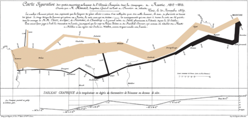
Tufte uses many old examples to show his points. These include John Snow's map of a cholera outbreak, Charles Joseph Minard's Carte Figurative (a map showing Napoleon's army), and Galileo Galilei's Sidereus Nuncius (his book about space). He also looks at Maya Lin's Vietnam Veterans Memorial. For example, he shows how listing the names of soldiers on the memorial in time order is more powerful than listing them alphabetically. This way, each soldier's sacrifice is highlighted within the story of the war.
Why PowerPoint Can Be Tricky
Tufte has often talked about how Microsoft PowerPoint is used. In his essay "The Cognitive Style of PowerPoint," he points out several problems:
- It's often used to help the person giving the talk, not to help the audience learn.
- The charts and tables are too simple. This was because old computer screens had low quality.
- Ideas are forced into a fake "outline" structure. This structure then has to be repeated on every slide.
- The audience has to follow the slides in a strict order. With printed handouts, people could look at things in any order they wanted.
- The text and chart designs are often bad. This is because presenters are not designers or use bad templates. It's especially hard to show scientific numbers.
- It makes thinking too simple. Ideas are squashed into bullet points. Stories with a beginning, middle, and end become just a list of separate points. This can make things seem more scientific and neutral than they really are.
Tufte even mentioned how NASA engineers used PowerPoint before the Space Shuttle Columbia disaster. He said it was an example of PowerPoint's problems. The software's style is made to convince people, not to share technical details. Tufte's ideas about a NASA PowerPoint slide were even included in the report about the disaster. He noted that an important engineering detail was hidden in small text on a crowded slide. If it had been shown in a regular engineering report, it might have been noticed, and the disaster could have been avoided.
Tufte believes that the best way to share information in a technical meeting is to give everyone a short written report. People can read this report in the first 5 to 10 minutes of the meeting. He thinks this is the fastest way to share knowledge. Then, the rest of the meeting can be used for discussion and questions.
Using Small Multiples for Comparison
One way Tufte suggests comparing many things quickly is using a small multiple. This is when you have many charts that show different information, but they are all placed next to each other. This can be easier to read than trying to put all the information on one chart. It's especially helpful when the charts measure different things (like temperature and rainfall) but over the same time period.
What are Sparklines?
Sparklines are a small, simple way to show trends and changes. They can show things like average temperature or stock market activity. They are often put right into the text, like this: The Dow Jones index for February 7, 2006 ![]() . Sparklines are often used as part of a small multiple, with several lines together. Tufte says a sparkline is like a "word" that gives a lot of information without stopping the flow of a sentence. The first known sparklines were created in 1998 by Peter Zelchenko and Mike Medved.
. Sparklines are often used as part of a small multiple, with several lines together. Tufte says a sparkline is like a "word" that gives a lot of information without stopping the flow of a sentence. The first known sparklines were created in 1998 by Peter Zelchenko and Mike Medved.
Edward Tufte's Sculpture Work
Besides his teaching and writing, Tufte has also created sculptures. These are often large outdoor artworks made of metal or stone. He first showed many of these on his own property in rural Connecticut. In 2009–2010, some of his art was shown at the Aldrich Contemporary Art Museum in Ridgefield, Connecticut. This show was called Edward Tufte: Seeing Around.
Hogpen Hill Farms: A Sculpture Garden
Hogpen Hill Farms is a large, 234-acre sculpture garden in Woodbury, Connecticut. It belongs to Tufte and is open to the public on summer weekends.
ET Modern Art Gallery
In 2010, Edward Tufte opened an art gallery called ET Modern. It was located in New York City's Chelsea Art District. The gallery closed in 2013.
See also
 In Spanish: Edward Tufte para niños

