History of Western typography facts for kids

Typography is the art of arranging text to make it easy to read and visually appealing. It has a very long history. Its roots go back to ancient times when people used punches and dies to make seals and coins.
The basic ideas of typography are as old as civilization itself and the first writing systems. Many key steps came together to form this craft. While woodblock printing and movable type were first used in East Asia, typography in the Western world grew after Johannes Gutenberg invented the printing press in the mid-1400s. Printing quickly spread across Germany and Italy. This led to the lasting use of blackletter, roman, and italic type styles.
Contents
Early Printing: Medieval Roots
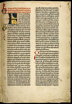
Typography, making type, and designing fonts all started in Europe in the mid-1400s. This was when the printing press with movable type was invented. It was a time between the medieval era and the Renaissance.
The first typefaces were based on the beautiful handwritten letters of the time. A style called textur, or textualis, was popular in Germany. It had a strong Gothic look. This style became the model for the first printed text.
Around 1450, Johannes Gutenberg invented a way to make lead type. He used it for an alphabet of about 24 letters. He also used existing press technology to print ink on paper. Before this, printing was done with woodblocks. But wood was too fragile for small, movable letters.
Gutenberg hired a scribe named Peter Schöffer. Schöffer helped design and cut the letter punches for the first typeface. This typeface had 202 characters and was used for the first printed books in Europe. Another typeface, with about 300 characters, was made for the Gutenberg Bible around 1455.
German printers kept using the Gothic/blackletter style. But in Italy, printing also began. The Italian style was influenced by humanism and classical ideas. This led to four new blackletter styles: Bastarda, fraktur, rotunda, and Schwabacher. Early printed books looked like handwritten manuscripts. They did not have title pages, page numbers, or headings.
Printing with movable type quickly spread across Europe. This led to more Gothic and mixed Gothic-to-Roman typefaces. For example, Johann Bämler's Schwabacher appeared in 1474. The Rotunda type of Erhard Ratdolt was made around 1486 for Venetian tastes. In 1476, William Caxton printed the first books in England. He used a Bâtarde type but soon stopped using it.
Early printers in Spain were Germans. They first used Roman types but soon switched to Gothic typefaces. These were based on Spanish handwritten letters. The first press in Spain was in Valencia in 1473. Printing in Portuguese started in Lisbon in 1495.
Classical Revival in Italy
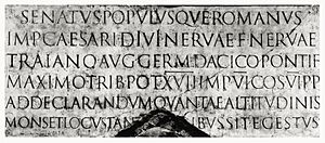
In Italy, the heavy Gothic styles soon changed. They were replaced by "Venetian" or "old style" Latin types, also called antiqua. The capital letters carved on Roman buildings and monuments were very important. These inscriptional capitals were designed using geometric rules.
Their perfect design, careful carving in stone, balanced thick and thin lines, and carved serifs became the ideal for Western civilization. The most famous example is on the base of Trajan's Column, carved around 113 AD.
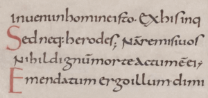
Italian scribes and humanist scholars in the early 1400s loved classical culture. They looked for ancient lowercase letters to go with the Roman capitals. Most old manuscripts had been rewritten during the Carolingian Renaissance. Humanist scribes thought Carolingian minuscule was the true ancient writing style. They copied it almost exactly, mixing it with Roman capitals.
But these two styles didn't match well. So, scribes redesigned the Carolingian letters. They made the ascenders (parts that go up) and descenders (parts that go down) longer. They also added carved serifs and finishing strokes. This made them fit better with the Roman capitals. By the time movable type came to Italy, this humanistic writing had become a consistent style. We know it today as humanistic minuscule, and it was the basis for the Venetian type style.
From Humanistic to Roman Type
The city of Rome attracted the first printers outside Germany. These were Arnold Pannartz and Konrad Sweynheim, followed by the brothers Johann and Wendelin of Speyer and the Frenchman Nicolas Jenson. These printers used types ranging from Gothic to fully developed Roman styles. Within a few years, Venice became the main printing center in Italy.
Before 1472 in Venice, Johann and Wendelin printed with a type called "Gotico-antiqua." This design mixed simplified Gothic capitals with a humanistic lowercase alphabet. It blended Gothic and Carolingian styles.
Around the same time (1468) in Rome, Pannartz and Sweynheim used a typeface called "Lactantius." It closely copied humanistic minuscule. Unlike the stiff Gothic forms, Lactantius had smooth, flowing letters. Its 'a' letter was different from both Carolingian and Gothic styles.
For more details on how lowercase letters developed from Latin capitals, see Latin alphabet.
Developing Roman Type
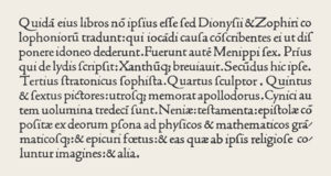
Nicolas Jenson started printing in Venice with his own Roman font in 1470. Jenson's design, and similar ones by Francesco Griffo (around 1499) and Erhard Ratdolt (around 1486), are seen as the most important Roman typefaces. They set the standard for most Western text fonts that came after them.
Jenson's Roman type was designed specifically for printing. It did not try to look exactly like handwriting. It looked unified and complete. Jenson took the strong structure of Roman capitals and applied it to humanistic lowercase letters. He did this by making them abstract and stylish. The serifs (small lines at the end of strokes) were carefully designed to be a bit uneven. The length of the ascenders and descenders, and the space between lines, made the text look balanced. Jenson also used "white space" (the empty areas) around the letters to make the page look dynamic.
The name "roman" is usually not capitalized. This helps tell these early types from the ancient Roman letters. Some parts of Europe call Roman type "antiqua" because it's linked to the humanistic "lettera antica." "Medieval" and "old-style" also refer to Roman types from the late 1400s, especially those used by Aldus Manutius. Roman fonts based on Speyer and Jenson are also called Venetian.
Italic Type
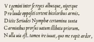
The Renaissance brought a new style of formal writing called "cursiva humanistica." This slanted, quickly written letter came from humanistic minuscule and other Gothic cursive hands in Italy. It became the model for cursive or italic typefaces. As books printed with early Roman types became popular, cursiva humanistica was used more for writing by hand. People liked cursive writing, which may have created a demand for this style in print. A bigger reason was probably the printing of small, pocket-sized editions of Latin classics by Aldus Manutius. Even as printing grew, more people learned to read. This meant more demand for documents, so calligraphers (people who write beautifully by hand) had more work.
The "Aldino" italic type was made for Manutius by Francesco Griffo in 1499. It was a compact type with letters placed close together. Griffo's punches were a delicate copy of Italian cursive handwriting. The letters had different slant angles and uneven heights. Some letters were connected (ligatures), and the small Roman capitals were not slanted. Aldus Manutius and his books became famous, so Griffo's italic was widely copied and very influential. It quickly became known as "italic" because it came from Italy.
Around 1527, Ludovico Arrighi, a scribe for the Vatican, designed a better italic type. His italic had a more organized structure and fewer ligatures. This made it less of a direct copy of handwriting than Griffo's. It had slightly taller Roman capitals, a gentler slant, and wider spacing between lines. This gave it an elegant look, like refined handwriting.
Many Italian books from the 1500s were printed with italic types. But by the mid-1500s, italic types were used less for long texts. They were mostly used for quotes, special text, emphasis, and abbreviations. Italic types from the 1900s to today owe a lot to Arrighi and his influence on French designers.
The Renaissance idea of using both Roman and italic types was described as "The model and ideal for the whole western world." Venice was a leader in type design, but this ended with political problems in Italy, like the sack of Rome in 1527.
Renaissance Germany and Switzerland
After 1500, Roman typefaces became popular north of the Alps for printing Latin books. Johann Froben of Basel, Switzerland, started his press in 1491. By about 1519, he had set standards for humanistic printing. These were copied widely in German-speaking areas, Spain, and to some extent, England. His main type was Roman in shape but still had a hint of Gothic influence. It was used with woodcut initial letters and larger capital letters for title pages. Froben was the first to use these larger "display typefaces" consistently. He developed the title page as a complete artistic design. Froben's italic type was based on Aldus's but was more even. These Swiss books were the first to be designed completely as printed items, not just copies of manuscripts.
After about 1550, French influence slowly took over this Swiss/German tradition. By the late 1500s, the Wechel family in Frankfurt (who had been in Paris) made beautiful books. They used French typefaces with rich woodcut decorations. But after 1600, the quality of German printing declined. It did not recover until the 1900s.
16th Century France
German printers Martin Crantz, Michael Freyburger, and Ulrich Gering brought typography to France. They set up a press in Paris in 1470. They used a copy of the Lactantius type. Gothic types were common in France until the late 1400s. Then, Roman designs slowly replaced them. Jodocus Badius Ascensius and Henri Estienne started a press in Paris in 1503. They printed with early Roman and half-Gothic types. They were busy meeting the demand for humanistic and classical texts. So, they didn't design their own original types. French books started to follow the style of Italian printers. Lyon and Paris became the new centers for printing. Eventually, the French government set a standard height for all type. This made sure different batches of type could be used together.
French Type Designers: De Colines, Estienne, and Augereau
After invading Italy in 1494, the French were greatly influenced by Renaissance culture. They began to change French culture from Gothic to neo-classical. Changes to the French language slowed down type design in France until the late 1520s. Then, Roman types from Robert Estienne, Simon de Colines, and Antoine Augereau started a new phase of French type design. Robert Estienne continued his father Henri Estienne's business after his father died in 1520. Simon de Colines had been the elder Estienne's assistant. He married his widow and started his own press.
The de Colines Roman type of 1531 looked like Griffo's 1499 Roman but was not an exact copy. It had narrower letters and tighter spacing. The 'a' had a low-angled bowl. The 'i', 'j', 'm', 'n', and 'r' had raised triangular serifs. The baseline serifs were flattened. The ascender serifs were delicate. These graceful, flowing lines defined the French style. Robert Estienne's Roman type of 1532 was similar to de Colines's. Estienne added a fine italic type based on Arrighi's. The people who cut the punches for Estienne's and de Colines's Roman types are unknown. In 1532, Antoine Augereau cut punches for a Roman type very similar to Estienne's. The lowercase letters of Estienne's and Augereau's types became the basis for "old style" typography after the Renaissance. French typographers copied them for the next 150 years.
Garamond: A Famous Name in Type
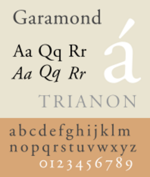
The elegant French style reached its peak with the Roman types linked to Claude Garamond (also spelled Garamont). He is the most famous person in French typography. In 1541, Robert Estienne, the king's printer, helped Garamond get jobs. He cut a series of Greek fonts for King Francis I of France, known as the "grecs du roi". We know for sure that Garamond cut the punches for some Roman fonts used in his publishing. Based on when they appeared and how similar they are to types used by Estienne, Christoffel Plantijn, and André Wechel, the types called "Canon de Garamond" and "Petit Canon de Garamond" are believed to be Claude Garamond's final Roman types. These were shown on a sample sheet from the Egenolff-Berner foundry in 1592.
Robert Granjon: Italic Innovator
Robert Granjon worked in the second half of the 1500s, mostly in Lyon. He also worked in Paris, Rome, and Antwerp. He is famous for his Civilité types, which copied French Gothic cursive handwriting. His most important contribution was an italic type called "Parangon de Granjon." Italic type design had changed since the Arrighi and Aldine models. Granjon's italic had a steeper slant, slanted Roman capitals, and was lighter. These features, along with its strong contrast between thick and thin strokes, made it look striking but hard to read. Still, it was the main influence for italic type design until the Arrighi model was brought back in 1920.
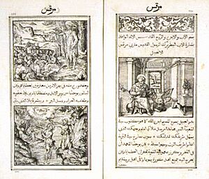
In the 1500s, Western printers also developed types for Oriental languages. For example, François Savary de Brèves and Robert Granjon made these. They often did this to spread the Catholic faith.
Changing Styles: 17th and 18th Century Type
New art styles like Baroque and rococo, along with the use of pointed pens for writing and steel engraving, slowly changed typographic style. The difference between thick and thin strokes became greater. Slanted stressing became vertical. Round shapes became more compressed. Blunt, bracketed serifs became sharp and delicate, turning into thin, straight lines. Details became clean and precise.
Transitional Roman types mixed the classical features of lettera antiqua with the vertical stressing and higher contrast of the "modern" Roman types that would come later.
Around 1618, the Dutch printing company Elzevir in Leyden used Roman types that looked like the 16th-century French style. They had higher contrast, were less strict, and made the page look lighter. After 1647, most Elzevir fonts were cut by the respected Christoffel van Dyck. Some experts at the time thought his precise work was even better than Garamond's.
Fell Types: English Printing
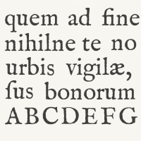
From the mid-1500s to the late 1600s, the English Crown interfered with printing. This stopped the development of type founding in England. Most type used by English printers in the 1600s came from Holland. Because of this lack of materials, the Bishop of Oxford, Doctor John Fell, bought punches and matrices (molds) from Holland around 1670–1672. He used them for the Oxford University Press.
These "Fell types" were likely made by the Dutch punchcutter Dirck Voskens. They were a big change from earlier designs. They had much shorter ascenders and descenders, higher contrast in strokes, narrower round letters, and flattened serifs. The design still had some old-style unevenness and angled stressing. Fell capitals were condensed, even-width, with wide flattened serifs. These were all features of the "modern" Roman types of the late 1700s. Fell italic types had high contrast, wide ovals, and long, flat serifs. They had an uneven slant, like French models.
A modern digital version of the Fell Types has been made available by Igino Marini.
Caslon: A Global Influence
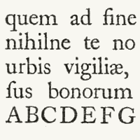
The first important person in English typography was William Caslon. He was a gun engraver who became a punchcutter. He spent 14 years creating the collection of typefaces shown on his sample sheet in 1734. This collection included Roman, italic, Greek, Hebrew, and Arabic types. Caslon's Great Primer Roman and English Roman were older designs. They closely followed the Fell types and the Roman type of Miklós Tótfalusi Kis (which was wrongly thought to be by Anton Janson). Caslon's serifs were slightly bracketed, and his old-style unevenness was not new. But his precise cutting and straightness made the letters very readable. Caslon's italic structures followed the Fell italics.
William Caslon's huge output influenced the whole world. Caslon type and its copies were used across the British Empire. It was the main type in the thirteen American colonies (brought by Benjamin Franklin) in the late 1700s. It was even used for the United States Declaration of Independence. Caslon's work marked England's rise as a center for typography.
Fleischmann: A New Modern Look
Joan Michaël Fleischman (1701–1768) was born in Nürnberg and trained as a punchcutter. He worked for Dutch type founders in Holland around 1728. At the Enschedé foundry in Haarlem, he cut many punches. After 1743, he created a special Roman design. It was related to earlier transitional types but was also different. It hinted at modern Roman types with thin lines and ball-ends. Fleischmann was inspired by the "Romain du Roi" type, which was made for Louis XIV in 1692. But he didn't copy it exactly.
Fleischmann's capitals were new. They had an even width, compressed rounds, vertical stressing, and triangular ends on 'E', 'F', 'L', 'T', and 'Z'. These features all pointed to the "classical" modern types of Bodoni and Didot. Fleischmann's italic looked a bit like Granjean's.
Fleischmann was highly respected by others in his time. His designs had a big impact in the late 1700s. The famous French punchcutter Pierre Simon Fournier (1712–1768) admitted to copying Fleischmann's design. Fournier was the first to call "contrast" types like Fell's, Caslon's, and Fleischmann's "modern." Fournier's rococo-influenced designs, Fournier and Narcissus, and his Modèles des Caractères (1742) continued the romaine du roi style. His italics were inspired by handwriting and engraved lettering called copperplate hand. Fournier also published a two-volume Manuel Typographique. In it, he recorded much European typographic history. He also introduced the first standard system for measuring type size, the "point".
Baskerville: Elegant and Strong
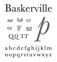
Around 1751, John Baskerville became successful making metal goods. He then moved into the printing business. His Roman and italic types appeared later than Fleischman's. They are considered transitional and somewhat old-fashioned. They returned to lower contrast, smooth modeling, finely made bracketed serifs, and long stems. However, the beautiful design of Baskerville's Roman type, combining elegance and strength, was modern. His Roman design, especially his italic, was influenced by rococo style. His letterforms were a planned step between old-style and modern styles. They were shaped by his past as a writing master and the influences of his time.
The types of Joseph Fry, Alexander Wilson, and John Bell closely followed Baskerville's. Through his letters with European type founders, Baskerville's influence spread across most of Western Europe. Baskerville was a careful artist. He controlled every part of his work. He designed more accurate presses, blacker inks, and paper sealed with hot rollers. This ensured clear impressions. A special detail is that the lower loop of his lowercase 'g' does not fully close. Modern versions of Baskerville often have this feature. A modern font called Mrs Eaves is named after Baskerville's mistress and later wife, Sarah Eaves.
Modern Roman Types
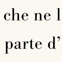
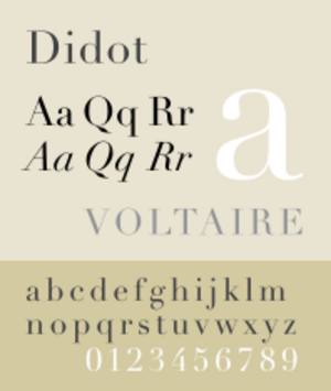
Truly modern Roman types arrived with the fonts of the Italian Giambattista Bodoni and the French Didots. They continued trends started by Fell types, Fleischman, Fournier, and Baskerville. These "classical" modern Roman types avoided handwritten and organic influences. Their balanced, geometric design followed the logical ideas of René Descartes and Isaac Newton.
These modern Roman types are called "classical" because they returned to long ascenders and descenders. They were set on widely spaced lines, making the page look light, like old-style types. This happened during a time when classical styles were popular again.
Bodoni was a leader in moving from rococo to the new classical style. He made an italic type very similar to Baskerville's. He also made a French cursive script type that was between italic and joined scripts. The Roman types of Francois Ambroise Didot and his son Firmin Didot looked very much like Bodoni's work. People disagree about whether the Didots or Bodoni created the first modern Roman types. In any case, the Didots' mathematical precision and lack of rococo design showed the "enlightenment" of post-revolution France under Napoleon. Francois Ambroise also designed "maigre" (thin) and "gras" (bold) types. These were like later condensed and expanded font formats.
The Spanish designer Joaquín Ibarra's Roman type was influenced by Baskerville, Didot, and Bodoni. But it was closer to old-style and used in a classical way, including spaced capitals. In England, modern Roman types similar to Bodoni's were cut for the printer William Bulmer around 1786. These were made by the punchcutter William Martin, who had learned from Baskerville. Martin's italic type had the open-tail 'g' and overall elegance of Baskerville's.
In Britain and the United States, modern Roman types (appearing around 1800 and very popular by the 1820s) were more rounded and less geometric than Didot's and Bodoni's designs. One clear difference is that in Anglo-American fonts, the uppercase 'C' has only one serif (at the top). In European designs, it has two.
19th and 20th Century Typography
Industrialization and New Typefaces
The 1800s brought fewer new styles but many technical inventions. A key invention was typefaces with stronger serifs. Early examples were the Egyptienne fonts, used from the early 1800s. Their name likely came from Napoleon's interest in the Middle East. Slab-serif fonts (like Clarendon from 1845) were often used in newspapers. Their serifs were made stronger to prevent damage during printing.
Stylistically, slab-serif fonts of the mid-1800s looked very strong. They had neo-classical design features that changed over time. By adding slab serifs to more and more typefaces, a new group of fonts appeared in the 1900s. Now, slab serifs are listed as their own group in most typeface classifications, separate from "serif" and "sans serif" (without serifs).
Slab-serif and sans-serif types were rarely used for long texts. They were mainly for advertisements, title pages, and other eye-catching print. By about 1820, most Western countries used modern Roman and italic types for continuous texts. This continued until the 1860s, when "old style" fonts became popular, mostly in English-speaking countries. These were the opposite of modern faces. "Thick" strokes were thinner, and serifs on thin strokes (like in C, E, L, and T) were narrow and angled. All uppercase letters were somewhat "condensed" (narrower). Old style fonts remained popular until about 1910.
The 1800s were very innovative in technical ways. Automatic manufacturing changed printing and illustrations. The lithography technique, invented by Alois Senefelder, made illustrations much more standardized. Finally, photography emerged in the late 1800s. This led to the first halftoning and reproduction methods.
The growth of a modern mass society created a rising demand for printed materials. Besides traditional books, newspapers and a large market for publications, advertisements, and posters appeared. Printing and typography had been simple crafts for centuries. Now, they had to face the challenges of an industry-driven mass society.
Hot Type and Phototypesetting in the 20th Century
The 90 years between 1890 and 1980 shaped typography as we know it today. Printing became a huge industry.
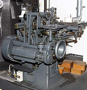
Making and using typefaces were more and more affected by industrial manufacturing processes. Important inventions were the hot type machines. These included the Linotype machine (1886) by Ottmar Mergenthaler and the Monotype machine (1887) by Tolbert Lanston. A few decades later, phototypesetting appeared. This meant that text could be set and designed using keyboards, instead of by hand.
Industrialization led to an incredible number and spread of new typefaces. Whether digital versions of Garamond and Bodoni, or new designs like Futura, Times, and Helvetica, almost all typefaces used today come from this time or are based on designs from this period. This was possible because large type foundries and manufacturers appeared. Successful typefaces quickly became like a "branding" for products or publications.
Chicago contributed a lot to typography design then. Frederic Goudy, who designed 123 typefaces, started several presses. Oswald Cooper, who designed Cooper Black, studied under Goudy.
Besides traditional book typography, graphic design became a separate field. The differences between these two fields greatly influenced the style of 20th-century typography.
Art Nouveau and New Book Art
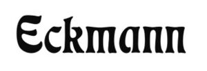
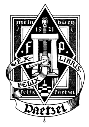
Since impressionism, modern art styles also appeared in graphic design and typography. Around 1890, art nouveau became popular. Its floral designs, curved shapes, and focus on graphics inspired type designers in the early 1900s. A popular art nouveau font was Eckmann, designed by artist Otto Eckmann. Art nouveau also influenced many book illustrations and ex libris designs.
Overall, there was a stronger return to the basics of book art around the early 1900s. This was started by British typographer, socialist, and private press publisher William Morris and the Arts and Crafts Movement. This movement led to three main things: a return to the old Roman type models of the Renaissance, clear and simple book illustrations, and straightforward technical processes for making printed materials. A direct result of the Arts and Crafts Movement was the growth of the private press movement. This movement followed Morris's ideas, and parts of it still exist today.
The New Book Art movement, which formed before World War I, was especially influenced by the Arts and Crafts Movement. Young type designers of that time, like Fritz Helmuth Ehmcke and Friedrich Wilhelm Kleukens, rejected both the old classical typography and the decorations of art nouveau. The new ideal was clean and simple book typography, inspired by Renaissance ideas. Walter Tiemann in Leipzig, Friedrich Hermann Ernst Schneidler in Stuttgart, and Rudolf Koch in Offenbach were teachers who guided this type of typography. They remained important in book typesetting long after World War II.
European Avant-Garde Typography
In the 1920s, typographers in central and eastern Europe experimented with new forms of avant-garde typography. The main places where these artists developed were Budapest, Zagreb, Belgrade, and after 1924, Prague. However, after 1925, avant-garde typography spread to cities across Europe.
In 1924, two important exhibitions for avant-garde typography were held. One was by Ljubomir Micić in Belgrade. The other was by Ion Vinea and Marcel Iancu.
Avant-Garde Typography in Poland
Important Polish artists included Władysław Strzemiński and Mieczysław Szczuka. They focused on poetry and valued the art of publishing books more than other art forms. Władysław Strzemiński is seen as a pioneer of avant-garde typography in Poland. He was one of the first artists to change the basic shape of letters. He believed the way something was presented was more important than the content itself. To understand a poster or cover, you had to understand what the artist wanted to say with the arrangement of words or letters. Inscriptions were designed to catch the eye. This was different from "traditional" typography, which was just seen as an addition to text. Architecture also became less of an inspiration. Avant-garde artists got their ideas from paintings and graphics. Jan Tschichold, a key thinker of avant-garde typography, said its basic rules should be no symmetry, lots of contrast, and total creative freedom. Unlike other art forms, avant-garde creators were also their own theorists and researchers.
See also
General
- Movable type
- Printing
- Printing press
- Punchcutting
- Typesetting
- Typometry (printing)
- Typography
- VOX-ATypI classification
Related history
- History of printing in East Asia
- History of sentence spacing
- Printing and the Mind of Man
- Spread of European movable type printing


