Jan Tschichold facts for kids
Quick facts for kids
Jan Tschichold
|
|
|---|---|
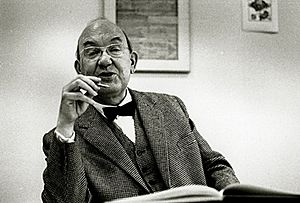
Jan Tschichold in 1963
|
|
| Born |
Johannes Tzschichhold
April 2, 1902 Leipzig, Germany
|
| Died | August 11, 1974 (aged 72) Locarno, Switzerland
|
| Occupation | Calligrapher, typographer, book designer |
Jan Tschichold (born Johannes Tzschichhold, also known as Iwan Tschichold, or Ivan Tschichold; 2 April 1902 – 11 August 1974) was a talented calligrapher, typographer, and book designer. He was very important in shaping graphic design in the 20th century. First, he helped create and spread modern ideas about how text should look. Later, he actually went back to more traditional styles. His work for Penguin Books after World War II set an example for how companies could create a clear visual style. He also designed the well-known Sabon typeface.
Contents
Early Life and Training
Jan Tschichold was the son of a sign painter. He learned calligraphy, which is the art of beautiful handwriting. In 1919, he started studying at the Leipzig Academy of Arts. He was so good that he quickly became a top student of Walter Tiemann, who designed fonts. Tschichold even helped teach his fellow students.
At the same time, he started getting his own design jobs. By 1923, he had his own business, helping print shops with their typography. His background in art and calligraphy was different from many other designers of his time. Most others had studied architecture or fine arts. This might be why he preferred to use ready-made fonts and commercial papers instead of custom-made ones.
New Ideas in Typography
Even though Tschichold had mostly worked with old-fashioned typography, his ideas changed a lot after he visited the Bauhaus exhibition in Weimar. There, he met artists like László Moholy-Nagy and El Lissitzky. These artists were trying out new and bold ways to break away from traditional typography rules.
Tschichold liked this idea of finding new ways to express art. He wanted to work in a more experimental way, but also keep things simple and practical. He became a key person in what was called the "new typography." In 1925, he wrote an important article called "Elemental Typography." In it, he explained his new ideas in a clear way.
Life During Difficult Times
After Adolf Hitler came to power in Germany, designers had to register with the government. Teachers who had modern ideas were in danger. Tschichold had started teaching in Munich. Soon, he and his colleague, Paul Renner, were accused of being "cultural Bolshevists," which was a term used to criticize modern art.
In March 1933, Tschichold and his wife were arrested. Police found posters from the Soviet Union in his home, which made them suspect him of working with communists. The secret police, called the Gestapo, took all copies of his books. After six weeks, a policeman helped him get tickets to Switzerland. In August 1933, he and his family escaped from Nazi Germany.
Tschichold lived in Switzerland for the rest of his life. He did visit England twice for longer periods. In 1937, he was invited by the Penrose Annual, a design publication. From 1947 to 1949, he worked for Penguin Books at the invitation of British typographer Ruari McLean. Jan Tschichold passed away in a hospital in Locarno in 1974.
Designing Books and Fonts
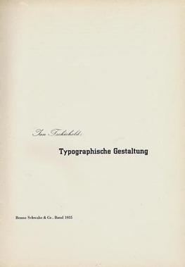
After visiting the Bauhaus exhibition in 1923, Tschichold became a strong supporter of Modernist design. He wrote an important book in 1928 called Die neue Typographie (The New Typography). This book was like a rulebook for modern design. In it, he said that only sans-serif fonts (called Grotesk in Germany) should be used. He also liked designs that were not centered, especially on title pages. He created many other rules for modern design.
Tschichold also suggested using standard paper sizes for all printed materials. He clearly explained how to use different sizes and weights of type to share information quickly. After this book, he wrote several guides about modern typography. These guides were very helpful for printers and designers in Germany.
However, over time, Tschichold started to change his mind. From about 1932, he began to move away from his strict modern ideas. He even designed a font called Saskia in 1932 that used classical Roman typefaces. Later, he said that Die neue Typographie was too extreme. He even criticized modern design in general, saying it could be too strict.
Between 1947 and 1949, Tschichold lived in England. There, he helped redesign 500 paperback books for Penguin Books. He created a set of rules for how Penguin's books should look, called the Penguin Composition Rules. He gave Penguin books, especially the Pelican series, a consistent look. He also made many typographic practices common that we use today. Even though he worked for a company that made cheap paperbacks, he still allowed each book's unique style to show through in its cover and title pages.
After the war, Tschichold lived in Switzerland, but he was not part of the new International Typographic Style that became popular there. He didn't like the new realist or neo-grotesque typefaces. He thought they were poorly designed.
Typefaces Designed by Tschichold
Between 1926 and 1929, Jan Tschichold designed a "universal alphabet." His goal was to simplify the German language by changing some spellings. For example, he created new characters to replace ch and sch. He also wanted to change eu to oi, w to v, and z to ts. Long vowels would have a special mark below them. This alphabet was designed to be used with a sans-serif font and had no capital letters.
Here are some of the typefaces Tschichold designed:
- Transit (1931)
- Saskia (1931/1932)
- Zeus (1931)
- Uhertype-Standard-Grotesk (1931) for an early phototypesetting machine. This was a changed version of Gill Sans.
- Sabon (1966/1967)
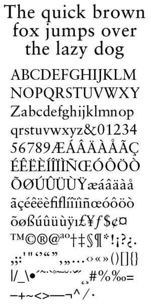
Sabon was designed so that it would look the same whether it was printed using Monotype or Linotype machines. This meant that all the type produced could be used together. One of the first times Sabon was used was by Bradbury Thompson for the Washburn College Bible. Later, a version called "Sabon Next" was released, which was a new take on Tschichold's original design.
|
See also
 In Spanish: Jan Tschichold para niños


