
Kerning facts for kids

Have you ever noticed how some words just look "right" on a page or screen? That's often thanks to something called kerning. Kerning is a special technique used in typography (the art of arranging text) to adjust the space between two letters. The main goal is to make text super easy to read and also look really nice.
When letters are kerned well, they look evenly spaced. No two letters are too close or too far apart. If the spacing is off, words can be hard to read. This makes the message unclear.
The main purpose of kerning is to make text more legible. Legible means easy to read. It also makes the text more attractive to look at.
A related idea is a typographic ligature. This is when two letters are joined together to fit better. For example, the letters "f" and "i" might be combined into a single character "fi". This makes them look smoother. In old printing, ligatures were physical metal pieces. They helped letters fit perfectly. It's like automatic kerning for certain letter pairs.
Contents
What is Kerning?
Kerning is all about the tiny spaces between letters. It's not about the space between words. It's about the space between individual characters. Think of it like a puzzle. Each letter needs its own perfect spot.
Why is Kerning Important?
Good kerning makes text flow smoothly. It helps your eyes read words quickly. Without it, letters might crash into each other. Or they might float too far apart. This makes reading a struggle. It can also make a design look messy.
Kerning vs. Tracking
Sometimes people confuse kerning with tracking. Tracking is different. Tracking changes the space for a whole group of letters or a word. Kerning only adjusts the space between two specific letters. Imagine you have a whole paragraph. Tracking would spread out all the letters in that paragraph. Kerning would only fix the space between, say, "A" and "V".
How Kerning Works
Kerning is often done by computer programs today. But skilled designers still check it. They look for awkward spaces. Some letter pairs always need kerning. Examples include "AV", "Wa", "To", or "LT". These pairs often have empty space next to them. Kerning fills that space.
Manual and Automatic Kerning
Many computer fonts have built-in kerning rules. This is called automatic kerning. It works well most of the time. But for headlines or logos, designers often use manual kerning. They adjust each letter pair by hand. This gives the best look. It makes sure the text is perfect.
Kerning in Daily Life
You see kerning everywhere. It's in books, magazines, and websites. It's on signs, posters, and product labels. Good kerning is often invisible. You don't notice it unless it's bad. When it's bad, words can look jumbled. Or they might have weird gaps.
Examples of Kerning
- "VA" – The "A" often tucks under the "V". This closes the gap.
- "To" – The "o" can fit under the "T". This makes the pair look tighter.
- "LT" – The "L" and "T" can leave a big gap. Kerning brings them closer.
Images for kids
-
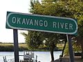
Some words are particularly difficult to space. The name of the Okavango River in southwest Africa is difficult because the letters AVA fit together well, but this makes the spaces on either side seem very large. Either wider or tighter letter spacing might help here.

See also
 In Spanish: Interletraje para niños
