1869 Pictorial Issue facts for kids
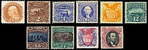
The 1869 Pictorial Issue was a special series of postage stamps released in the United States. These stamps came out in early 1869, right when President Grant started his time in office. There were ten different stamps at first, ranging from one cent to ninety cents. Most of them were released in March 1869.
Later, in May, the Post Office changed the 15-cent stamp. The first 15-cent stamp had a frame that wasn't quite right, so they added a diamond shape above the main picture. Stamp collectors consider this changed 15-cent stamp to be part of the same series, making it the eleventh stamp in the set.
Contents
What Makes These Stamps Special?
The word "pictorial" means "having pictures," and that's exactly what made these stamps so new and exciting! Before 1869, U.S. stamps almost always showed only pictures of dead leaders. But the designers of these stamps decided to try something different.
Only three stamps in this series showed famous people:
- The 1-cent stamp featured Benjamin Franklin.
- The 6-cent stamp showed George Washington.
- The 90-cent stamp had Abraham Lincoln.
The other seven stamps showed many different things.
Pictures of Travel and History
Some stamps showed how mail was delivered:
- The 2-cent stamp showed mail being carried by a horseback rider.
- The 3-cent stamp featured a locomotive (a train).
- The 12-cent stamp displayed a steamship.
Two other stamps showed important moments from American history, based on famous paintings:
- The 15-cent stamp showed John Vanderlyn's Landing of Columbus.
- The 24-cent stamp showed John Trumbull's Declaration of Independence.
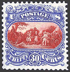
The 30-cent stamp was planned to show the British surrendering after the Battle of Saratoga in 1777. But at the last minute, the Post Office decided not to use this design, so they wouldn't upset the British. Instead, they used a design with an Eagle and Shield that had been used before, adding flags to it.
First Two-Color Stamps
Another amazing new thing about the 1869 Pictorials was that they were the first U.S. stamps printed in two colors! This was done for the stamps that cost 15 cents or more.
Printing two colors meant the paper had to go through the printing press twice. Sometimes, by mistake, the paper was put in upside down for the second printing. This created America's first "invert errors" – stamps where part of the design is upside down! These error stamps are very rare and valuable. For example, in 2011, three used invert stamps sold for a total of a quarter of a million U.S. dollars!
Why Collectors Love Them
For over a hundred years, stamp collectors have really liked the pictorial series. Many admire how bold the idea was to use pictures instead of just portraits. They also appreciate the detailed engraving work.
The 12-cent stamp, with its picture of the S.S. Adriatic ship, is often called especially beautiful. This ship was very fast, like a Concorde airplane of its time, but it wasn't very profitable.
Many collectors also feel a sense of history when they look at these stamps. The 3-cent locomotive stamp is quite common and affordable. For many, it was the first truly old stamp they could collect for their albums. Most other stamps in this series are rare, especially the higher values, which makes them very special to collectors.
How Were They Designed?
By early 1868, the stamps being used were quite old, and the printing plates were worn out. Also, these stamps reminded people of the Civil War, which was not a popular memory. The company that printed the stamps, the National Banknote Company, had a contract ending in February 1869. This meant the Post Office needed to find a new company to print stamps for the next four years.
This was a perfect time for the Post Office to plan a brand new series of stamps. They asked companies bidding for the contract to submit ideas for new stamp designs. The Post Office even suggested that the new stamps should have "variety in the sizes as well as the designs." While the sizes didn't end up being different, this idea might have led to the new shape and size of the pictorial stamps.
A Planned Series
The 1869 issue was the first time designers could plan a whole series of U.S. stamps together. They chose subjects and styles that would work well as a complete set. Earlier stamp series had grown bit by bit, without a clear plan. For example, the 1851-61 series started with just three stamps, and more were added without much thought. The 1861 series was made quickly to stop the Confederacy from using old U.S. stamps for money, so no new designs were made.
In contrast, the 1869 series was meant to tell a story about the history of the Post Office in the United States. It started with Benjamin Franklin, who was the first postmaster, and the early mail riders. Then it showed trains and ocean steamers that carried mail. It also included important scenes from early American history and pictures of George Washington and Abraham Lincoln.
Design Ideas and Changes
The National Banknote Company submitted its design ideas, called "essays", on July 22, 1869. Many of these designs were accepted with only small changes, like making the numbers bigger.
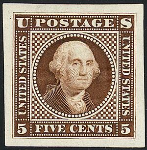
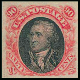
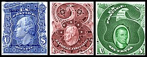
Some of the early ideas were quite different from the final stamps. For example, the first designs included George Washington on two stamps (a 5-cent and a 90-cent stamp). Washington had been on many stamps before, so this wasn't surprising. The 5-cent stamp was later changed to a 6-cent stamp, which was the first 6-cent stamp ever issued by the U.S. Post Office. The 90-cent Washington design was later changed to feature Lincoln.
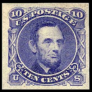
Originally, Lincoln was on the 10-cent stamp. The 30-cent stamp was planned to show "The Surrender of General Burgoyne at the Battle of Saratoga." But as mentioned, this design was removed because the Post Office worried it might offend the British. The 10-cent stamp then became the Eagle-and-Shield design. The 30-cent stamp also used the Eagle-and-Shield, printed in red, with blue flags and stars around it.
Many years later, in 1927, a different picture of the Battle of Saratoga appeared on a 2-cent stamp, and no one objected. In 1994, the original 1869 Burgoyne design was finally used on a stamp, but it was a one-dollar stamp and called "The Battle of Saratoga" to focus on the battle itself, not the British defeat.
Because the new pictorial stamps were a different size, the National Banknote Company used a smaller "grill" pattern on them. A grill is a pattern of tiny bumps pressed into the stamp to prevent people from washing off the ink and reusing them. This specific grill, called the "G-Grill," was only used on the 1869 issue.
What Happened Next?
The 1869 Pictorial Issue didn't stay around for long. People complained that the stamps were too small. So, for the next series of stamps in 1870, the Post Office made them much larger than ever before.
The Post Office decided to stick with the 1870 designs for a long time. They didn't dare to change the general look of U.S. stamps again until 1890. Pictures didn't appear on regular mail stamps again until 1893. Those 1893 stamps were special, celebrating the Columbian Exposition, and were meant to be temporary. After that, only national heroes were supposed to be on regular stamps.
It wasn't until the series of 1922–25 that the Post Office started putting pictures on regular stamps again. Even then, pictures were only on stamps that cost 15 cents or more. Lower-value stamps still showed presidents and other famous Americans.
Reprints and Modern Interest
The 1869 pictorials had a brief return in 1875. The Post Office reprinted many old stamps to show them at the Centennial Exposition in Philadelphia in 1876. Unlike their first release, collectors in 1876 loved these reprints!
The easiest way to tell the original 1869 stamps from the 1875 reprints is that the reprints have no grills. Also, a third version of the 15-cent stamp appeared in the reprints, similar to the first 1869 version but with some shading removed. Used reprints are much rarer than the original stamps. For example, there are about 5,000 used 90-cent original stamps, but only about 40 used 90-cent reprints.
Toward the end of the 1900s, the U.S. Postal Service became interested in the pictorials again. In 1989, they released a special sheet of stamps with four images of the 90-cent Lincoln stamp from 1869. One was in the original red and black colors, and the others were in different test colors.
Five years later, in 1994, two new stamps came out to celebrate the 125th anniversary of the pictorials. One was the Battle of Saratoga design, which had been planned for the 1869 30-cent stamp but never issued. It was now a one-dollar stamp. The other was a five-dollar stamp based on a very unusual diamond-shaped design that had been considered for the pictorials, showing both Washington and Jackson.


