Flag of Milwaukee facts for kids
 |
|
| Adopted | 1954 |
|---|---|
| Designed by | Fred Steffan |
The official flag of Milwaukee was chosen in 1954. It represents the city of Milwaukee, Wisconsin. Some people think it's not the best design. In 2004, a group that studies flags ranked it 147th out of 150 major American city flags.
Contents
What Does the Milwaukee Flag Look Like?
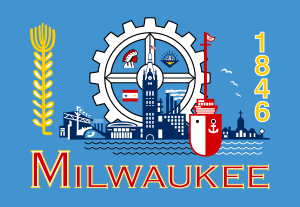
The flag has a medium blue background. It shows many symbols of Milwaukee. In the middle, there is a gear. This gear stands for industry and factories. Inside the gear are more symbols about Milwaukee's identity and past.
Symbols on the Flag
- An Indian head: This symbol looks like the old Milwaukee Braves baseball team logo. It represents the Native American people who lived there first.
- A flag with two stars: This might be a flag from the American Civil War. It could also be a service flag, honoring people who served in the military.
- A lamp: This symbol was once linked to the Milwaukee Public Library.
- Milwaukee City Hall: This building stands for the city's government.
- Other buildings: Next to City Hall are a church, a factory, and the old Milwaukee County Stadium.
- Golden barley stalk: On the left side, this plant represents Milwaukee's long history of brewing beer.
- Red ship with water: This shows that Milwaukee is a port city. It is located on a large lake and has a busy harbor.
How the Milwaukee Flag Was Chosen
The idea for a city flag first came up in 1897. A local newspaper held a contest. The winning design had an oak branch and the words "Steady Progress." The mayor liked it, but the flag was never used.
Finding a New Flag Design
In the 1950s, Milwaukee leaders found out something interesting. Their city was one of the few big cities without its own flag. So, they decided to hold another contest. Fred Steffan, a former city council member (called an alderman), helped create the flag. He took parts from some of the best ideas submitted in the contest. This is how the current flag was made.
Efforts to Redesign the Flag
People have tried to change the flag four times since it was adopted. The first three attempts to create a new design were not successful. As of 2016, a fourth new design was picked, but the city had not officially approved it yet.
Past Redesign Contests
In 1975, an employee from the Milwaukee Public Museum won a citywide contest. He won a $100 savings bond for his design. However, his flag was not chosen to be the official city flag.
In 2001, the Milwaukee Arts Board held another contest. They wanted new flag designs. More than 105 designs were sent in. But the board did not approve any of them. So, the old flag stayed.
In 2004, the North American Vexillological Association did a survey. This group studies flags. They rated Milwaukee's flag as the fourth worst among major U.S. cities. The symbols on the flag were common for the mid-1900s. They showed things like factories and farming.
The People's Flag of Milwaukee
In 2015, a local graphic designer named Steve Kodis started a new contest. It was called "The People's Flag of Milwaukee." This happened after a podcast called 99% Invisible talked about how unpopular the flag was.
More than 1,000 designs were submitted by the public. In 2016, five designs were chosen as finalists. Over 6,000 people voted online. A design called "Sunrise Over the Lake" got the most votes.
Meaning of the "Sunrise Over the Lake" Design
The rising sun over Lake Michigan symbolizes a new day. The light blue bars in its reflection represent the city's three rivers and three founding towns. Gold represents our brewing history and white symbolizes unity.
As of June 2016, the city had not yet decided to adopt this new design.
- Milwaukee, Wisconsin (U.S.) at Flags of the World


