Flow map facts for kids
A flow map is a special kind of thematic map that shows how things move from one place to another. Think of it as a mix between a regular map and a flow diagram. These maps use lines to show the movement of almost anything you can imagine, like people migrating, cars on a highway, goods being traded, or even data traveling through the internet.
Because there are so many different things that move, map makers have come up with many ways to design flow maps. Often, the thickness of the lines on the map changes to show the amount, or volume, of what's moving. A very thick line might mean a lot of traffic, while a very thin line might mean only a little.
Contents
The History of Flow Maps
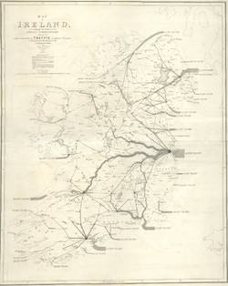
The first known maps to show the amount of flow were made by an engineer named Henry Drury Harness in 1838. He created maps showing how much cargo was moved on roads and canals in Ireland. This was to help decide where to build new railroads.
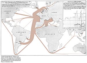
A few decades later, a French engineer named Charles Joseph Minard became a master at creating flow maps. In the 1850s and 1860s, he made many amazing maps on different topics. His most famous one, created in 1869, shows the French army's campaign in Russia in 1812. Many people call it "the best statistical graphic ever drawn" because it shows so much information in a simple way. It shows the path the army took, the number of soldiers, the temperature, and the dates.
In the 1980s, a geographer named Waldo Tobler began using computers to create flow maps. At first, computer-made maps weren't as good as Minard's hand-drawn ones. But today, with modern Geographic information system (GIS) and graphics software, it's much easier to design detailed and beautiful flow maps.
What Can a Flow Map Tell Us?
Flow maps can answer several questions about movement all at once:
- Origin and Destination: Where does the movement start and where does it end?
- Route: What path does it take to get there? The map can show the exact route or just a simple line connecting the start and end points.
- Type of Movement: What is being moved? It could be people, products, or even something like the temperature of an ocean current.
- Amount of Movement: How much is being moved? This is often shown by the thickness of the line.
- Direction of Movement: Which way is it going? Arrows are often used to show the direction of the flow.
- Speed of Movement: How fast is it moving? Some maps can show the speed of traffic or wind.
Flow maps are used to show all kinds of topics. In human geography, they can show human migration, travel, and trade. In physical geography, they can show how rivers flow, how wind moves, and the migration of animals.
Different Kinds of Flow Maps
Depending on what information is most important, map makers use different types of flow maps.
Origin-Destination Maps
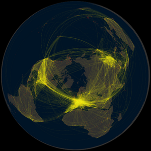
These maps are great for showing that a connection exists between two places. The most important thing is showing the start and end points, and often the amount of flow between them. A great example is an airline route map, which shows all the places an airline flies to from a certain city. The lines are usually straight or gently curved to make the map look clean and easy to read.
Distribution Maps
These maps show how something from one place is "distributed" to many other places. For example, a map could show how goods from a port city are shipped all over the world. A thick line starts at the origin and then splits into thinner branches that go to each destination. This shows both the routes and how the total amount is divided up.
Network Route Maps
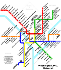
This type of map focuses on the actual paths that things travel along, like roads, railway lines, or shipping lanes. A map showing traffic on a city's highways is a good example. These maps can show the exact route or a simplified version, like a transit map for a subway system.
Mass Flow Maps
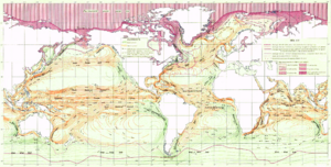
Some things don't move along clear paths. Instead, they flow across a whole area. Think about wind blowing or currents moving in the ocean. These are called mass flows.
To map these, map makers might draw many small arrows to show the direction and strength of the flow at different points. Another method is to draw streamlines, which are smooth lines that show the path the moving air or water takes. These maps are great for understanding weather patterns and oceanography.
How Maps Show 'How Much' is Moving
The most common way to show the amount of flow is by changing the thickness, or weight, of the lines.
Usually, the line's thickness is directly proportional to the amount of flow. This means if you double the amount of traffic, you double the thickness of the line on the map. This makes it easy for people to compare different amounts just by looking at the lines.
However, if there's a huge difference between the smallest and largest amounts, this can be a problem. The thickest lines might become too big and cover up other parts of the map, while the thinnest lines might be nearly invisible. In this case, a map maker might choose a minimum and maximum thickness and fit all the other values in between. Another simple option is to just use a few categories, like "thin," "medium," and "thick."
Flow Diagrams Beyond Maps
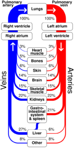
The idea of using lines with different thicknesses to show flow is also used in diagrams that are not maps. For example, a Sankey diagram can show how energy moves through a power plant or how money is spent in a budget. These diagrams are useful for visualizing flow in all kinds of systems.
See also
- Flow diagram (disambiguation)
- Thematic map


