
Organizational chart facts for kids
An organizational chart is a special kind of picture, or diagram, that shows how a company or group is set up. It helps you see who is in charge, who reports to whom, and how different parts of the group work together. Think of it like a family tree, but for a business!
You might also hear it called an organigram or organogram. It's a great way to quickly understand how a team or organization is structured.
Contents
What is an Organizational Chart?
An organizational chart is a drawing that clearly shows how different people or departments in a company are connected. It can show who manages whom, or how different parts of a business relate to each other. This picture helps everyone understand the whole organization at a glance.
For example, it can show the connection between a manager and their team members, or how the CEO (Chief Executive Officer) connects to all the different departments. If a chart gets too big, it can be split into smaller charts for each department.
There are a few main types of organizational charts:
- Hierarchical: This is the most common type, like a pyramid, where there's a clear chain of command from top to bottom.
- Matrix: This type shows people reporting to more than one manager, often for different projects.
- Flat: Also called Horizontal, this type has fewer layers of management, giving employees more freedom.
There's no single "right" way to make these charts. Usually, the most important person or department is at the top. Others are placed below them based on their rank. People's job titles, and sometimes their names, are put inside boxes or circles. Lines connect these boxes to show who reports to whom.
History of Organizational Charts
The idea of drawing out an organization's structure is quite old! An engineer named Daniel McCallum from Scotland and America is often given credit for making the first organizational charts for American businesses around 1854. A person named George Holt Henshaw drew this first chart.
The actual phrase "organization chart" started being used in the early 1900s. In 1914, a person named Brinton said that these charts should be used much more often. He thought they were a great way to show how a big group is divided into smaller parts. During these years, engineers who studied industries really pushed for using these charts.
Even in the 1920s, organizational charts were not super common in regular businesses. But they slowly started to become more popular in offices and companies. The word "organigram" came along later, in the 1960s.
Why Organizational Charts Can Be Tricky
While organizational charts are very helpful, they do have some limits:
- They can get old fast: If a company changes staff often, especially a big one, the charts can quickly become out-of-date if they're not updated regularly.
- They only show formal connections: These charts show who officially reports to whom. They don't show the informal friendships or social connections that happen between people at work. They also often don't show connections between people on the same level.
- They don't show how managers lead: The charts don't tell you if a manager is very strict (autocratic) or if they let their team make more decisions (democratic).
- They often don't include customers: Most charts focus on the internal structure and don't show how customers fit into the picture.
Examples of Organizational Charts
Let's look at a simple example, like a military chart.
In this chart, a "line relationship" means a direct reporting line. For example, the two colonels report directly to the general. The general gives orders to the colonels, and they follow them. This is also called a chain of command.
A "lateral relationship" means people who are on the same level and report to the same person. For instance, "Captain A" and "Captain B" are both captains, they work on the same level, and they both report to "Colonel B". They might work together on projects.
You can use different shapes like rectangles, squares, triangles, or circles to show different roles. Colors can also be used for the shapes or the lines connecting them. This can show different levels of power or responsibility. A job that hasn't been created yet, or is empty, might be shown with a dotted outline. The size of the shape can also show how important a position is, along with its placement on the chart.
See also
 In Spanish: Organigrama para niños
- Boxology
- Figurative system of human knowledge
- Organizational structure
- Work breakdown structure
Images for kids
-
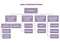
Example of a functional hybrid organizational chart
-
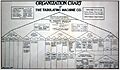
Tabulating Machine Company pyramid style organizational chart, 1917, showing directors, officers, and various systems.
-
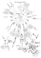
League of Nations complex organization chart, 1930, showing the secretariat, advisory bodies, and other organizations.
-
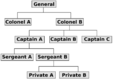
Simple military charts


