
Scatter graph facts for kids
A scatter graph (also called a scatter plot) is a special type of graph that helps us see if there's a connection or relationship between two different sets of information. Imagine you have two lists of numbers, like the number of hours someone studies and their test score. A scatter graph can show if studying more generally leads to higher scores.
It's like drawing dots on a map, where each dot represents a pair of information. For example, one dot could show that a student studied for 3 hours and got a score of 85. By looking at all the dots together, we can often spot patterns or trends.
Contents
What is a Scatter Graph?
A scatter graph uses two lines, called axes, that cross each other.
- The horizontal axis (the one that goes left to right) is usually called the X-axis. It shows one type of information.
- The vertical axis (the one that goes up and down) is usually called the Y-axis. It shows the other type of information.
Each point on the graph is a dot that shows where a specific X-value and a specific Y-value meet. For example, if you're plotting height and shoe size, one dot might be at 150 cm on the X-axis and size 7 on the Y-axis.
Why Do We Use Scatter Graphs?
Scatter graphs are super useful for finding out if two things are related. This relationship is called a correlation.
- Seeing Trends: They help us quickly see if one thing tends to go up when another thing goes up, or if it goes down.
- Spotting Outliers: Sometimes, a dot might be far away from all the other dots. This is called an outlier, and it can show us something unusual or unexpected in the data.
- Making Predictions: If we see a strong pattern, we might be able to guess what could happen next. For example, if we see that taller people generally have bigger shoe sizes, we could make a reasonable guess about a person's shoe size if we know their height.
Types of Relationships
When you look at a scatter graph, the way the dots are spread out tells you about the relationship between the two sets of information.
Positive Correlation
If the dots generally go from the bottom-left to the top-right, it means there's a positive correlation. This means that as one thing increases, the other thing also tends to increase.
- Example: The more hours you spend exercising, the more calories you burn.
Negative Correlation
If the dots generally go from the top-left to the bottom-right, it means there's a negative correlation. This means that as one thing increases, the other thing tends to decrease.
- Example: The more hours you spend watching TV, the less time you might spend doing homework.
No Correlation
If the dots are scattered all over the place with no clear pattern, it means there's no correlation. This suggests that the two things are not related in a clear way.
- Example: A person's favorite color and their height. There's no reason to expect a connection.
How to Make a Scatter Graph
Making a scatter graph is quite simple!
- Step 1: Collect Data: Get two sets of numbers that you want to compare.
- Step 2: Draw Axes: Draw your X-axis and Y-axis. Label them clearly with what they represent (e.g., "Hours Studied" and "Test Score").
- Step 3: Scale Your Axes: Decide on a good scale for each axis so all your data points will fit.
- Step 4: Plot Points: For each pair of numbers, find where they meet on the graph and draw a small dot.
- Step 5: Look for Patterns: Once all your dots are plotted, step back and see if you can spot any trends or relationships.
Examples of Scatter Graphs
Scatter graphs are used in many different areas to understand data.
- Science: Scientists might use them to see if the temperature of water affects how quickly a chemical dissolves.
- Health: Doctors could use them to see if a person's age is related to their blood pressure.
- Business: Companies might use them to see if the amount of money spent on advertising affects sales.
- Weather: Meteorologists could plot temperature against humidity to look for patterns.
Images for kids
-
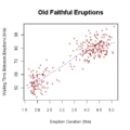
Waiting time between eruptions and the duration of the eruption for the Old Faithful Geyser in Yellowstone National Park, Wyoming, USA. This chart suggests there are generally two "types" of eruptions: short-wait-short-duration, and long-wait-long-duration.
-
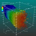
A 3D scatter plot allows the visualization of multivariate data. This scatter plot takes multiple scalar variables and uses them for different axes in phase space. The different variables are combined to form coordinates in the phase space and they are displayed using glyphs and colored using another scalar variable.


See also
 In Spanish: Diagrama de dispersión para niños
