Graph facts for kids
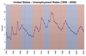
A graph is a special kind of picture that helps us understand information. It's great for showing how two or more things are connected. Look at the graph on the right! It shows how the unemployment rate changed over many years in the United States.
Most simple graphs show the link between two sets of numbers or measurements. Imagine a grid, like the squares on a notebook. In a common type of graph, called a rectangular graph, you'll see two main lines. One line goes straight up (this is the vertical axis). The other line goes straight across (this is the horizontal axis). These lines meet at the bottom left corner of the graph.
Both of these lines have small marks along them, like a ruler. These are called tick marks. They help you read the measurements or numbers on each axis.
A graph is a type of chart or diagram. However, not all charts are graphs. For example, a flowchart or a tree diagram might show steps or connections, but they don't usually compare numbers in the same way a graph does.
How to Make a Simple Graph
Let's say you want to make a graph about your height as you grew up. You could put your height in centimeters on the vertical axis. Your age in years would go on the horizontal axis.
For example, imagine you were 60 centimeters tall at age 1. You were 85 centimeters tall at age 2, and 95 centimeters tall at age 3. To plot these points, you would:
- Find 60 centimeters on the vertical axis.
- Find 1 year on the horizontal axis.
- Where an imaginary line from 60 cm meets an imaginary line from 1 year, you would draw a small dot. This is called "plotting the point."
You would do the same for 85 centimeters at year 2, and 95 centimeters at year 3. If you had more measurements, you would keep plotting more points. Once you have enough dots, you can draw a line connecting them. This creates a line graph. The graph at the top of this article is a line graph showing unemployment rates over time.
You can even show more than one set of information on a single graph. For instance, you could graph both your height and your brother's height. You might use different colors for each line to tell them apart. Or, on the unemployment graph, you could add a second line showing the Gross Domestic Product (GDP) each year. This would help you see if there's a connection between GDP and unemployment.
Why Graphs Are Useful
Graphs make information much easier to understand, especially when you're looking at how different numbers are related.
Think about the unemployment graph again. All that information could be written in a table, like this:
| Year | Unemployment rate |
|---|---|
| 1950 | 4.5% |
| 1951 | 3.1% |
| 1952 | 3.4% |
| etc. |
A long list of numbers can be hard to read and understand. But when you see the same information as a graph, it's much clearer! You can quickly spot trends and relationships. For example, just by looking at the graph, you can see that unemployment was low in the late 1960s. It was much higher in the early 1980s.
Scientists and engineers use graphs all the time. They help them quickly grasp the big picture from their data. Business people also use graphs in presentations to make their points clearer and more impactful. For graphs with lots of data points, computers are often used to draw them.
Understanding Graph Paper

Most of the time, graphs are drawn on special paper called graph paper. This paper has many evenly spaced horizontal and vertical lines already printed on it. You can see an example of graph paper on the right.
The lines on graph paper are not the graph itself. They are just a helpful guide. The graph is the points you plot and the lines you draw, along with the axes.
There are many different kinds of graphs and graph paper. The most common type, which we've talked about, is called rectangular or Cartesian graphs. Other types include bar graphs, pie graphs, polar graphs, and logarithmic graphs. Some graphs can even show information in three dimensions!


