
Bar chart facts for kids

A bar chart is a special type of chart that helps us see information clearly. It uses rectangular bars to show the amounts of different things. Imagine you want to compare how many students like different sports. A bar chart would have a bar for each sport, and the height or length of the bar would show how many students chose that sport. The longer the bar, the more popular the sport!
Bar charts are also known as pillar diagrams or column graphs. They are great for comparing different categories of data. Even though the bars can be different heights, they usually have the same width. The height (or length) of each bar directly shows the value it represents. This makes it easy to quickly understand and compare information.
Contents
Why Use Bar Charts?
Bar charts are super useful because they make numbers easy to understand at a glance. Instead of looking at a long list of numbers, you can quickly see which category has the most or least. They are especially good when you want to compare things that are not changing over time, like comparing the number of sunny days in different cities or the sales of different products.
Comparing Different Things
When you want to compare different items, like the number of books read by each person in your class, a bar chart is perfect. Each person would have their own bar, and the height of the bar would show how many books they read. This makes it simple to see who read the most or the least.
Showing Changes Over Time
Sometimes, bar charts can also show how something changes over time. For example, you could have a bar chart showing how many ice cream cones were sold each month of the year. Each month would have a bar, and you could easily see which months had the highest or lowest sales.
How Bar Charts Work
Bar charts usually have two main parts, called axes.
The Category Axis
One axis lists the different groups or categories you are comparing. For example, if you're looking at favorite fruits, this axis might list "Apples," "Bananas," "Oranges," and "Grapes." This axis is often along the bottom of the chart.
The Value Axis
The other axis shows the numbers or values. This axis usually goes up the side of the chart. It tells you what the height or length of each bar means. For example, it might show numbers like 0, 5, 10, 15, and so on, representing the count of something.
Drawing the Bars
Once you have your axes, you draw a rectangle (the bar) for each category. The bar starts from the category axis and reaches up (or across) to the correct value on the value axis. All the bars are usually separated by a small space.
Types of Bar Charts
There are a few different ways to arrange bars in a chart.
Vertical Bar Charts
In a vertical bar chart, the bars go up and down. This is the most common type you'll see. The categories are usually along the bottom, and the values go up the side.
Horizontal Bar Charts
Sometimes, the bars go sideways, from left to right. This is called a horizontal bar chart. The categories are usually listed along the side, and the values go across the bottom. These are often used when the category names are very long.
Grouped Bar Charts
A grouped bar chart (also called a clustered bar chart) lets you compare more than one set of data for each category. Imagine you want to compare the number of boys and girls who like different sports. For each sport, you would have two bars next to each other: one for boys and one for girls. This helps you compare both groups at once.
Images for kids
-
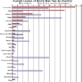
Example of a grouped (clustered) bar chart, one with horizontal bars.

See also
 In Spanish: Diagrama de barras para niños
