
Histogram facts for kids

A histogram is a special type of graph used in statistics. It helps us see how data is spread out. Imagine you have a lot of information, like the heights of all students in your school. A histogram can show you how many students are between 140-150 cm tall, how many are 150-160 cm, and so on.
Histograms are like a picture made from a table. This table lists different groups or categories. Then, it tells you how many items fall into each group. The word histogram comes from two Greek words: histos (meaning web or mast) and gramma (meaning drawing or record). So, a histogram is like a drawing that shows the "web" or structure of your data.
Contents
What is a Histogram?
A histogram shows how often different values appear in a set of data. Think of it like sorting your toys. You might put all your action figures in one box, all your cars in another, and all your building blocks in a third. A histogram does something similar with numbers.
It divides your data into "bins" or "intervals." For example, if you're looking at test scores from 0 to 100, your bins might be 0-10, 11-20, 21-30, and so on. Then, the histogram uses bars to show how many test scores fall into each bin. Taller bars mean more data points are in that range.
Why are Histograms Useful?
Histograms are very helpful for understanding large amounts of data quickly. They can show you:
- Where most of the data is: Is it clustered in one area, or spread out?
- The shape of the data: Is it symmetrical, or does it lean to one side?
- Any unusual values: Are there some numbers that are very different from the rest?
For example, if you look at a histogram of student heights, you might see that most students are around a certain height. You might also notice a few students who are much taller or shorter than average.
Histograms and Other Tools
Histograms are one of the seven basic tools used in quality control. These tools help businesses and scientists understand and improve processes. Other similar tools include:
- A Pareto chart, which shows problems in order from biggest to smallest.
- A check sheet, which is a simple form to collect data.
- A control chart, which tracks changes over time.
- A cause-and-effect diagram, which helps find reasons for problems.
- A flowchart, which shows the steps in a process.
- A scatter diagram, which shows the relationship between two different things.
A population pyramid is actually like two histograms put together. It shows the age and gender distribution of a population. One side shows males, and the other shows females, both grouped by age.
Images for kids
-
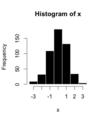
A simple example of a histogram.
-
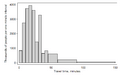
Histogram showing how long people travel to work in the US (2000 census).
-
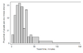
Another histogram of travel time, where the total area under the bars equals 1.
-
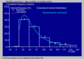
A histogram and a curve showing a Gumbel distribution.
-
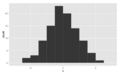
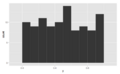
This histogram is symmetrical, meaning both sides are similar.
-
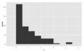
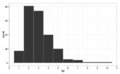
This histogram is "skewed right," meaning its tail is longer on the right side.
-
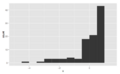
This histogram is "skewed left," meaning its tail is longer on the left side.
-
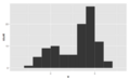
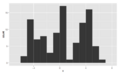
This histogram is "bimodal," meaning it has two main peaks.
-
This histogram is "multimodal," meaning it has many peaks.
-
Another example of a symmetrical histogram.
-
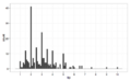
A histogram showing tips received, using $1 groups. It's skewed right.
-
The same tips data, but using smaller 10-cent groups. You can see more details, like rounding.


See also
 In Spanish: Histograma para niños
