Courier (typeface) facts for kids
| Category | Monospaced |
|---|---|
| Classification | Slab serif |
| Designer(s) | Howard "Bud" Kettler |
| Commissioned by | IBM |
| Foundry | IBM, Corp. |
| Date created | 1956 (circa) |
| Date released | 1995 |
| License | Free license |
 |
|
| Sample | |
Courier is a special kind of typeface (which is like a set of letters, numbers, and symbols that all look the same). It's called a monospaced font because every letter and character takes up the exact same amount of space. Imagine if the letter "i" and the letter "w" were the same width – that's what monospaced means! Courier also belongs to a group called slab serif fonts, which means its letters have thick, block-like feet or lines at the ends of their strokes.
This font was designed by Howard "Bud" Kettler in the 1950s. It was first made for IBM's typewriters. Later, it became a popular computer font, and you can find versions of it on most computers today.
Contents
History of Courier
IBM, the company that first used Courier, didn't put a special trademark on its name. This means that the design and name of Courier are now available for everyone to use freely.
Because it's a monospaced font, Courier became very useful in the 1990s for things like computer coding. In coding, it's important for characters to line up perfectly in columns. Courier makes this easy! It also became the standard font for writing screenplays (scripts for movies and TV shows). Most screenplays are written in 12-point Courier or a similar style.
Did you know the name "Courier" almost wasn't chosen? The font was nearly called "Messenger." But Howard Kettler, the designer, thought about it and said, "A letter can be just an ordinary messenger, or it can be the courier, which radiates dignity, prestige, and stability." He felt "Courier" sounded more important and official.
Different Kinds of Courier
Over time, many different versions of the Courier font have been made. Each one has slightly different features.
Courier for Coding
As computers became more common, special versions of Courier were made for coding. These versions often have:
- Larger punctuation marks.
- Clearer differences between similar characters, like the number 0 and the letter O, or the number 1 and the letter L.
- Some versions even have a sans-serif style, which means they don't have the "feet" at the ends of the letters.
These changes make the font easier to read on computer screens, especially when you're looking at lines of code for a long time.
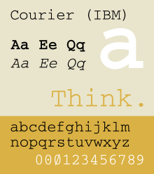
IBM Courier
IBM made its own version of Courier available for free. This version is sometimes called IBM Courier. It includes some special characters that IBM used, like a zero with a dot inside or a slash through it.
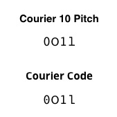
Courier 10 Pitch BT and Courier Code
Courier 10 Pitch BT is a font that looks a lot like the original Courier that came from typewriters. It's a bit heavier (thicker) than some other digital versions. This font is often found on Linux computers.
Courier Code is a special version of Courier 10 Pitch BT made for computer programming. In this font, the number zero has a dot inside to make it easy to tell apart from the letter "O." Also, the lowercase "L" is changed so it doesn't look like the number one. These small changes help programmers avoid mistakes.
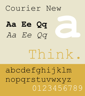
Courier New
Courier New is a very common version of Courier that you'll find on many computers, especially those running Windows. When you print Courier New, it can look a bit thin. This is because it was made directly from the "golf ball" (the part that prints letters) of an old IBM typewriter, without making the lines thicker for digital screens.
However, computer technology like ClearType helps make Courier New look clearer on screens. This font family includes regular, bold, italic, and bold italic styles.
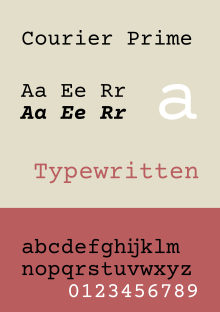
Courier Prime
 |
|
| Sample |
Courier Prime is a newer version of Courier that was created with screenwriters in mind. It has a true italic style, which means the italic letters were designed separately, not just slanted versions of the regular letters. Courier Prime is designed to be easy to read and look good. It's free to download and use!
Courier Screenplay
This font was made for a screenwriting program called Fade In. Courier Screenplay is designed to be easy to read and helps screenwriters keep their page counts correct. It's also free to download and use.
Courier Final Draft
Similar to Courier Screenplay, Courier Final Draft was made for another popular screenwriting program called Final Draft. It's based on Courier 10 BT and helps writers keep their scripts formatted correctly.
Dark Courier
Dark Courier is a font made by HP. Even though it's called "Dark," it's not a bold font. It was created as an alternative to Courier New for people who thought Courier New looked too thin. Dark Courier has a normal weight but appears a bit thicker.
Nimbus Mono L
Nimbus Mono L is a version of Courier that was made available for free in 1996. It's part of a set of free fonts that are used in many free and open source computer systems, like Linux.
Where Courier is Used
In ASCII Art
Courier is often used for ASCII art. This is a type of art where pictures are made using only text characters. Because Courier is monospaced, all its characters take up the same space. This makes it perfect for lining up characters to create images.
In Computer Programming
Since it's a common monospaced font, Courier is frequently used to display source code. The way its characters line up helps programmers read and understand their code more easily.
See also
 In Spanish: Courier para niños
- American Typewriter
- Monospaced font
- Proportional font


