Flag of Provo, Utah facts for kids
 |
|
| Use | Civil flag |
|---|---|
| Proportion | 3:5 |
| Adopted | January 6, 2015 |
| Design | Blue background with the Provo City logo in the center |
The flag of Provo, Utah is the official flag for the city of Provo, Utah. It's located in the United States. The current flag has a light blue background. It also shows the city's logo in the middle. This flag was chosen on January 6, 2015.
Before this, Provo had a different flag. It was adopted in 1989. Many people thought the old flag was not very good-looking. Some even said it looked like the logo for Centrum vitamins. The North American Vexillological Association (NAVA) even called it one of the worst city flags in America.
Contents
What Does the Provo Flag Look Like?
The current flag of Provo, Utah, is quite simple. It has a light blue background. In the very center, you can see the official seal of the city. This design is described in the city's rules.
A Look Back: Provo's Flag History
Provo's First Flag (1965)
Provo's very first flag was chosen in 1965. It had both red and blue colors. In the middle, there was a special letter "P". This "P" stood for "Provo."
The Controversial Flag (1985-2015)
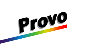
The second flag for Provo was adopted in 1985. Mayor Joe Jenkins introduced it. The design came from Stephen Hales. This flag was mostly white. It had the word "Provo" written in black letters. These letters had gray shadows.
A colorful rainbow bar ran across the flag. It went from one corner to the center. The city government said this rainbow showed the "eclectic and diverse nature" of Provo. This means it represented the many different kinds of people and ideas in the city.
In 2004, a group called the North American Vexillological Association (NAVA) did a survey. They asked people to rate city flags in the United States. Provo's flag ranked very low. It was 143rd out of 150 flags. This meant it was the 8th worst. In 2013, another survey showed the flag was still in the same low spot. People who love flags, called flag enthusiasts, knew this flag was "notoriously bad."
Many people thought the flag looked like the label on Centrum vitamin bottles. Others said it looked like something drawn with magic markers and crayons.
Choosing the New Flag (2015)
In 2013, Mayor John Curtis decided it was time for a new flag. He started a public process to replace the old one. He talked to local flag experts and residents for new ideas.
By May 2014, a committee narrowed down the choices to two designs. Both showed simple pictures of Utah Lake and the mountains nearby. One design also had three stars. These stars were meant to represent life in Provo. However, residents did not like these designs very much.
So, Mayor Curtis suggested a public design contest. It ended in early June. People in Provo agreed on one thing: they did not want the color red in the new flag. This is because red is the color of the University of Utah. That university is a rival to Provo's own Brigham Young University.
A total of 51 different flag ideas were sent in. These were put into an online poll in July. In September, two final designs were shown to the Provo City Council. Both of these designs featured a stylized mountain. One had a white background, and the other had a blue one.
Finally, on January 6, 2015, the Provo City Council made a choice. They all agreed on the city's new flag. This new flag used the city's new logo, which had been adopted in 2012.
Images for kids
See also
 In Spanish: Bandera de Provo para niños


