
Complementary color facts for kids
Complementary colors are pairs of colors that are opposite each other. Think of them as "opposites" on a color wheel. When you put complementary colors next to each other, they often look very bright and stand out. What "opposite" means can be a bit different depending on if you're talking about science or art.
Contents
Complementary Colors in Science
In color science, complementary colors are exactly opposite on the color wheel. These pairs are usually a primary color and a secondary color. A primary color is a basic color that can't be made by mixing other colors. A secondary color is made by mixing two primary colors.
Here are some common scientific complementary pairs:
- red and cyan ( red cyan ) (Cyan is a mix of green and blue light)
- green and magenta ( green magenta ) (Magenta is a mix of red and blue light)
- blue and yellow ( blue yellow ) (Yellow is a mix of red and green light)
Seeing Afterimages: Eye Tricks!
Have you ever stared at a bright color for a while, then looked away at a white wall and seen a different color? That's an afterimage! It happens because of something called eye fatigue.
Here's how it works:
- Your eyes have special cells called photoreceptors. These cells are like tiny sensors that pick up different colors of light.
- If you stare at one color, like red, the photoreceptors that detect red light get tired. They become less able to send strong signals to your brain.
- When you then look at a white surface, all the photoreceptors try to send signals. But because the red-sensing cells are tired, the signals for other colors (like green and blue, which make cyan) are stronger.
- Your brain then creates the illusion of seeing the complementary color, like cyan, even though it's not really there.
Complementary Colors in Art and Design

For a long time, artists used a different set of complementary color pairs. This was because they had a limited range of colors available to them. Many artists still use these traditional pairs today:
In art, the complementary color of a primary color (red, blue, or yellow) is usually the color you get by mixing the other two primary colors. For example:
- Red + blue = purple (so yellow and purple are complements)
- Blue + yellow = green (so red and green are complements)
- Red + yellow = orange (so blue and orange are complements)
When artists mix two complementary colors together, they usually create a gray or brown color.
Using complementary colors is very important in art and graphic design. When these colors are placed next to each other, they make each other look brighter and more vibrant. You can see this in logos or store displays. On an artistic color wheel, complementary colors are always placed directly opposite each other.
Images for kids
-

The HSV color wheel has the same complementary colors as the RGB color model, but shows them in three dimensions.
-
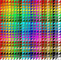
A chart of color combinations.
-
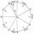
Newton's color circle (1704) displayed seven colors. He declared that colors opposite each other had the strongest contrast and harmony.
-
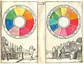
A Boutet color circle from 1708 showed the traditional complementary colors; red and green, yellow and purple, and blue and orange.
-
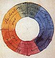
The color wheel designed by Johann Wolfgang von Goethe (1810) was based on the idea that the primary colors yellow and blue, representing light and darkness, were in opposition to each other.
-

Impression, Sunrise by Claude Monet (1872) featured a tiny but vivid orange sun against a blue background. The painting gave its name to the Impressionist movement.
-

Oarsmen at Chatou by Pierre-Auguste Renoir (1879). Renoir knew that orange and blue brightened each other when put side by side.
-

In this self-portrait (1889), Vincent van Gogh made the most of the contrast between the orange of his hair and the blue background.
-
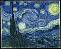
Starry Night by Vincent van Gogh (1889) features orange stars and an orange moon.
-
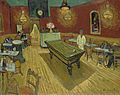
The Night Café by Vincent van Gogh (1888) used red and green to express what van Gogh called "the terrible human passions".
-

Orange life rafts provide the highest contrast and visibility seen against blue water.
-
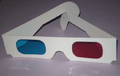
Red and cyan glasses are used for viewing Anaglyph 3D three-dimensional images on the Internet or in print.
-

This image, viewed with red and cyan Anaglyph 3D glasses, will appear in three dimensions.


_check_life_rafts_for_survivors_Sept._6,_2009_following_the_sinking_of_a_Philippine_super_ferry.jpg)


See also
 In Spanish: Colores complementarios para niños
