
Oblique type facts for kids
An oblique type is a style of typeface where the letters are slanted slightly to the right. It's used to make words stand out, much like italic text. But here's the main difference: oblique type uses the exact same letter shapes as regular, upright text (called Roman type). It just tilts them! A glyph is simply the specific shape of a letter or symbol.
Some people who design typefaces think oblique type looks less like handwriting (which is called calligraphy) compared to true italic type. This can be a good thing in certain situations.
Contents
What is Oblique Type?
Oblique type is a special way of drawing letters so they lean over. Think of it like someone standing straight, then leaning to one side. That's what happens to the letters! This style is often used when you want to emphasize a word or phrase, just like when you use italic text.
Oblique vs. Italic: What's the Difference?
It's easy to confuse oblique type with italic type because both make text slant. However, there's a key difference in how they are made:
- Oblique type takes the regular, upright letters and simply slants them. The shapes of the letters don't change.
- Italic type often has slightly different letter shapes that are designed to look more like handwriting. For example, the lowercase 'a' or 'f' might look different in an italic font compared to its regular version.
Where Do We See Oblique Type?
You'll often find oblique designs used instead of true italic ones, especially in sans serif typefaces. Sans serif fonts are those that don't have the small decorative lines (called serifs) at the end of strokes. A famous example is Helvetica, which uses an oblique style for its slanted version.
Many modern fonts, especially those designed to be very clear and simple, use oblique type. This is because it keeps the clean look of the original font while still allowing for emphasis.
Images for kids
-
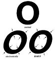
This image shows a simply slanted (left) and a corrected (right) example of oblique type.
-
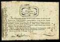
This old Norwegian banknote from 1807 has unusual back-slanted oblique lettering.
-
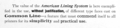
Serif typefaces with an oblique style are rare. This example, "De Vinne" from 1903, is an early exception.
-
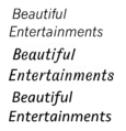
Here are three sans-serif "italics." News Gothic (1908) uses an oblique. Gothic Italic no. 124 (1890s) has a true italic. Seravek (modern) has a more informal italic like handwriting.

.jpg)

