Charles Shipman Payson Building facts for kids
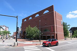
The Charles Shipman Payson Building is a big addition to the Portland Museum of Art (PMA) in Portland, Maine. It sits at the corner of High Street and Congress Square. A famous architect named Henry N. Cobb designed this building. It opened in 1983. The Payson Building added five times more space for art than the older museum buildings. These older buildings include the McLellan-Sweat House, Charles Quincy Clapp House, and L. D. M. Sweat Memorial Galleries.
The building was made possible by Mr. Payson. He gave the museum 17 paintings by the famous artist Winslow Homer. He also donated ten million dollars. The Payson Building now holds many modern paintings. It also features special art shows by artists from Maine. These shows often focus on themes from the local area.
Contents
What Does the Payson Building Look Like?

Designing the Payson Building was a challenge for Cobb. He wanted it to be a great place to see art. But it also needed to fit in with the buildings around it. The museum's location was an unusual shape.
Other buildings around Congress Square are tall and made of brick. So, the Payson Building needed to look strong and important. But on the Spring Street side, there are smaller, older museum buildings. Cobb had to make the Payson Building fit with these too.
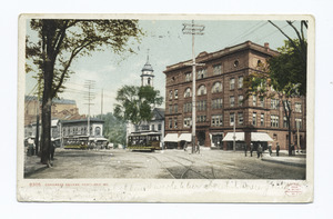
His solution was a wide front made of red brick. It has gray granite details and round openings. This design was inspired by the old Libby Building that used to be there. This front part of the building looks grand, like an old European palace. It helps frame the public square.
Behind this main front, the building gets smaller. It steps back and down in height. This way, the Payson Building doesn't overpower its historic neighbors. It lets them stand out.
Cobb built the Payson Building with a concrete frame. The outside walls are mostly decorative. Some other architects thought this made the building look like a "billboard." But Cobb said the outside design shows what's inside. The round shapes on the outside represent the square art galleries inside. The rectangular brick patterns show the rectangular hallways.
Inside the Payson Building: Art Spaces
Inside the Payson Building, you'll find many art galleries. They have clean white walls and pine wood floors. Thin strips of granite are set into the floor. These granite strips mark out spaces that are 20 feet by 20 feet. Cobb believed this was the perfect size for a gallery.
Granite strips also outline the rectangular paths you walk on. Some walls have wide doorways cut into them. These walls help create different-sized gallery spaces.
Cobb wanted the galleries to be perfect for the Winslow Homer paintings. So, he made the ceilings different heights. Some are 12.5 feet high, others 25 feet, and some are 37.5 feet high.
These varied spaces mean there's no single clear path through the museum. Cobb said this design was like the old cities of New England. They don't have straight, wide streets. This layout also lets you peek into other galleries from where you are standing. You can often see different levels. This makes exploring the museum feel like an adventure.
One of the best things about the galleries is the lighting. It's very special. The ceilings are domed and let in natural light. This light comes from octagonal windows high up, called clerestory lanterns. These windows are designed to let in lots of sunlight. But they stop direct sun rays from hitting the art. This natural light changes throughout the day. It makes the galleries feel alive and highlights the art. Sometimes, the electric lights are not even needed during the day.
Where Did the Ideas Come From?
When Cobb designed the Payson Building, he got ideas from many famous buildings. The outside look, with its round openings and plain brick, was inspired by buildings like the Indian Institute of Management in Ahmedabad, India. It also took ideas from the Phillips Exeter Academy Library in New Hampshire.
The amazing lighting in the Payson Building was inspired by places like the Dulwich Picture Gallery and the Kimball Art Museum in Fort Worth. Even the lanterns of Ely Cathedral gave him ideas. Other influences included old European buildings like the Doge's Palace in Venice.
Connecting to Maine's History
Cobb also really wanted the Payson Building to feel connected to Maine. He said, "The Portland Museum is a regional museum in a region that is itself a museum." He felt it was important to link the new building to the city and the area.
To show this connection, Cobb used materials common in Maine. He used local brick, pine wood, and granite. These materials are found in many old buildings in Portland. You can see them in the brick buildings of the Old Port. They are also in the Federal-style brick homes near the museum.
When you look up at the Payson Building from the ground, the round openings seem to capture Maine's air and light. This makes the light part of the building itself. The many octagonal windows also do this. These windows also remind people of the viewing decks on Maine's lighthouses. They also look like the octagonal Portland Observatory, a famous landmark in the city. Plus, some round windows look like portholes on a ship. They offer views of the Fore River. This reminds everyone of Maine's rich history with the sea.


