
Composition (visual arts) facts for kids

In visual arts, composition is how an artist arranges the different parts or "ingredients" in a piece of art. Think of it like organizing your room – you decide where everything goes so it looks good and makes sense. It's about putting together the elements of art (like lines, shapes, and colors) using the principles of art (like balance and rhythm).
The word "composition" means 'putting things together'. It's used for any artwork, from music to writing to photography, where things are arranged on purpose. In visual arts, people often use words like design, form, or visual order instead of composition.
For things like graphic design or making a magazine, composition is often called page layout.
Contents
What are the Elements of Design?
The different visual parts an artist uses are called the elements of design or elements of art. These are like the words an artist uses to create their artwork. They usually connect to each other and to the whole piece.
Here are the main elements of design:
- Line — a visual path that helps your eye move around the artwork.
- Shape — areas defined by edges, like a square or a blob.
- Colour — the different hues, how bright they are, and how strong they look.
- Texture — how a surface feels or looks like it would feel (like rough or smooth).
- Tone — the light and dark shades used to show form.
- Form — a 3D shape, showing length, width, and depth.
- Space — the area taken up by objects (positive space) or the empty space around and between them (negative space).
- Depth — how far away things seem, like in the foreground (close), middle ground, or background (far away).
How do Artists Use Lines and Shapes?
Lines help artists guide your eye through a picture. Even though lines don't really exist in nature, artists can arrange things to make you see them. For example, a row of trees or a fence can create a "line" that leads your eye.
Lines can also show how things are moving or create a certain mood:
- Straight lines can make a picture feel calm or grand.
* Horizontal lines (like a flat horizon) often suggest peace and open space, especially in landscape photography. * Vertical lines (like tall buildings) can give a feeling of height and importance. * Diagonal lines (slanted lines) create excitement and movement.
- Curved lines usually feel softer and more pleasing to the eye. They can make a picture feel more natural and harmonious.
The angle of lines and how they fit in the picture can change the mood. Even a small change in where the artist stands (their viewpoint) can make lines look very different and change how you feel about the image.
What About Color in Art?
Color has different parts: its hue (like red, blue, green), its brightness (how light or dark it is), and its saturation (how strong or dull it is).
Colors can also have special meanings, depending on the culture. For example, white often means purity or peace in many places. But in some countries, like Japan and China, white can mean death.
What are the Principles of Organization?
Artists decide what the most important part of their artwork will be. This is called the "center of interest" or "focus." Then, they arrange all the elements around it. The way they arrange things follows certain rules, called the principles of organization or principles of art. These rules help everything work together to create a feeling of unity in the artwork.
Here are some principles that help organize a picture:
- Shape and proportion: How big or small things are compared to each other.
- Position and balance: Where elements are placed and how they create a stable feeling.
- Cropping: Deciding what parts of the scene to include in the picture.
- Eye path: The way your eye moves through the image.
- Negative space: The empty space around objects.
- Color: How colors are used to create mood or draw attention.
- Contrast: The difference between light and dark areas.
- Arrangement: Using special guides like the golden mean or the rule of thirds to place things.
- Lines: How lines are used to guide the eye.
- Rhythm: Repeating elements to create a sense of movement.
- Lighting: How light and shadows are used.
- Repetition: Using the same shapes or colors multiple times.
- Perspective: Creating the illusion of depth.
Sometimes, artists might even break these rules on purpose to create tension or make the picture more interesting!
How Does Viewpoint Affect a Picture?
The position from which you view something (or the artist takes a picture) can really change how an image looks and how you feel about it.
For example, if you take a photo of a boy from high up, looking down, he might seem smaller or less important. If you take the photo at his eye level, he might seem like an equal. If you take it from below, looking up, he might seem powerful or dominant. So, the artist or photographer chooses how you, the viewer, will "stand" to see the art.
Making the subject fill the whole picture can make it seem more dramatic and important. It also helps remove distracting things from the background.
In photography, moving the camera closer, to the side, or up and down can change the picture so the main subject stands out more.
What are Some Composition Techniques?
Artists use many different "compositional techniques" to make their artwork feel unified and complete. Usually, an artwork looks pleasing if its parts are arranged in a balanced way. However, some artists, like Salvador Dalí, like to break these rules to make you think differently about balance and design.
The "rule of odds" suggests that having an odd number of main subjects (like 1, 3, or 5) in a picture is often more interesting than an even number. For example, three flowers usually look better than two or four. This is because an even number can create too much symmetry, which might look less natural in an informal picture.
For instance, a picture of one person surrounded by two other people (making a total of three) often feels more friendly and comforting than a picture of just one person alone.
Simplification: Making it Clear
Pictures with too much going on can be messy and make it hard to see the main subject. By removing extra details, the viewer can focus on what's important. Artists can also use lighting, lines, or colors to guide the eye to the main parts. In paintings, artists might use less detail around the edges of the picture.
Using Shallow Depth of Field
In photography, one way to simplify a picture is to use a "shallow depth of field." This means that only your main subject is sharp and clear, while the background is blurry. This helps your eye go straight to what the photographer wants you to see.


Geometry and Symmetry in Art
Triangles are often seen as a pleasing shape in art. For example, in a face that is considered beautiful, the eyes and mouth often fit within the points of an imaginary triangle. The artist Paul Cézanne often used triangles in his paintings of still life. A triangular shape can make a picture feel stable and strong.
Creating Movement in a Picture
It's usually more enjoyable for your eye to move around an image instead of just stopping in one spot. Artists try to make their compositions feel "active" rather than "static" or "flat." Look at these two images:


In Image A, the two mountains are the same size and placed side-by-side. This makes the picture feel very still and less interesting. In Image B, the mountains are different sizes, and one is closer to the horizon. This guides your eye from one mountain to the other, making the picture more interesting and natural, because things in nature are rarely exactly the same size or perfectly spaced.
Other Helpful Techniques
- There should be a main point of interest in the artwork, so it doesn't just look like a random pattern.
- Your eye should be led around all the important parts of the artwork before leaving the picture.
- The main subject usually shouldn't be looking or facing out of the picture.
- Avoid dividing the picture exactly in half.
- Small, bright, or high-contrast elements can be just as impactful as larger, duller ones.
- The main subject should usually be a bit off-center, unless you want a very formal or symmetrical look. It can be balanced by smaller elements around it.
- The horizon line should not cut the picture exactly in half. Instead, place it higher or lower to emphasize either the sky (if there are interesting clouds or a sunset) or the ground (if it's a landscape).
- Also, the empty spaces between objects in your artwork should not all be the same size or shape. Varying them makes the image much more interesting.
These principles work best when used together to create a strong composition.
Examples of Composition
These paintings all show the same story, the Raising of Lazarus, and mostly the same people, but they have very different compositions:


Images for kids
-

Patterns in the frosted glass form leading lines which help draw in the viewer's eye in this photograph of a ledge in the Brooklyn Botanic Garden.
-
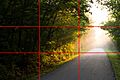
Rule of thirds: Note how the horizon falls close to the bottom grid line, and how the dark areas are in the left third, the overexposed in the right third.
-
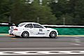
Image of a racing car with lead room
-
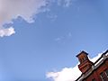
A simple composition with cloud and rooftop that creates asymmetry.


See also
 In Spanish: Composición (artes visuales) para niños
