
Income inequality in the United States facts for kids
Income inequality in the United States means that the money people earn is not shared equally. Since the 1970s, the gap between what the richest people earn and what others earn has grown a lot. This means that a larger share of the country's total income goes to those who are already wealthy.
Sometimes, people talk about a "pay gap." This often refers to differences in pay between men and women, where men might earn more for the same work. This has led to protests and calls for fairer pay.
Contents
What is Income Inequality?
Income inequality happens when some people earn a lot more money than others. Imagine a pie representing all the money earned in a country. If income is equal, everyone gets a similar slice. But with inequality, some people get very big slices, while others get very small ones.
In the U.S., the amount of money earned by the richest people has grown much faster than the earnings of middle-class or poorer families. This trend started around the 1970s.
How We Measure Inequality
Economists use different ways to measure income inequality:
- Top 1% Share: This looks at how much of all the money earned goes to the richest 1% of households.
- Income Groups (Quintiles): People are often divided into five equal groups based on their income, from the lowest 20% to the highest 20%. This helps show how much each group earns.
- Gini Index: This is a number from 0 to 1 (or 0 to 100). A Gini index of 0 means perfect equality (everyone earns the same). A Gini index of 1 (or 100) means one person earns everything. The higher the number, the more inequality there is.
Why Has Inequality Increased?
Many things can cause income inequality to grow. Here are some ideas:
- Changes in Jobs: Some jobs that used to pay well for people without college degrees have become less common. New jobs often require more education or special skills, which can lead to higher pay for some.
- Technology: New technologies can make some workers more productive, increasing their pay. But they can also replace other jobs, reducing demand for those workers.
- Globalization: Companies can move jobs to other countries where labor is cheaper. This can affect wages in the U.S.
- Rules and Policies: Government rules about taxes, minimum wage, and unions can also affect how income is shared. For example, if taxes on the wealthy are lowered, they keep more of their income.
- Education: People with more education often earn more. Differences in access to good education can lead to bigger income gaps.
Effects of Income Inequality
High income inequality can have several effects on a country:
- Economic Growth: Some studies suggest that too much inequality can slow down economic growth over time.
- Social Issues: It can lead to feelings of unfairness and can make it harder for people from poorer backgrounds to improve their lives.
- Middle Class Squeeze: While the costs of important things like housing, healthcare, and education keep going up, the income of many middle-class families has not kept pace. This can make it hard for them to afford necessities.
What About the Pay Gap?
The "pay gap" often refers to the difference in average earnings between men and women. Even when doing similar jobs, women often earn less than men. This can be due to many factors, including:
- Job Choices: Men and women sometimes choose different types of jobs, which can have different pay scales.
- Work Experience: Women might take more time off for family reasons, which can affect their career progression and pay.
- Discrimination: Sometimes, unfair treatment or bias can lead to women being paid less than men for the same work.
- Negotiation: Differences in how men and women negotiate salaries can also play a role.
Efforts are being made to address the pay gap, including laws to ensure equal pay for equal work and encouraging companies to be more transparent about salaries.
Images for kids
-
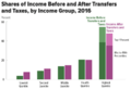
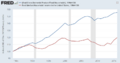
Income before (green) and after (pink) taxes and Transfer payments for different income groups starting with the lowest quintile.
-
Top 1% share of US income pre-tax (blue and orange) and after-tax (green).
-
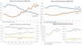
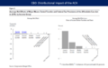
Four charts that describe trends in income inequality in the United States. Top left: the share of pre-tax income earned by the top 1% (orange) versus the bottom 50% (blue). Top right: the share of after-tax income earned by the top 1% (orange) versus the bottom 50% (blue). Bottom left: the share of income earned by the top 5% (green), next 45% (blue), and the bottom 50% (yellow). Bottom right: the mean income of the top 5% (green), next 45% (blue), and bottom 50% (yellow) income groups.
-
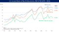
Share of U.S. pre-tax income earned by the top 1% (blue) and top 0.1% (red) of households 1913–2016.
-
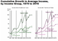
This CBO chart shows the cumulative increase in real household income by income quintile from 1979 to 2016, for income before taxes & transfers and after-tax income. It shows that even lower income quintiles still had sizable gains in income, although not as great as the top quintile.
-
CBO data indicates that real (inflation-adjusted) household income increased significantly after-taxes and transfers from 1979 to 2016 across all income quintiles. However, the top 1% income fell from 2007 to 2016, due to both the Great Recession and tax hikes on upper incomes during the Obama Administration.
-
Share of U.S. income earned by top 1% households in 1979 (blue), 2007 (orange), and 2016 (green) (CBO data). The first date 1979 reflects the more egalitarian pre-1980 period, 2007 was the peak inequality of the post-1980 period, and the 2016 number reflects the Obama tax increases on the top 1% along with residual effects of the Great Recession.
-
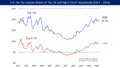
Illustrates the productivity gap (i.e., the annual growth rate in productivity minus annual growth rate in compensation) by industry from 1985 to 2015. Each dot is an industry; dots above the line have a productivity gap (i.e., productivity growth has exceeded compensation growth), those below the line do not.
-
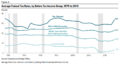
Real GDP per household has typically increased since the year 2000, while real median income per household was below 1999 levels until 2016, indicating a trend of greater income inequality (i.e., the average is more influenced by high income outliers than the median). The income considered in the two lines is different as well; the GDP figure includes all income (derived from labor and capital) while the median income figure includes only a subset of income (wages/salaries but not benefits).
-
Labor's share of GDP declined by 4.5 percentage points from 1970 to 2016, measured based on total compensation. The decline measured for wages and salaries was 7.9 points. These trends imply income due to capital (i.e., asset ownership, such as rent, dividends, and business profits) is increasing as a % of GDP.
-
While middle-class family incomes have stagnated as income shifts to the top, the costs of important goods and services continue rising, resulting in a "Middle class squeeze."
-
A 2011 study by Ostry and Berg of the factors affecting the duration of economic growth in developed and developing countries, found that income equality has a more beneficial impact on steady growth than trade openness, sound political institutions, or foreign investment.
-
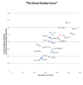
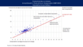
The Great Gatsby curve showing intergenerational economic immobility on vertical axis and increasing inequality on the horizontal axis for a number of different countries.
-
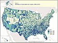
This Gini Index map shows regional and county level variation in pre-tax income inequality Gini index. The 2010 Gini index value range from 20.7 for Loving County (Texas) to 64.5 to East Carroll Parish (Louisiana).
-
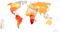
Income gini coefficient map according to the World Bank (2018). Higher Income Gini Index for a nation in this map implies more income inequality among its people.
-
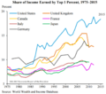
Share of income of the top 1% for selected developed countries, 1975 to 2015.
-
The distributional impact of the Affordable Care Act (ACA or Obamacare) during 2014. The ACA raised taxes mainly on the top 1% to fund approximately $600 in benefits on average for the bottom 40% of families.
-
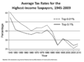
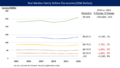
Average statutory tax rates for highest-income U.S. taxpayers, 1945–2009.
-
Based on CBO Estimates, under 2013 tax law the top 1% will be paying a higher effective tax rate, while other income groups will remain essentially unchanged.
-
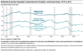
CBO chart illustrating the percent reduction in income inequality due to Federal taxes and income transfers from 1979 to 2011.
-
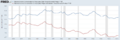
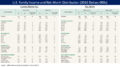
CBO charts describing amount and distribution of top 10 tax expenditures (i.e., exemptions, deductions, and preferential rates)
-
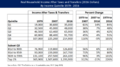
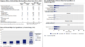
U.S. family pre-tax income and net worth distribution for 2013 and 2016, from the Federal Reserve Survey of Consumer Finances.
-
U.S. median family income from 2001 to 2016 (real, measured in 2016 dollars), with comparative statistics, from the Fed Survey of Consumer Finances. The top decile and bottom quintile had real increases in income comparing 2001 and 2016, while the 20th to 80th percentiles has decreases. For all families, the median was $54,100 in 2001 and $52,700 in 2016, a slight decline. Note this differs from real median household income, which hit a record level in 2016.
-
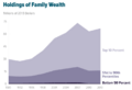
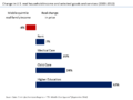
CBO Chart, U.S. Holdings of Family Wealth 1989 to 2013. The top 10% of families held 76% of the wealth in 2013, while the bottom 50% of families held 1%. Inequality increased from 1989 to 2013.
-
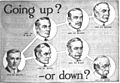
Illustration from a 1916 advertisement for a vocational school in the back of a US magazine. Education has been seen as a key to higher income, and this advertisement appealed to Americans' belief in the possibility of self-betterment, as well as threatening the consequences of not achieving economic security in the great income inequality existing during the Industrial Revolution.


See also
 In Spanish: Desigualdad de ingreso en Estados Unidos para niños
