Tolkien's artwork facts for kids
J. R. R. Tolkien, the famous author of The Hobbit and The Lord of the Rings, was also a talented artist. His artwork was a very important part of his creative process. Tolkien was a philologist, which means he studied languages and their history. He created many different things to go with his fantasy stories, like drawings, paintings, and even fake old objects. He also made detailed maps, beautiful calligraphy (fancy writing), and sketches from real life. Sometimes, his artworks combined several of these skills.
During his lifetime, some of his art was included in his books, and other pieces were used on the covers. After he passed away, many more of his artworks were published in collections. Experts have now started to study him as an artist, not just as a writer.
Contents
Tolkien's Art: Early Sketches
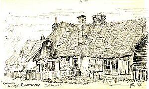
When Tolkien was young, his mother taught him to draw and paint. He created many sketches and paintings of real places and things. He was very good at drawing landscapes, buildings, trees, and flowers. He could make them look very realistic. However, he admitted he wasn't good at drawing people. His attempts at human figures looked more like cartoons.
Experts Wayne G. Hammond and Christina Scull say his 1912 ink drawing of a cottage in Berkshire, called "Quallington Carpenter", is one of his best early works. They describe its "sagging walls" and "thatched roof" as having amazing detail and shading.
Illustrations for His Books
Tolkien made many kinds of illustrations for his books. These included drawings, paintings, special fake objects, detailed maps, and beautiful calligraphy.
The Hobbit Illustrations
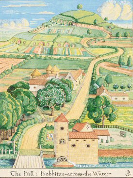
Tolkien's illustrations helped make his stories even better, but many of his artworks were not published while he was alive. The first British edition of The Hobbit, released in 1937, included ten of his black-and-white drawings. It also had a drawing called The Hill: Hobbiton-across-the-Water at the very beginning of the book.
This drawing shows Bilbo Baggins's home village of Hobbiton in the Shire. You can see an old mill and a river in the front, with a peaceful English countryside in the middle. In the background are The Hill and Bilbo's home, Bag End, which is built into the hill. The American edition of the book used a full-colour painting of the same scene instead. This colourful version was later used in British editions too. The American edition also had four more of his watercolour paintings.

Tolkien's biographer, John Garth, noticed that Tolkien's painting looked a lot like a 1936 painting of Faringdon Folly by Lord Berners. This painting was used in advertisements by Shell. Garth said that the "angles, proportions, shapes, and arrangement ... are strikingly similar." This Shell advertisement was very well-known when Tolkien was writing The Hobbit, as it was even painted on their oil delivery trucks.
The Lord of the Rings Illustrations
The Book of Mazarbul
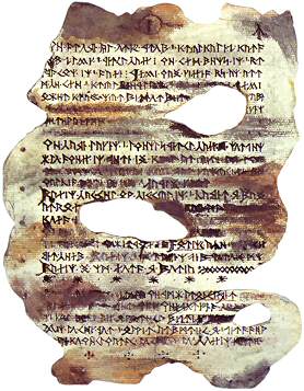
Tolkien worked hard to create realistic objects to go with his stories. He spent a huge amount of effort on a fake Book of Mazarbul. He wanted it to look exactly like the burnt and torn book found by the wizard Gandalf in the Dwarf realm of Moria. In the story, Gandalf struggles to read the damaged text.
Tolkien carefully stained the paper, actually burning and tearing it to make it look as real as possible. He hoped his publisher would include a picture of it in the first edition of The Lord of the Rings. However, they chose not to. Tolkien felt that without the image, the story part about the book seemed "rather absurd."
The Doors of Durin
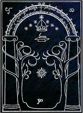
The Lord of the Rings had only one illustration, besides its maps and fancy writing. This was The Doors of Durin, which appeared in the first book, The Fellowship of the Ring, in 1954.
The Doors of Durin were magical stone gates that formed the western entrance to Moria. They were invisible when closed. But under moonlight, their special designs and letters, made of mithril (a precious metal), would appear. The letters were a welcome message and the password, written in Feänorian script and the Elvish language. Tolkien drew elegant, curly trees in the design, matching the curls of the script. Achieving the simple, clean look of the design took Tolkien a lot of effort. He made many sketches, making each one simpler than the last.
Tolkien wanted the drawing to appear as white lines on a black background, to show how the silver lines would look in the darkness. He also added a fancy English caption that looked like old English manuscripts and the Elvish script it translated.
The Silmarillion Illustrations
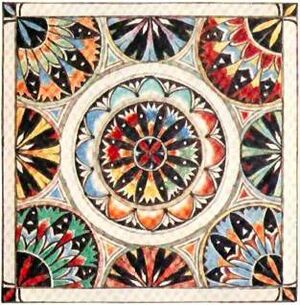
Tolkien passed away before The Silmarillion was published. However, he had prepared many images for it. These included paintings of several symmetrical, tile-like emblems for the kings and houses in his stories. He also made a real-looking Númenórean tile. This tile was meant to look like something saved from the destroyed land of Númenor and brought to Middle-earth by Elendil's ships.
One of his emblems, for Lúthien Tinúviel, was used on the front cover of The Silmarillion. Five other emblems (for Fingolfin, Eärendil, Idril Celebrindal, Elwë, and Fëanor) were used on the back cover.
Tolkien's Maps
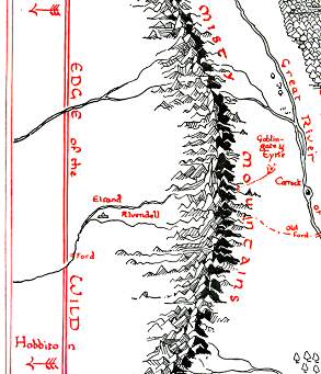
Tolkien's maps were very important. Like his illustrations, they helped readers feel truly immersed in his created world of Middle-earth. The Hobbit had two maps. The Lord of the Rings had three maps, which were redrawn by his son, Christopher Tolkien. The Silmarillion also had two maps.
These maps served several purposes. First, they helped Tolkien himself keep his story consistent. Later, they helped readers follow the often complicated journeys of his characters.
Tolkien's Calligraphy
Tolkien's job as a language expert meant he knew a lot about medieval illuminated manuscripts (old books with decorated letters and pictures). He copied their style in his own calligraphy, a skill his mother had taught him. He used this skill to create alphabets for his invented languages in Middle-earth, especially for the Elvish languages like Tengwar.

Tolkien used his calligraphy skills to write the famous inscription on the One Ring. This writing was in the Black Speech of Mordor, using the Elvish Tengwar script. The beautiful inscription and its translation, provided by Gandalf, appear in The Fellowship of the Ring.
Publication of Tolkien's Art
In 1979, Tolkien's son, Christopher, started to share his father's artwork with the world. He edited a book called Pictures by J.R.R. Tolkien, which had 48 pictures, some in colour. Before this, only a few of Tolkien's artworks had been seen, mostly on calendars.
Two important books have focused on Tolkien's art. One is J. R. R. Tolkien: Artist & Illustrator (1995) by Hammond and Scull, which is a collection of his paintings. The other is Catherine McIlwaine's 2018 book, Tolkien: Maker of Middle-earth, which went along with an art exhibition. Hammond and Scull have also published two more collections: The Art of The Hobbit by J. R. R. Tolkien (2011) and The Art of The Lord of the Rings by J. R. R. Tolkien (2015).
Artists Inspired by Tolkien
Many artists and illustrators have created drawings and paintings based on Tolkien's Middle-earth stories. Tolkien was not always happy with some of the early attempts by other artists. However, he was glad to work with the illustrator Pauline Baynes, who created the famous map of Middle-earth.
Some of the many artists who have worked on Middle-earth projects include John Howe, Alan Lee, and Ted Nasmith. John Howe and Alan Lee not only illustrated books but also worked as concept artists for Peter Jackson's Lord of the Rings movies.
Images for kids


